Overview
This release introduces Toggle Blocks, a new content formatting option designed to make your posts more dynamic and easier to navigate. With Toggle Blocks, authors can add collapsible sections to posts, articles, and other content — perfect for FAQs, long guides, or any content where you want to keep things concise without losing detail.
Schedule
- Staging: October 8, 2025
- Production: October 15th
- Enterprise: October 29th
Toggle Blocks
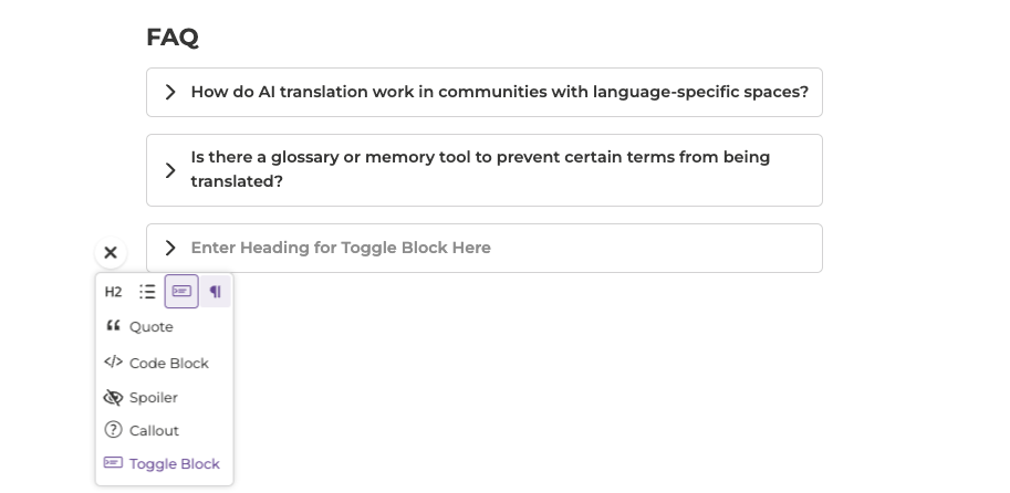
The Toggle Block is a new element available in the Rich Editor that allows you to create expandable and collapsible sections within your content. Each block has a clickable header that reveals additional text, media, or links when expanded, helping you structure information more clearly.
Use cases include:
- Frequently Asked Questions (FAQs)
- Step-by-step instructions or documentation
- Long community updates and announcements
Who can use it:
Available to all users with posting permissions.
Customization:
You can fully customize the look and feel of Toggle Blocks in your Style Guide using advanced theme variables. This includes adjusting options such as:
- Header text decoration and hover styles
- Background and border colors
- Padding, spacing, and corner radius
- Icons or indicators for open and closed states
These options make it easy to match Toggle Blocks to your community’s brand style or accessibility needs.