The Quick Links menu makes it easy for your users to navigate to essential parts of your Higher Logic Vanilla (Vanilla) community.
By default, the menu appears in the right side panel on most community pages. It displays a customizable list of "quick access" links to:
- community-based content, such as the Categories list page, the Recent Posts page, and the My Drafts page.
- user-based content, such as drafts, bookmarks, group pages, and posts.

NOTE: The user-based content items display counts. If a user doesn't have any drafts or bookmarks, for example, the count still displays, but as 0.
Read on to learn how to customize the Quick Links menu. You can:
- configure the appearance of the Quick Links menu and
- choose and customize the links that populate it.
TIP: Be sure to test these changes on your staging site before committing them to your production site.
Quick Links menu in Theme Editor
The Quick Links menu is a default feature of the Foundation theme. The feature can also be used with your custom themes and Vanilla's "legacy" themes (e.g., Bootstrap3, Deflector, and Keystone ) as part of Vanilla Labs.
Regardless of which theme you use, the Quick Links menu is managed in Theme Editor, where you can:
- choose whether to display borders and separators,
- select which links to include, and
- set the link font color.
Access Theme Editor
- Access the Dashboard.
- Navigate the appropriate path for your theme.
- Foundation theme: Appearance > Style Guides > Copy.
- Custom and legacy themes: Appearance > Layouts > [select_page] > Edit [current_page] > Copy.
3. In the right panel, click Global Styles and select Quick Links.

The Quick Links config panel displays:

Work through the remaining sections to customize the Quick Links menu to suit your community.
Theme Editor options
As you customize your Quick Links menu in Theme Editor, note these caveats regarding the undo and save options -- and how they impact one another.
Undo
The List Divider Style, Border Style, and Link Color settings each display an "undo" icon whenever the previously saved value is changed.

- Click the icon to revert to the previously saved value.
The "undo" icon displays until Save (in the upper right of the editor) is clicked.
Save
Even though there are only a few configuration options for Quick Links, it's still a good idea to periodically save your changes as you work and try different display settings.
The Save option is in the upper right of Theme Editor.
When you click Save:
- the page refreshes,
- your changes are saved,
- your changes are immediately applied to the Quick Links menu, and
- the "undo" icon no longer displays; it reappears when you change settings.
TIP: You can make changes in Quick Links and then navigate to another section in Theme Editor, such as Global Styles, and change some of its settings; then -- as long as you have not clicked Save -- when you return to Quick Links, the (unsaved) changes can still be reverted via the "undo" icon. This is very convenient if you want to compare, for example, various text and background colors with one another.
List Divider
Use the List Divider Style setting if you want to add some "padding" between the links.
- You can leave the default (No Separation) or apply either a Bordered or Separator setting as shown below.

Container Border
Use the Border Style setting if you want to enclose the list of links.
- You can leave the default (Borderless) or apply either a Bordered or Shadow setting as shown below.
NOTE: The Bordered and Shadow options are very similar, but the Shadow is lighter and more difficult to see against some backgrounds.

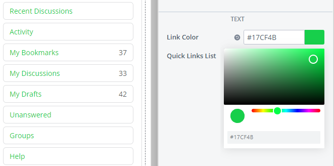
Customize Quick Links text color
The Text section has two settings that you can use to make the Quick Links menu reflect your brand's aesthetic.
Link text color
Use the Link Color setting to set a color (such as your brand color) for the text of the Quick Links menu links.

- If you know the HEX code of your preferred color, you can enter it in the text field; otherwise,
- Click the color sample box to open the color picker and set a color by using the color bar and/or color ring.
The color you set is applied to only the text of the Quick Links, as shown above. If a color is not set, the text of the Quick Links inherits the color of Global Styles > Body > Text.
NOTE: The title and the counts have the same color, which is inherited from Global Styles > Body > Text. These two elements are not controlled by this setting.
Manage your Quick Links
The Quick Links List setting is your "master control" for which links display and what they are labeled. This is also how you add custom links (to an external "sister" site, for example).
Click Edit to open the Quick Links dialog and manage your links.

Add a link
Click (+) New Link to add your own custom links to other internal community pages and to simplify access to trusted external sites.
Give your link a Label (its display name), specify its URL, and set the desired link permissions to control what Roles can view it. Refer to the Navigation link permissions section below to learn more about these permissions.
NOTE: Enter a full URL for external pages or a relative path for internal community pages.
Edit a link
Click the pencil icon to edit a link's Label, URL, and permissions. (More on link permissions below.)
IMPORTANT: While it's possible to edit your community's default links, we don't recommend doing this to protect the integrity of your community's core functionality. Instead, you can hide a default link and "replace" it with a custom one.
Show/hide links
Click the eye icon to show/hide a default link.📝 NOTE: This action is only available for the community's default links.
Hidden links remain in this list but are grayed out; they do not display in the Quick Links menu on your community pages.
Delete a link
Click the trashcan icon to remove a custom link. 📝 NOTE: You cannot delete default links to protect the integrity of your community's core functionality.
Arrange links
You can customize the order in which your Quick Links display on community pages.
- Click and hold a link.
- Drag it to a new location in the list and "drop" it into place.
- Repeat as necessary to achieve the order you want; click Apply.
NOTE: You cannot "nest" (make one be sub to another) Quick Links.

Theme Variables in Advanced Settings
You can use Vanilla's Theme Variables to apply even more granular customizations to the Quick Links menu. Some of the additional customizations are:
- Add a background color or image (
quickLinks.box.background) - Adjust the spacing and padding (
quickLinks.box.spacing) - Apply text colors for different states, such as hover, focus, and click (
quickLinks.listItem.fontState) - Customize font properties, such as alignment, letter spacing, line height, and text decoration (
quickLinks.listItem.font)
To learn more about using variables to customize your Quick Links menu, see: