In Higher Logic Vanilla (Vanilla), there are two types of Title Bars:
- Each Style Guide theme includes a Title Bar. Because a theme is applied community-wide, this functions as a default Title Bar that displays on every page.
- Communities that leverage Vanilla's custom page layouts can optionally create a custom Title Bar for each layout. These layout-based Title Bars supersede the theme-based Title Bar. In this scenario, the default Title Bar will display on all pages except for those with a custom layout that has a custom Title Bar.
This flexibility allows you to create a default Title Bar that meets your needs across most of your community but also create custom Title Bars for specific pages to, for example, add unique navigation links to them.
NOTE: Just because you use a custom layout doesn't mean its Title Bar has to be different from your applied theme's Title Bar: by default, a custom layout's Title Bar mirrors the theme Title Bar; only if you choose to customize it will it be different.
What you'll learn in this article
This article is dedicated to walking you through how to customize a Title Bar for a custom page layout, covering everything from adding custom text and backgrounds to logo images and navigation links.
To instead learn how to customize a theme-based Title Bar, see Customize your Default Title Bar.
What is a Title Bar?
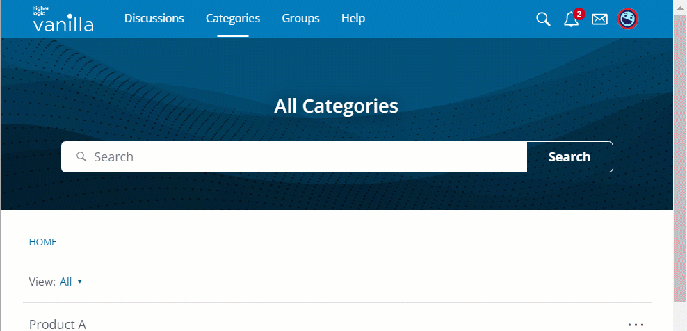
The Title Bar is located at the top of every page of your community, giving users easy access to some of its most important features, like its main navigation links and user-profile options.
An example of a "sticky" Title Bar is shown below, meaning it stays pinned to the top of the page as users scroll down.
Access a layout's Title Bar
Let's learn how to customize a layout's Title Bar using the Layout Editor.
- Access the Dashboard and navigate to the Appearance tab. All of the available layouts are listed in the LAYOUTS section.
- Click to expand the section for the layout you want to edit (e.g., Home Pages, Category Pages, Post pages, etc.).
- Click to select the desired layout, followed by Edit. You are now editing the layout with Layout Editor.
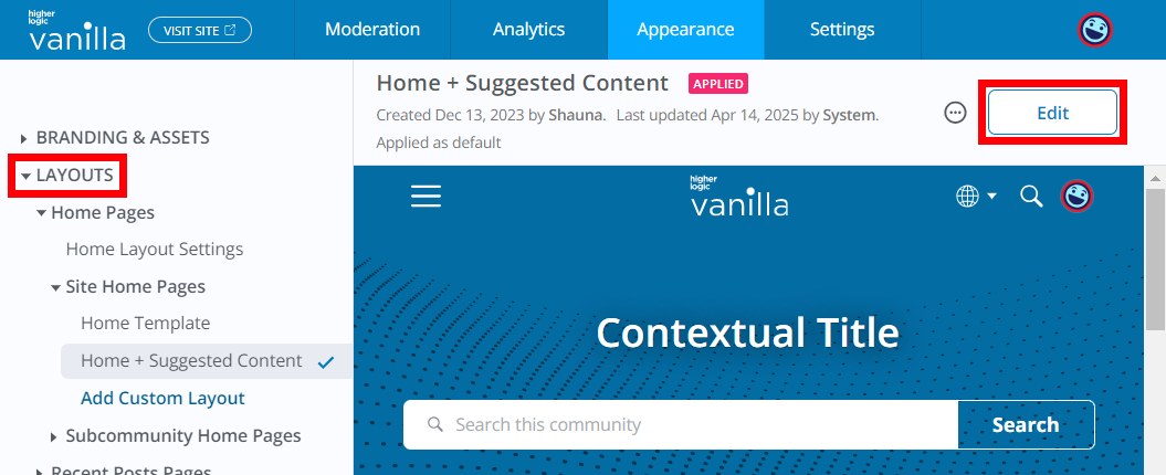
- Click to select the layout's Title Bar at the top of the page; the Title Bar widget popup displays.
- Click the pencil icon to edit the Title Bar and access its properties.

The sections below describe each of the properties you can use to customize a layout's Title Bar.
IMPORTANT: All layout Title Bars use the properties in your community's applied theme, by default, to provide an aesthetic baseline. At any time while editing a layout Title Bar, you can revert back to these defaults, if needed.
Editor "scale" and "preview background"
Before continuing, let's first examine two options you can leverage to make your customization efforts easier.
Scale
The Scale option controls the Title Bar's relative size in the editor's preview area, helping you understand how the Title Bar will display at dimensions that correspond to various device screen sizes. For example, setting the Scale to 150% is similar to a desktop view, while 50% is similar to a mobile phone.
Use this feature while customizing your Title Bar to keep an eye on how elements like custom logos and additional navigation links will look at various screen sizes.

Background preview
As you're working, you'll likely change various aspects of the Title Bar, like its background color, logo, or transparency.
To help you better visualize how these updates may look with your community's page background color, you can use the Preview Background feature to change the page background at any time.

Background Color
You can update the Title Bar's background color using the color picker or by entering a hex code.

Foreground Color
The foreground color refers to the text and icon elements on "top" of the background. You can set the foreground color via the color picker or by entering a hex code.
NOTE: This only affects top-level link text; nested navigation links will not be affected.

Positioning
The Positioning option controls whether the Title Bar is sticky or static.
- If sticky, it remains pinned to the top of the page, even as users scroll down a page, ensuring its options are always available.
- If static, the Title Bar is "left behind" as users scroll down a page, meaning it's only visible if users scroll to the top of the page.

For each of these options, you can also set whether the Title Bar is transparent or solid.
- If solid, the Title bar retains its set background color at all times.
- If transparent, the Title Bar blends in with the banner's background color. If set to sticky, the Title Bar will be transparent while at the top of the page but revert to the set background color when scrolling past the Banner. This is illustrated below:

Height & Height (mobile)
You can set the height of the Title Bar, in pixels, for users viewing your community on both desktop and mobile.
- The recommended size for desktop is between 48—90px,
- with a shorter height recommended for mobile because of the smaller screen size.

Border Type
You can set the Title Bar's border type to:
- None - No border.
- Border - Adds a small border around the Title Bar; you can use the Width theme Variable to modify this size.
- Shadow - Adds a small shadow to the bottom of the Title Bar to provide a little depth and distinction between the bar and banner/page content.

Logo
The Logo section of the Title Bar properties allow you to:
- insert a unique custom logo image for both desktop and mobile devices,
- and control its alignment for both desktop and mobile devices.
NOTE: If a logo is not added, the Title Bar will inherit either a default logo or come from your Dashboard > Appearance > Branding & SEO settings.
The recommended logo image dimensions will depend on the size of your Title Bar.

Logo alignment
You can set a left- or center-aligned logo for both desktop and mobile.
Left example

Center example

Edit logo destination URL
- By default, clicking the logo navigates users to your community Home Page.
- However, you can set a custom URL if you'd like users to land somewhere else (such as your main corporate site). Simply enter the URL to your desired destination in the URL field.

Navigation Links
You can either use the default links from your Style Guide theme (the default setting) or select Custom from the Navigation Type menu to create a unique set of links specifically for the layout.
If creating (or managing existing) custom links, click the Edit Links button.

Add a link
Click (+) New Link to add your own custom links to other internal community pages and to simplify access to trusted external sites.
Give your link a Label (its display name), specify its URL, and set the desired link permissions to control what Roles can view it. Refer to the Navigation link permissions section below to learn more about these permissions.
NOTE: Enter a full URL for external pages or a relative path for internal community pages.
Edit a link
Click the pencil icon to edit a link's Label, URL, and permissions. (More on link permissions below.)
Delete a link
Click the trashcan icon to remove a custom link.

Navigation link permissions
For both the default links and any custom links you create, you can set custom view permissions that control who can see and use them. This gives you freedom to create a single, multifaceted set of links that cater to the needs of multiple groups of users within your community.
⭐️ EXAMPLE: You could create a total of six links, where only two are visible to guests, four are visible to members, but all six are visible to administrators.
NOTE: If custom permissions are set for a link, the lock icon displays, as shown above; hover over this icon to view the Roles that can see the link.
Arrange and nest navigation links
To reorder or nest links, drag and drop them as shown below:

Additional navigation link options
If you'd like your navigation links to appear vertically rather than horizontally, simply nest them in an additional level.
For example, if you nest them like this:

They will appear as:
