In Higher Logic Vanilla (Vanilla), there are two types of Title Bars:
- Each Style Guide theme includes a Title Bar. Because a theme is applied community-wide, this functions as a default Title Bar that displays on every page.
- Communities that leverage Vanilla's custom page layouts can optionally create a custom Title Bar for each layout. These layout-based Title Bars supersede the theme-based Title Bar. In this scenario, the default Title Bar will display on all pages except for those with a custom layout that has a custom Title Bar.
This flexibility allows you to create a default Title Bar that meets your needs across most of your community but also create custom Title Bars for specific pages to, for example, add unique navigation links to them.
NOTE: Just because you use a custom layout doesn't mean its Title Bar has to be different from your applied theme's Title Bar: by default, a custom layout's Title Bar mirrors the theme Title Bar; only if you choose to customize it will it be different.
What you'll learn in this article
This article is dedicated to walking you through how to customize a theme's Title Bar, covering everything from adding custom text and backgrounds to logo images and navigation links.
To instead learn how to customize a layout-based Title Bar, see Create a Custom Title Bar to learn more.
What is a Title Bar?
The Title Bar is located at the top of every page of your community, giving users easy access to some of its most important features, like its main navigation links and user-profile options.
An example of a "sticky" Title Bar is shown below, meaning it stays pinned to the top of the page as users scroll down.
Access a theme's Title Bar
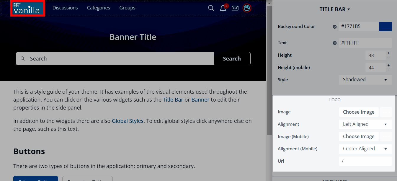
Let's learn how to customize a Title Bar using the Theme Editor.
- Access the Dashboard.
- Navigate to the Appearance > Branding & Assets > Style Guides page and edit your community theme to access the Theme Editor.
- Click the Title Bar in the preview "canvas" or select TITLE BAR from the dropdown in the right panel (highlighted below). All of the available Title Bar properties display in the right panel.

The sections below describe each of the properties you can use to customize a theme's Title Bar, as well as some additional options that exist using Theme Variables.
Positioning
The Positioning option controls whether the Title Bar is sticky or static.
- If sticky, it remains pinned to the top of the page even as users scroll down a page, ensuring its options are always available.
- If static, the Title Bar is "left behind" as users scroll down a page, meaning it's only visible if users scroll to the top of the page.

For each of these options, you can also set whether the Title Bar is transparent or solid.
- If solid, the Title bar retains its set background color at all times.
- If transparent, the Title Bar blends in with the banner's background color. If set to sticky, the Title Bar will be transparent while at the top of the page but revert to the set background color when scrolling past the Banner. This is illustrated below:

Background Color
You can update the Title Bar's background color using the color picker or by entering a hex code.

Text
You can set the color for text and icon elements on the Title Bar's foreground via the color picker or by entering a hex code.
NOTE: This only affects top-level link text; nested navigation links will not be affected. You can, however, use Variables to customize nested navigation links.

Height & Height (mobile)
You can set the height of the Title Bar, in pixels, for users viewing your community on both desktop and mobile.
- The recommended size for desktop is between 48—90px,
- with a shorter height recommended for mobile because of the smaller screen size.

Border Style
You can set the Title Bar's border style to:
- Borderless - No border.
- Bordered - Adds a small border around the Title Bar; you can use the Width theme Variable to modify this size.
- Shadowed - Adds a small shadow to the bottom of the Title Bar to provide a little depth and distinction between the bar and banner/page content.

Logo
The Logo section of the Title Bar properties allow you to:
- insert a unique custom logo image for both desktop and mobile devices,
- and control its alignment for both desktop and mobile devices.
NOTE: If a logo is not added, the Title Bar will inherit either a default logo or come from your Dashboard > Appearance > Branding & SEO settings.
The recommended logo image dimensions will depend on the size of your Title Bar.
Logo alignment
You can set a left- or center-aligned logo for both desktop and mobile.
Left example

Center example

Edit logo destination URL
- By default, clicking the logo navigates users to your community Home Page.
- However, you can set a custom URL if you'd like users to land somewhere else (such as your main corporate site). Simply enter the URL to your desired destination in the Url field.

Navigation Links
Click the Edit button in the Navigation section to manage the Title Bar's available navigation links.

Add a link
Click (+) New Link to add your own custom links to other internal community pages and to simplify access to trusted external sites.
Give your link a Label (its display name), specify its URL, and set the desired link permissions to control what Roles can view it. Refer to the Navigation link permissions section below to learn more about these permissions.
NOTE: Enter a full URL for external pages or a relative path for internal community pages.
Edit a link
Click the pencil icon to edit a link's Label, URL, and permissions. (More on link permissions below.)
IMPORTANT: While it's possible to edit your community's default links, we do not allow you to delete them. This is to protect the integrity of your community's core functionality. Instead, you can hide a default link and "replace" it with a custom one..
Show/hide links
Click the eye icon to show/hide a default link.📝 NOTE: This action is only available for the community's default links.
Hidden links remain in this list but are grayed out; they do not display in the Title Bar on your community pages.
Delete a link
Click the trashcan icon to remove a custom link. 📝 NOTE: You cannot delete default links to protect the integrity of your community's core functionality.

Navigation link permissions
For both the default links and any custom links you create, you can set custom view permissions that control who can see and use them. This gives you freedom to create a single, multifaceted set of links that cater to the needs of multiple groups of users within your community.
⭐️ EXAMPLE: You could create a total of six links, where only two are visible to guests, four are visible to members, but all six are visible to administrators.
NOTE: If custom permissions are set for a link, the lock icon displays, as shown above; hover over this icon to view the Roles that can view the link.
Arrange and nest navigation links
To reorder or nest links, drag and drop them as shown below:

Additional navigation link options
If you'd like your navigation links to appear vertically rather than horizontally, simply nest them in an additional level.
For example, if you nest them like this:

They will appear as:

Advanced customization with Theme Variables
In addition to the customizations discussed above, you can use Theme Variables to make slightly more advanced changes to your Title Bar.
NOTE: Basic use of Theme Variables requires basic knowledge and understanding of CSS, and are typically handled by theme developers or more technical individuals with this expertise. For advanced customizations using Theme Variables, a theme developer may be required.
- Check out this article to learn how to customize your Title Bar with Theme Variables.
- Several Title Bar-specific Variables are listed below for easy reference.
Background Color Theme Variables
- Background color on hover -
titleBar.colors.state.bg
Text Theme Variables
Font variables
- Text Color (nav links only) -
titleBarNavigation.navLinks.font.color - Letter Spacing -
titleBarNavigation.navLinks.font.letterSpacing - Size -
titleBarNavigation.navLinks.font.size - Text Decoration -
titleBarNavigation.navLinks.font.textDecoration - Transform -
titleBarNavigation.navLinks.font.transform
Padding variables
- Left -
titleBarNavigation.navLinks.padding.left - Right -
titleBarNavigation.navLinks.padding.right
Border Style Theme Variables
- Width -
titleBar.border.width
Logo Theme Variables
- Max Width -
titleBar.logo.maxWidth- dashed|dotted|double|groove|hidden|inset|none|outset|ridge|solid
- Right Margin -
titleBar.logo.offsetRight
Mobile only
- Max Width -
titleBar.logo.mobile.maxWidth
Additional Theme Variables
Banner - Swoop
- Amount -
titleBar.swoop.amount - Offset -
titleBar.swoop.swoopOffset
You can use these variables to give the Title Bar a curved bottom, like in the example below:

Spacing - Title Bar
Using theme variables, you can set the spacing for all of the Title Bar’s individual spacing such as horizontal or vertical elements or you can set the spacing for the left, right, top and bottom individually.
- Left -
titleBar.spacing.padding.left - Right -
titleBar.spacing.padding.right