BETA NOTICE: Widget Builder is currently in active beta. Features, APIs, and interface elements may evolve as we refine developer tooling.
Access is available on staging environments for testing, and select customers have approved early access in production.
For the latest updates or to request beta access, contact your Customer Success Manager (CSM) or Account Executive.
Widget Builder enables developers to create new widgets and fragments from scratch or customize existing ones using React, TypeScript, HTML, and CSS.
This article familiarizes you with the Widget Builder editor, teaching you how to:
- Customize widgets/fragments
- Edit code and styles
- Preview your changes
- Commit and publish your widget/fragment
- Use your widgets/fragments in Layout Editor
WARNING: Widget Builder is a powerful, code-first customization interface designed for developers who are skilled in JavaScript, CSS, React, and other design principles. With this in mind, make sure you possess the proper coding expertise and knowledge before using this tool—or work with someone who does. Otherwise, you may damage the integrity and functionality of your Higher Logic Vanilla (Vanilla) community.
For guidance on safe customization, review Widget Builder Best Practices.
Developer Settings
When using Widget Builder for the first time, review the Developer Settings to personalize the workspace to your preferences. These are high-level settings that adjust how the coding environment looks and behaves.
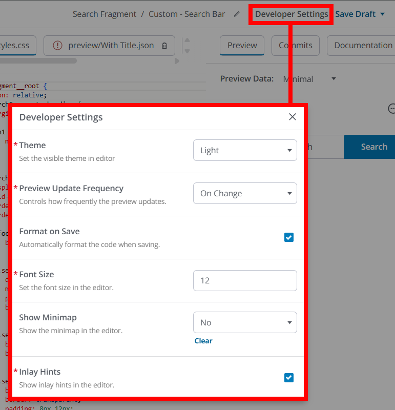
Click Developer Settings at the top-right of the editor to access the following settings:
Setting | Description |
|---|
Theme | Switch between light and dark mode for the editor interface. |
Preview Update Frequency | Control how often the live preview refreshes as you type (e.g., automatically on change or only when you save). |
Format on Save | Automatically formats your code each time you save, keeping styles consistent. |
Font Size | Adjust the text size in the code editor for better readability. |
Show Minimap | Toggle a small overview of your code for quick navigation. |
Inlay Hints | Display helpful inline hints (like parameter names and types) to improve code readability. |
Widget/fragment creation overview
NOTE: Creating custom widgets/fragments is a complex and highly custom process. Because of this, the goal of this article is not to provide a creation step-by-step but to give you the foundational knowledge you can then use to create your own custom widgets/fragments.
Reference this section and the subsequent Understand the Widget Builder interface section for guidance.
1. On the Appearance > Branding & Assets > Widget Builder page, click Create Widget.
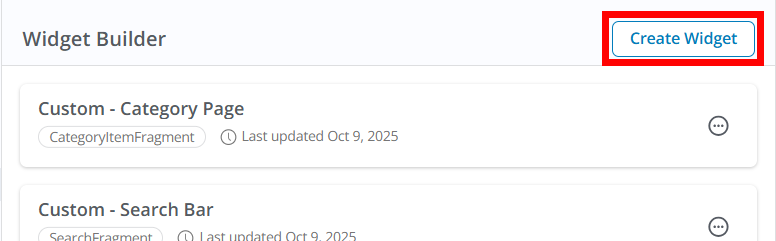
2. In the resulting Select Widget popup, you have two options:
- Select Custom Fragment to create a widget from scratch. This is generally the approach to leverage if you want to build something entirely unique that extends beyond our existing widget functionality.
- Otherwise, several of Vanilla's default, built-in widgets are listed (e.g., Discussion List, Category List, etc.). These options enable you to create a variant of Vanilla's existing widgets, with much of the code and data being in place. You can think of this as building a widget from a "template."
- This is a great way to make changes to Vanilla's existing widgets to better fit your organization's branding and needs beyond the more limited customization possible when configuring these widgets in Layout Editor, or
- to simply begin the creation process with some code and design already in place.
3. Click Add to access the Widget Builder interface.
4. Name your widget/fragment: Give it a unique name so it’s easy to find and reuse later across layouts.
TIP: We recommend adopting consistent naming conventions (prefixes/suffixes for site section, audience, or display intent), so your saved widgets are easily scannable in the management list and recognizable in Layout Editor.
5. Edit the code and styles: Use the code editors to implement your widget’s UI and logic (JSX/TSX) and apply styles (CSS).
NOTE: These tabs are explained in more detail in the Understand the Widget Builder interface section below.
6. Preview as you build: Use the live preview in the right panel to confirm rendering and interactions before you publish.
7. Save/Publish: Save your work; once published, your custom widget/fragment will appear in the Layout Editor for admins to place and configure like any other widget.
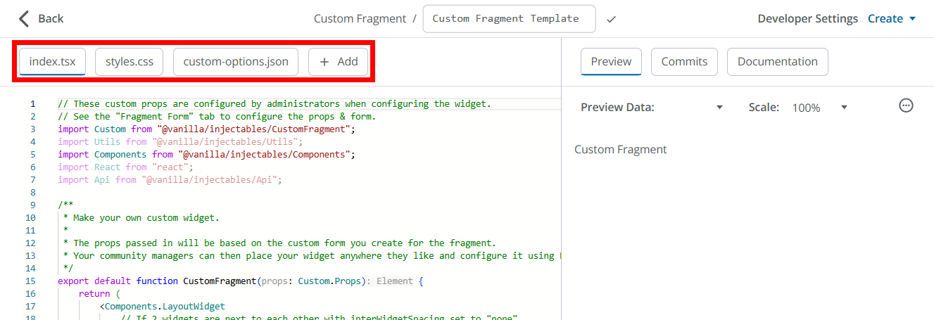
Understand the Widget Builder interface
You'll build widgets/fragments with a multi-tab editor; each tab corresponds to part of your widget’s structure and configuration.
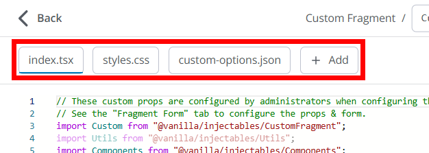
Tab | Purpose | Key Actions |
|---|
index.tsx | The main React/TypeScript file that defines the widget’s or fragment's logic and layout. | Add UI structure, interactivity, and data fetching. |
styles.css | Controls the widget’s or fragment's appearance. Styles are scoped in a Shadow DOM to avoid affecting the rest of your site. | Add or modify CSS for spacing, typography, and states. |
custom-options.json | Defines admin-facing configuration options visible in Layout Editor. | Add fields like title, toggles, or filters. |
+ Add | Create additional files to support your widget/fragment. | Add helper scripts, constants, or sample JSON data for preview testing. |
NOTE: Widget Builder uses a Monaco-based code editor with type hints and autocomplete. You can adjust your developer settings — like theme, font size, and preview refresh rate — under Developer Settings in the top-right corner.
index.tsx
index.tsx is the main React/TypeScript entry point for a custom widget/fragment in Widget Builder. It defines the widget’s UI, behavior, and how it consumes platform utilities, and it’s what the live preview compiles and renders as you build.
Import and use the Utils library for common tasks (current user, permissions, navigation, data fetching, i18n).
Key functionality
- Renders the widget’s visual output using React (JSX/TSX) as the single exported component/function.
- Wires up logic and interactivity: event handlers, navigation, conditional rendering, and state management.
- Fetches and transforms data from Vanilla APIs (and optionally external endpoints) using the injected utilities, and then maps the results to the UI.
- Reads admin-configured options (defined in the custom-options.json tab) via props and applies them to the render path (titles, layout modes, limits, toggles, etc.).
- Respects platform context and safety constraints by using the provided injectables instead of direct internal imports.
Usage experience
- The editor compiles your TSX as you type and shows a live preview; you iterate in-place without leaving the editor.
- The React editor is typed: the environment injects types for props/utilities to improve autocomplete and guardrails during development.
- When you publish, the compiled widget becomes available in Layout Editor, and its render logic (from the index.tsx tab) runs wherever the widget is placed.
Working with props and options
- Your component receives a typed props object that includes values backed by the admin-facing configuration you declare in the custom-options.json tab (e.g., title, limit, layout, showMeta). Use these values to control rendering and behavior.
- Treat options as the “source of truth” for variations of the widget so admins can reuse it safely across layouts without code changes.
Using the Utils library
- Import Utils from @vanilla
/injectables/Utils to access safe, platform-aware helpers for common tasks such as user context, permissions, navigation, i18n, formatting, and data fetching via React Query. - Examples of frequently used methods:
Utils.useCurrentUser() to personalize content or gate actions.Utils.usePermissionsContext() to conditionally render privileged controls.Utils.useLinkNavigator() for in-app vs full-page navigation that “does the right thing.”Utils.useQuery() and Utils.useMutation() for data retrieval and writes with caching, retries, and loading states.
Using platform Components (optional)
- You can import UI Components from @vanilla
/injectables/Components to align visuals and behavior with Vanilla’s design patterns, reducing custom markup and making your widget "feel" native.
Data fetching and state patterns
- Prefer
Utils.useQuery() for reads to handle loading, error, and caching automatically; render skeletons or fallbacks while data loads. - Use
Utils.useMutation() for writes (e.g., reactions, follows), with optimistic updates and invalidation to keep the UI fresh and fast.
Navigation, localization, and formatting
- Route users with
Utils.useLinkNavigator() to preserve SPA performance where possible and gracefully fall back for external destinations. - Localize all user-facing strings with
Utils.t(); avoid hardcoding text so the widget adapts to the viewer’s language. - Format numbers and dates with
Utils.formatNumber() and related helpers to respect locale conventions.
Performance and safety considerations
- Use the injected utilities instead of direct DOM manipulation or non-scoped imports; this keeps your widget compatible and secure within the builder sandbox.
- Keep expensive computations memorized and minimize re-renders by structuring state thoughtfully; leverage React Query caching to avoid redundant network calls.
Preview-to-publish behavior
- The same index.tsx code that powers the live preview is what runs after you publish, so verify empty, loading, and error states before release.
- Updates to the widget’s code propagate everywhere the widget is used, so treat changes as versioned behavior and coordinate with admins who have placed it in layouts.
styles.css
This is the stylesheet for your custom widget/fragment in Widget Builder. It controls the widget’s look (colors, spacing, layout, states) and is applied inside an isolated Shadow DOM so your styles don’t leak into the rest of the page—and global site styles won’t unexpectedly override your widget.
What the styles.css tab is responsible for
- Defines the widget’s visual design: typography, spacing, borders, colors, hover/focus/active states, and empty/loading/error states that the code in index.tsx renders.
- Keeps styling safely scoped to the widget via Shadow DOM isolation to prevent clashes with Vanilla’s core CSS and other widgets on the page.
- Aligns your widget with your Vanilla community's brand by mirroring Theme Editor choices (e.g., fonts, color palette) so it feels native when used with out‑of‑the‑box widgets.
Scope and cascade behavior
- Styles in styles.css apply only to your widget; they do not affect the rest of the page, and the page’s global CSS should not override your widget’s rules because of Shadow DOM encapsulation.
- Treat styles.css as the single source of truth for presentation, while index.tsx handles structure and logic. Avoid inline styles in code unless you need dynamic, per‑state values that are hard to express in CSS.
Working with theme alignment
- Many Vanilla widgets and elements inherit visual properties from your applied theme's Global Styles. Use comparable tokens (colors, spacing) so your custom widget/fragment harmonizes with the theme.
- For consistency, mirror commonly used patterns (button sizes, card padding, list spacing) you see in out‑of‑the‑box widgets documented in the Layout Editor Widgets article.
Authoring tips and best practices
- Prefer class‑based styling and clear naming for maintainability. Keep variants explicit (e.g., .widget-compact vs .widget-full).
- Define a small scale for spacing and typography and reuse it across elements to keep the UI cohesive.
- Style all interaction states (hover, focus, active, disabled) and check color contrast for accessibility so the widget works with keyboard navigation and varied themes.
- Keep responsive behavior simple (stack vs grid) and test narrow/wide widths in the preview. Use flexible units (%, rem, clamp) to adapt to different column sizes in Layout Editor.
custom-options.json
custom-options.json is a JSON file in Widget Builder that declares the admin-facing configuration fields for your custom widget/fragment, so non-developers can set titles, toggles, filters, and other parameters in the UI when placing the widget in Layout Editor.
How it fits into the workflow
- Developers define options in custom-options.json alongside the widget’s code and styles.
- After publish, the widget becomes available in Layout Editor, and the options you defined become configurable inputs for admins when they add and edit the widget on a page.
- Updates you save to the widget (including its options) apply everywhere that widget is used, streamlining reuse across layouts.
What you typically put in it
- A structured list of fields (e.g., text, boolean, select, number) with labels, defaults, and optional helper text, so admins see clear, friendly controls instead of raw code.
- Constraints or presets (e.g., required, min/max, allowed values) to keep inputs valid and consistent across pages.
- Optional grouping and descriptions to keep complex widgets organized and understandable in the editor panel.
Authoring tips
- Use clear labels and short helper text so admins immediately understand what each option does in Layout Editor.
- Provide sensible defaults; most admins will accept defaults and only tweak a few fields for each placement.
- Prefer booleans and selects for guardrails; they prevent invalid combinations and make layouts more predictable.
- Keep related fields together in groups to reduce scrolling and roadblocks for admins.
+ Add
The + Add tab lets you insert additional support files for your custom widget/fragment, alongside index.tsx, styles.css, and custom-options.json.
Use it to organize helpers, constants, or preview data files that support your widget’s code and configuration.
Typical uses
- Add small TypeScript/TSX helpers to keep your main component clean (e.g., formatting utilities or list‑item render helpers).
- Store JSON “preview data” files to simulate API responses in the live preview while you build and test your widget’s UI states (loading, empty, error, populated).
- Keep shared constants (such as default limits, display modes, or label keys) in one place to reduce duplication and make refactors simpler.
- Create optional documentation or notes (for example, a README stub or comments within a helper) to guide other developers who may edit the widget later.
Best‑practice guidelines
- Keep helpers small and focused; we recommend a few short utilities over one large “kitchen‑sink” helper for readability and easier maintenance.
- Centralize defaults in a constants file so your component logic and your admin options (from custom‑options.json) remain in sync.
- Use JSON preview data to validate empty, long‑content, and edge‑case scenarios in the live preview before publishing; it speeds up iteration without relying on live API conditions.
- Rely on platform injectables (for example, Utils and Components) rather than bringing in external packages; this keeps your widget compatible and secure in the builder sandbox.
Preview your changes
While working in Widget Builder, a preview of your code and CSS is displayed in the right-hand panel, making it easy to see and verify your changes as you work. The preview renders your in-progress widget or fragment with real platform injectables and sample data, so you can validate JSX/CSS and behavior before publishing.
- Implement your logic in the index.tsx tab and styling in the styles.css tab; the preview updates as you edit, letting you verify structure, styles, and interactions in one place.
- Use the platform-injected system components and available data inside the builder, and then observe their output in the preview to confirm composition and theming.
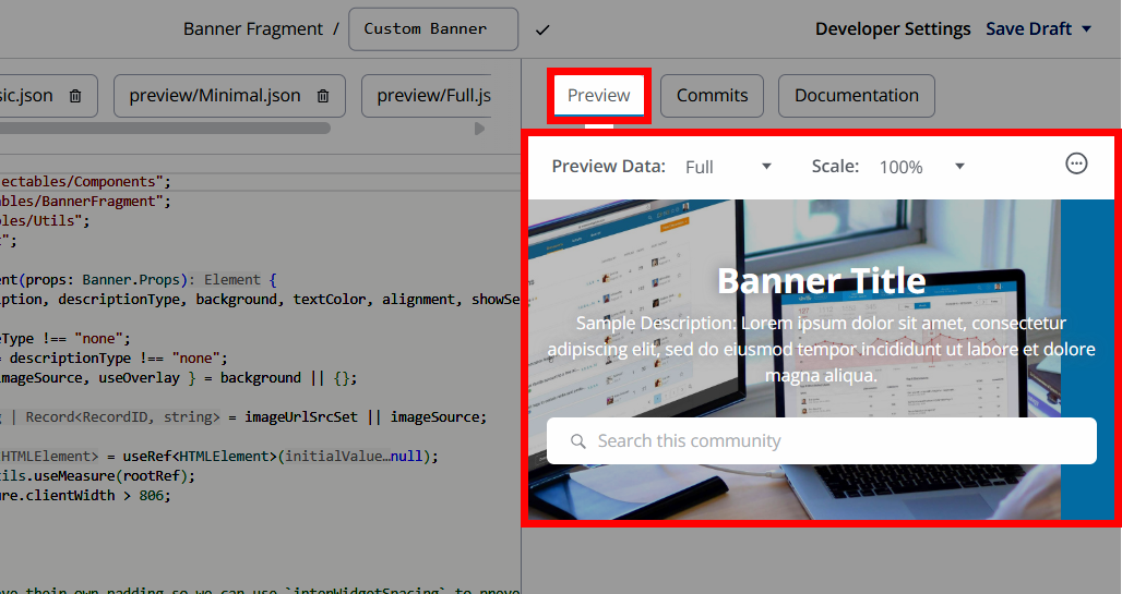
Preview options and controls
- Default preview data: Each widget/fragment starts with built-in sample data to give the preview context (e.g., example posts, user info) so you can see rendering immediately.
- Custom preview datasets: Create and save different sets of preview data on the custom-options.json tab to simulate scenarios (e.g., empty states, long titles, rich meta) and quickly switch between them.
- Typed props in the index.tsx tab: The builder injects typed props for the React/JSX experience, helping you discover what data is available and how to consume it in the preview without ad‑hoc imports.
- Use Utils in preview: The Utils library is available inside the previewed code, so you can verify behavior with:
- Navigation via
useLinkNavigator() (e.g., button click routes). - Personalization via
useCurrentUser() and auth gating via useCurrentUserSignedIn(); adjust your preview dataset to simulate guest vs. member experiences. - Conditional actions via
usePermissionsContext() to test moderator/admin-only UI in preview datasets that include those roles. - Localization with
t() and locale checks with getCurrentLocale() to validate translated copy and locale-aware behavior. - Data fetching patterns with
useQuery() / useMutation() and proper loading/error UI—preview renders your loading and error states while your code runs. - Responsive behavior using
useMeasure() and overflow handling with useIsOverflowing(), ensuring the preview shows compact/full views and ellipsis where needed.
- System components palette: Leverage platform components (e.g., layout scaffolds) exposed in the builder; confirm their rendering and composition directly in preview.
- Multiple preview sets for regression testing: Keep several saved preview datasets you can toggle to quickly sanity-check UI against edge cases (e.g., “no results,” “RTL locale,” “moderator permissions”).
Tips for reliable previews
- Always handle loading and error states when using
useQuery() / useMutation() so the preview reflects complete UX paths (success, retry, failure). - Create at least three preview datasets (e.g., guest, member, moderator) and a content edge-case set (long text, no data) to catch layout/styling issues before saving.
- Keep naming consistent across your saved datasets and widgets/fragments so it’s easy to switch and compare behaviors while previewing changes.
Preview with different Roles
Use the Role Preview feature to choose one or more Roles to simulate in real-time. The preview will then behave “as if” you have those Roles.
- In the preview panel, click the ellipsis (…) menu and select Preview Roles.
- In the dialog, select one or more Roles and click Preview.
When one or more Roles are selected, the simulated “current user” presented to your code uses a placeholder name/email derived from the Role(s), and the permissions in preview are the union of the selected Roles’ permissions. This lets you exercise permission checks in your JSX without logging in/out as different users.
IMPORTANT: Always clear Role Preview when you’re done testing. Role Preview simulates selected roles and merges their permissions, which directly changes what renders and which code paths execute; if left on, you can misread widget visibility and permissions and commit changes based on a simulated state.
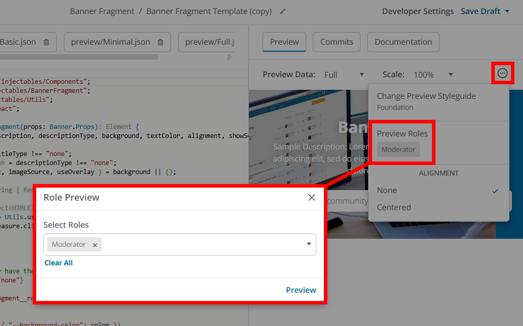
TIPS: 1. Preview one Role at a time to clearly see what that Role will experience. 2. If you’re validating page-level visibility, use Layout Editor’s Preview Roles feature to confirm which Widgets display/hide.
Save & commit your changes
Let's begin by understanding the difference between saving your work and committing it.
- Saving persists your in‑progress edits in the editor so you don’t lose work; we recommend saving frequently as you iterate. This does not publish any changes to your live site.
- Committing finalizes a new version and makes it live everywhere that widget/fragment is used in layouts; edits propagate to all placements that reference it.
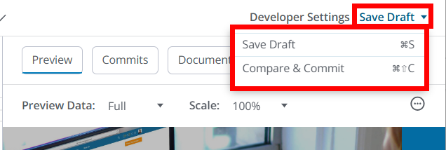
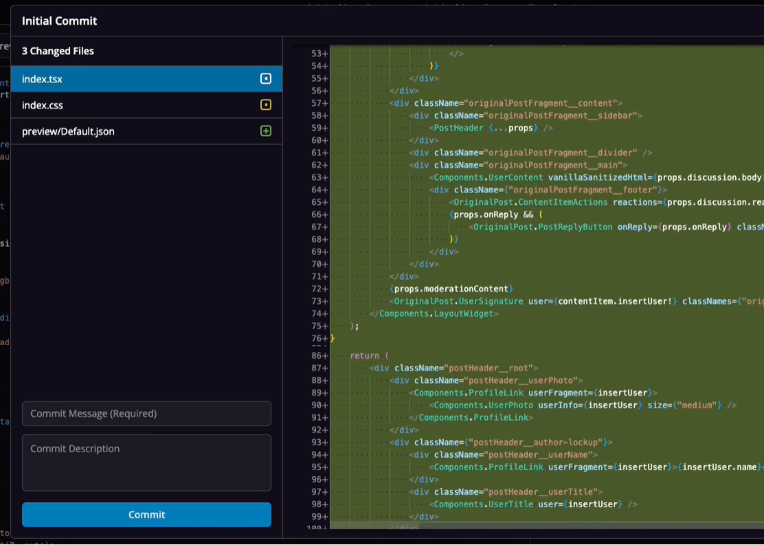
How to commit your work
- Select Compare & Commit from the top-right dropdown to view the Commit dialog, where you can view the widget's code.
- At the bottom left, provide a Commit Message (this is required) to explain the commit action at a high level.
- You can optionally provide a more detailed description in the Commit Description field, if needed.
- Click Commit to publish your widget.
TIP: These details are saved with your commits to help you and your team understand the purpose/changes of each commit, along with any important details. We recommend providing detailed information with every commit to make historical analysis and troubleshooting of widget versions simpler.
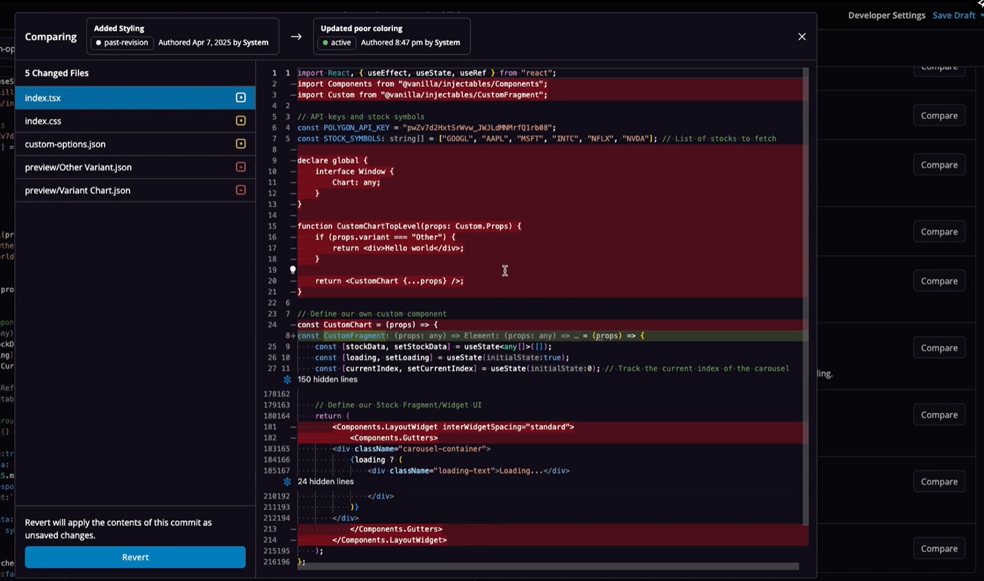
Comparing commits & reverting changes
Each commit creates a new version of the widget’s source (code, styles, options), forming a history you and your team can browse and compare over time. This makes comparing commits to see what changed between versions (useful for review and diagnosing regressions) much easier.
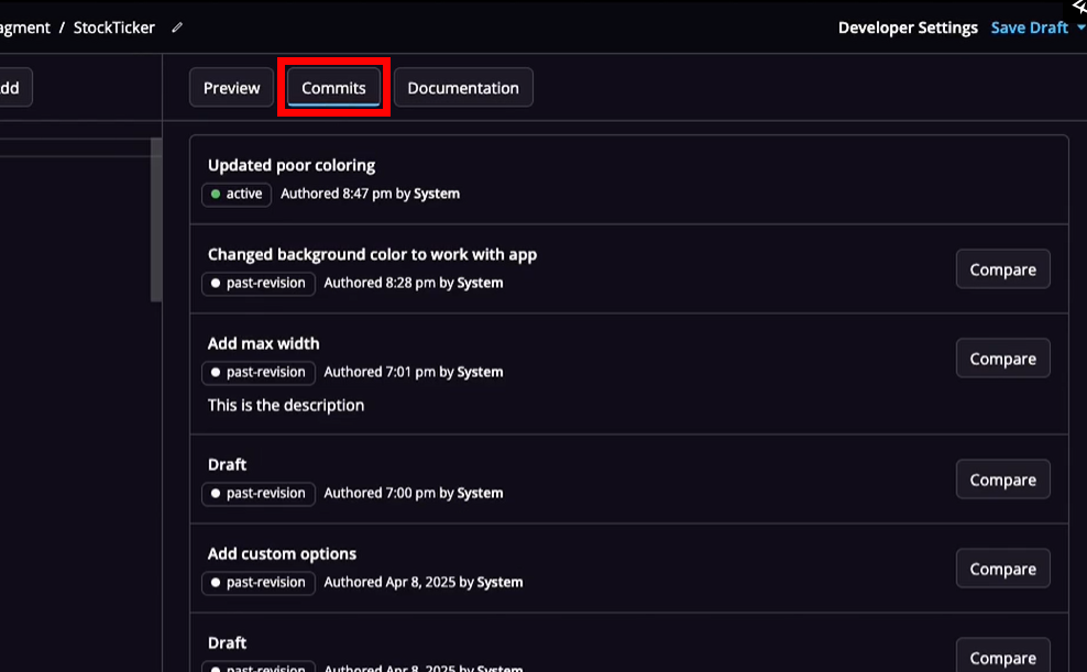
Each of a widget's versions are listed on the Commits tab. Over time, you'll likely make several updates to your custom widgets, resulting in a Commit tab like the one below, with each "version" listed. You can click the Compare button for a particular commit to view its details/changes.
While viewing a previous version, you can click the Revert button at the bottom left to restore the widget to any previous version. This is especially useful in situations where a recent commit had unintended consequences or undesired changes that you want to quickly revert.
Practical tips
- Treat each commit as a release: since widgets can be reused across many layouts, even small commits can have broad impact.
- test on staging first: always test on staging to reduce risk before you commit to your production environment.
- Copy, then save: Use the builder’s ability to copy an existing widget to create a new variant (e.g., “Discussion List - Compact”) and commit changes to the copy. This lets you test and roll out the new variant selectively in the Layout Editor without affecting pages that use the original.
- Communicate with admins: layout owners should know a commit is coming, because it will update all placements of the widget immediately upon publish.
Use your custom widgets/fragments in Layout Editor
Custom widgets and fragments created in Widget Builder are available in the Layout Editor, where you can use them to customize your community layouts.
This means that:
- Developers can create and version custom code in Widget Builder.
- Admins can then place and configure those widgets and fragments directly in Layout Editor without needing to edit code.
NOTE: If you update or roll back a widget or fragment in Widget Builder, any layouts using it will automatically update across your community.
Add a custom widget
If you created a custom widget in Widget Builder, it behaves like a standalone widget that you can place directly into a layout.
To add a custom widget:
- Navigate to the Appearance tab in the Dashboard and expand the Layouts section.
- Edit an existing layout or click Add Custom Layout for the desired community area (Home Pages, Post Pages, etc.) to create a new one.
- In the layout grid, click a section and then click the (+) icon to open the widget selector dialog.
- Search for and select your custom widget.
- Adjust its configuration options and placement as needed.
- Save the layout to publish your changes.
Your custom widget will now render in that layout as a reusable, version-controlled component.

Add fragments to existing widgets
If you’re using Full Widget Builder (Enterprise or Enterprise Plus customers only), you can also create fragments that modify the appearance or behavior of existing widgets.
For example:
- A Post List Item Fragment can be applied to Post List, Q&A, Ideas, Announcements, or Recent Posts Widgets
- A Search Fragment can be applied to a Banner Widget or a Search Widget
- A CTA Fragment can be applied to a CTA Widget
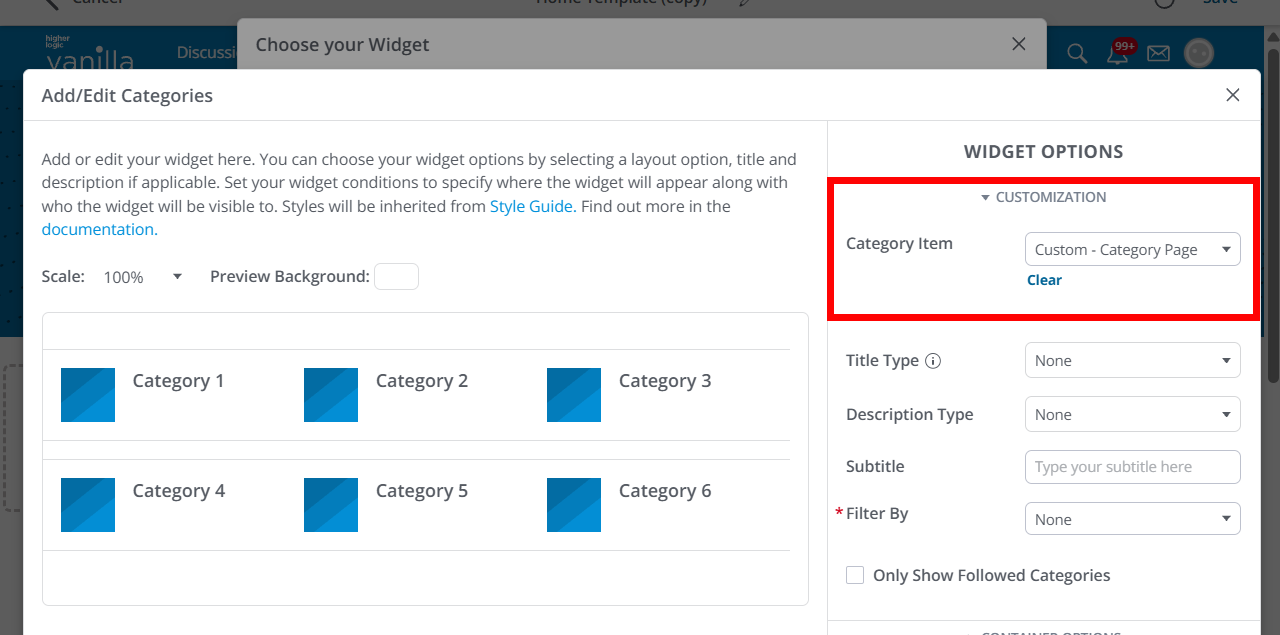
These fragments appear as selectable options inside the Customization section of the widget’s settings (see image below).
Steps
- Open the relevant layout in Layout Editor.
- Add or edit the widget you want to apply your fragment to.
- At the top of the configuration panel, expand the Customization section.
- In the dropdown, select your custom fragment. The dropdown lists all available fragment types associated with that widget (e.g., Post List Item, Search Bar).
- The widget preview updates immediately to reflect your selection.
- Adjust any additional widget settings and Save the layout.
Best practices
- Use clear naming conventions (e.g., Post List Item – Compact) so your fragments are easy to identify in Layout Editor.
- Test fragment updates on staging layouts before committing to production.
- If multiple widgets share the same fragment type, test each one after updating that fragment to ensure consistent rendering.
Manage your widgets & fragments
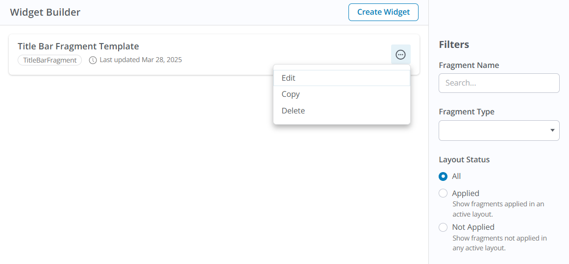
The Widget Builder page lists all of your organization's custom widgets and fragments, each with an ellipsis (…) menu allowing you to:
- Edit: Selecting this (or clicking the widget/fragment in the list) opens the editor where you can make adjustments and preview the widget/fragment.
NOTE: Updates are propagated to all layouts where that widget/fragment is used.
- Copy: Duplicate an existing custom widget/fragment; rename the copy and modify it to easily create purposeful iterations (e.g., “Discussion List - Compact” vs “Discussion List - Full”). Upon selecting Copy, the editor opens with the widget's or fragment's full code in place. Commit any desired updates to add your new widget/fragment to the list and make it available for use in Layout Editor.
- Delete: Displays a popup informing you of the impact deleting the widget/fragment will have in your community. To finalize the deletion, click the "I have read and understand the effects" button, and then follow the additional prompt.
IMPORTANT: Deleting a widget/fragment has the following effects:
1. The widget/fragment and all its revisions will be permanently deleted.
2. When deleting a fragment, any current usages of the widget it's applied to will revert to system defaults.
Locate widgets & fragments with search and filters
When you create a custom widget/fragment, you'll choose from one of the available "templates" or create one from scratch. Each of these falls into a specific Type, such as Banner, Custom, CategoryItem, etc.
- On the right side of the editor, you can filter your widgets/fragments based on these Types via the Fragment Type dropdown: select a Type to display all associated widgets/fragments of that Type.
- In addition, you can search your widgets/fragments by their name in the Fragment Name field: as you type, all widgets/fragments matching your text are immediately displayed. Clear the field to revert back to the full list.
- Lastly, you can use the Layout Status options to filter the list by All, Applied (show widgets applied in an active layout), or Not Applied (show widgets not applied in an active layout).
Use these options to quickly locate the widget/fragment you want to customize.
TIP: When creating widgets/fragments, adopt consistent naming conventions (prefixes/suffixes for site section, audience, or display intent), so your saved widgets/fragments are easily scannable in the management list and recognizable in Layout Editor.