You can use Layout Editor to add custom pages to your Higher Logic Vanilla (Vanilla) community. The editor makes it easy for you to customize the layout of your pages and to then populate the pages with content via a variety of widgets.
Widgets are a great device in communities because they can host either static or dynamic content. Serving up dynamic content to your users enhances the value of your community because it feels fresh and up-to-date with its ever-changing content.
TIP: This article functions as a "one-stop shop" that features dozens of widgets; reference the article index to the right to jump to a widget you want to learn about.
⚠️ Before we begin…
- This article lists and describes all of Layout Editor's available widgets. It focuses solely on highlighting each widget's unique options—those you'll configure to define their core functionality.
- To instead learn about the common widget options that are shared amongst all widgets, such as their display options, container options, and conditions, see Add & Configure Layout Editor Widgets.
Access the Widgets
Widgets are individually added to columns in a Section.
1. Access the Dashboard.
2. Navigate to the Appearance tab and expand the LAYOUTS section.
3. Expand one of the available page layout options (e.g., Home Page, Discussions Page, etc.) and click Add Custom Layout.

4. Click a Section to select it. (See Sections in Create a Custom Layout to learn how to add, remove, and rearrange Sections.)
NOTE: Before choosing a Section, consider which and how many widgets you plan to add, and then choose an appropriate Section to host the content.
5. Click the (+) in a Section column to open the widget selector.
6. Click a widget to select it and then click Add at the bottom right.

Layout Editor Widgets
The sections that follow describe the widgets that are available in Layout Editor.
NOTE: This article focuses on highlighting each widget's unique options. See Add & Configure Layout Editor Widgets to learn about common widget options, such as their display options, container options, conditions, and more.
Meta Options
Before discussing Layout Editor's widgets, let's touch on Meta Options.
NOTE: These options pertain only to the content-based widgets listed below (the available Meta Options vary per widget):
- Announcements
- Articles
- Categories
- Discussions
- Ideas
- Questions
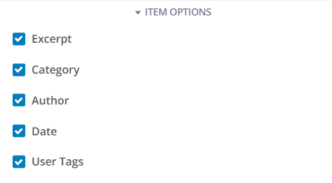
You can turn ON/OFF a host of Meta Options to control what content- and user-based details are provided for each widget entry (see image below). These options make it easy to show important, at-a-glance details and metrics, such as an entry's author, the user who last commented, its score, tags, and more.
NOTE: A widget's configured Display Type (grid, list, carousel, links) controls what Meta Options are available: The List Display Type provides the most Meta Options (along with the ability to display them as text or icons), whereas the Link Display Type offers none.

Article Reactions
NOTE: This widget is limited to Help Center Article Pages and Guide Article Pages layouts.
Displays two buttons at the bottom of an article, allowing users to vote whether it was helpful or not. The title and button text is customizable.
TIP: Admins can use Vanilla analytics to report on this feedback (via the Article Reactions data source).

Widget options
- Title before feedback: Allows you to customize the text that displays above the buttons before a user votes. The default text is "Was this article helpful?"
- Title after feedback: Allows you to customize the text that displays above the buttons after a user votes. The default text is "Thank you for your feedback!"
- Use "No" button: Controls whether the "No" button is available. This is ideal for organizations that prefer to keep the feedback positive-only.
- Use Custom Labels for "Yes" and "No" Buttons: The default button text is "Yes" and "No." If you'd like to use custom text, toggle this option on and enter your desired text for each button in the two fields that appear.
- Show Vote Count: Controls whether the "X out of X people found this helpful" text displays below the buttons.

Article Table of Contents
NOTE: This widget is limited to Help Center Article Pages and Guide Article Pages layouts.
By default, each article provides the On This Page section that functions as a "table of contents" allowing users to easily jump to major sections of the article; this helps readers quickly find the information they're looking for.

Widget Options
- Title: Allows you to customize the title text that displays above the header listing. The default text is "On this page."
- Headings Shown: Use these checkboxes to control the "depth" of article headings provided in the widget. By default, only Header 2's display (as shown above), but you can choose to provide a depth down to Header 5. ✔️ TIP: For longer articles with numerous headings at lower depths, consider limiting headings shown to level 2 or level 3; otherwise, the amount of headings in the widget may become overwhelming and unwieldy.

Announcements
- Displays a list of announcements that have been posted in your Vanilla community. Using the Display Type Container Option, announcements can be displayed in a grid, list, carousel, or as links.
Each entry can be configured to show or hide various information, such as:
- an excerpt (discussion summary),
- various discussion details (author and category) and user activity metadata (view count, comment count, score count, etc.).
In addition, each announcement can be clicked so that users can read the full post.

Discussion Options
- Excerpt: Controls whether an excerpt from each announcement is included (this is a short snippet, or preview, of text serving to give users an idea as to the announcement's content).

Articles
Displays a list of knowledge base articles that have been posted in your Vanilla community. Using the Display Type Container Option, articles can be displayed as a grid, list, carousel, or as links.
Each entry:
- provides a summary and
- links to the knowledge base where users can read the full article.

Display Options
You can configure several Display Options to control what articles are displayed, and how:
- Knowledge Base: 📝 This option only pertains to customers who have multiple knowledge bases. Leave this option blank to allow articles from all of your knowledge bases or select one from this menu to only display articles from that specific knowledge base.
- Show Featured: This toggle controls whether only articles that have been flagged as Featured will display.

Article options
There are two meta options that control who is attributed to an article in the widget.
- Most Recent Editor: Check this box to display the user who last edited the article.
- Original Author: Check this box to display the original author of the article, regardless of who last edited it.
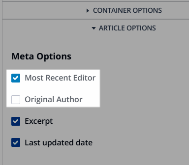
These two options are also available for the Article Header widget, which is a default widget for Help Center Article and Guide Article layouts.
Banner
📝 NOTE: This widget is only available with the 1 Column - Full Width section type.
Adds a page-specific banner that can display:
- the default title of the page,
- a description,
- a background colour or image, and
- a search bar.
Depending on your needs, you can:
- Hide the banner title and description, which is recommended if your banner image already includes text (or you simply don't want text)
- Hide the search bar, if that functionality is not wanted.
- Choose to pull banner titles, descriptions, and images dynamically from site settings, subcommunity settings, or category settings. This adaptability is based on the type of layout and precisely where the layout is applied, allowing you to curate the perfect look and feel for each corner of your platform.

Category Articles
NOTE: This widget is limited to Help Center Category Pages layouts.
In Help Center knowledge bases, categories are used to organize articles into topics to make it easier for readers to find and browse similar documentation.
This is the default, and required, widget on category pages that displays a category's associated articles.

Display Options
- Limit: Controls how many articles can display per page (100 maximum).

Article Meta Options
- Author: Controls whether an article's author is displayed in the meta details for each article listing.
- Last updated date: Controls whether an article's last updated date is displayed in the meta details for each article listing.

Comment Thread
NOTE: This widget is limited to Discussion Page, Idea Page, and Event Page layouts. It cannot be removed from Discussion or Idea Page layouts, but it can be removed from Event Page layouts. It is included in this article to explain its customizable features.
Displays the list of comments on the Post pages listed above in either a flat structure or nested structure. The main feature of this widget is the ability to nest comments up to five levels deep.

Widget Options
- Title: If needed, customize the title from Comments (the default) to something more appropriate to your community use-case (such as Replies).
- Default Sort Order: Controls the default sort order of comments. You can choose to have oldest (default), newest, top, or trending comments show first.
- Nesting Depth: Controls the level of depth to which comments can be nested:
- Flat: No nesting will occur, and any previously nested comments will quote their parent comment. This option is for those who do not want a nested structure for their comments.
- Nesting Depth 2—5: Select one of these options to meet your desired level of comment-nesting depth. Choosing to nest comments creates an indented structure that may make it easier for your users to visually identify the flow of a conversation. Each level includes a (+) / (-) icon users can click to expand and collapse the level, making it easier to navigate the nested structure and focus on the content they want to read.
- ⭐️ EXAMPLE: The original post in a thread is set at "level 1" in the structure. When a user replies to the original post, their comment is nested at level 2, and is visually indented to indicate this. If a user responds to a comment at level 2, their post is then indented to level 3, and so on.
- Collapse Level: Comments at the set level and beyond will automatically display on the page as collapsed. Users can choose to expand these levels to expand and view them. ✔️ TIP: Refer to the Consider the benefits of setting a Collapse Level section below to learn more about how this option may benefit your community.
- Show OP Indicator: Controls whether the original poster of a thread is visually marked with the "OP" label. Turning this on helps the subsequent comments by the creator of a thread stand out.
- Show Badges: Controls whether a user's badges are displayed next to their name in a post.
- If on, use the Badges Limit option to control how many of a user's badges display (if set to 2, for example, a maximum of two badges display for each user).
Check out our Badges article to learn about the logic governing which badges display and how they're sorted for user posts.

Consider the benefits of setting a Collapse Level
In large communities with high engagement, some discussion threads may contain dozens of comments, making it visually overwhelming for some users to read. Because of this, consider the following benefits of setting a collapse level:
- Improved readability: When comments are collapsed, the main content of the thread remains uncluttered, making it easier for users to focus on the primary discussion topic(s) without being overwhelmed by a long list of comments.
- User control: Users can choose which comments to expand and read, giving them control over their browsing experience. This is especially useful in threads with high engagement, where not all comments may be relevant to every user.
- Reduced cognitive load: For new users or those just browsing, seeing a massive wall of text can be intimidating. Collapsing comments helps reduce cognitive load and makes the discussion more approachable.
- Encourages engagement: By collapsing comments, users might be more inclined to click and explore the discussion, increasing overall engagement as they actively choose which threads to dive into.
- Mobile friendliness: On mobile devices, screen space is limited. Collapsing comments helps keep the interface clean and navigable, enhancing the user experience on smaller screens.
Content Banner
NOTE: This widget is only available with the 1 Column - Full Width section type.
Adds a page-specific banner that displays:
- the default title of the page,
- a description, and
- a background colour or image,
While this widget is similar to the Banner, discussed above, there are two main differences:
- It does not include the search bar functionality.
- It is not as tall as the Banner, making it better suited in situations where space is limited and you want a smaller footprint.
Depending on your needs, you can:
- Hide the banner title and description, which is recommended if your banner image already includes text (or you simply don't want text)
- Choose to pull banner titles, descriptions, and images dynamically from site settings, subcommunity settings, or category settings. This adaptability is based on the type of layout and precisely where the layout is applied, allowing you to curate the perfect look and feel for each corner of your platform.

Call to Action
Allows Administrators to insert a title, description, and (optional) button anywhere in their Vanilla community to prompt users to take a particular action.
- Buttons can have a Primary and Secondary color, which are pulled from your Style Guide.
- Place Call to Action widgets across your community (e.g., sign up today!, join our meeting!, check out our KB, etc.) to get the word out to your users about anything important to your organization.

NOTE: When configuring this widget, if you're inserting an image via the Image option, check out Images in Call To Action Widgets, which: points out the various factors that can influence how an image displays; discusses image scaling and cropping; and provides examples of an image in the various Section types.
TIP: You do not have to include a button with this widget. Excluding a button provides additional ways to leverage the widget, such as the example below where it's used as an eye-catching banner at the top of a page to advertise important information. Note, however, that you can turn OFF the button but include a URL to make the entire widget a clickable link.

Categories
Displays a list of Categories from your Vanilla community. Using the Display Type Container Option, Categories can be displayed as a grid, list, carousel, or as links.
You can control what information is displayed for each Category, including:
- a summary description, and
- various discussion details (discussion count, follower count, etc.) and user activity metadata (last post author, last post date, etc.).
In addition, each Category can be clicked so that users can view its content.

Let's learn about the options you can configure to control what information is displayed in this widget.
Widget Options
An important option to highlight here is Filter By, which allows you to filter the displayed Categories in a few ways:
- Subcommunity: Only show Categories belonging to the selected Subcommunity. You can optionally choose to only show Followed Categories, meaning only the Categories a user has chosen to Follow will display.
- Category: Only show the selected Category. You can optionally choose to also include content from any associated subcommunities and/or only show a user's Followed Categories.
- Featured: Only show Categories flagged as Featured.

Category Options
- Category Description: Controls whether each Category's description text is displayed.

Custom HTML
Allows you to add custom code (HMTL, CSS, and/or JavaScript) to a page to target specific content, such as including advertisements and embedding iframes (for videos, podcasts, calendars, feeds, etc.). The code is:
- separated by type, and
- validated to help with organizing code and troubleshooting.
NOTE: This can add visible content to the page or it can host code that operates in the background.

As shown above, click the HTML, CSS, and JS tabs to add that specific type of code in the widget.
HTML
The HTML tab is where you write the markup for your widget. The editor offers:
- syntax highlighting,
- autocomplete, and
- inline documentation for built-in HTML tags.
CSS
The CSS tab is where you apply styling to your markup. Vanilla uses Shadow DOM to isolate the HTML and CSS of your widget from the rest of page. This prevents conflicts between the application's CSS/styling and your own CSS/styling.
JavaScript
Use the JS tab to apply scripting and interactivity to your widget. A few helpful utilities are provided:
The customHtmlRoot element
The HTML element at the root of your widget (that wraps your widget) is available in the variable customHtmlRoot. Use this to get easy access to the HTML you wrote.
NOTE: Because the HTML is inside of a shadow root, you'll need to use that shadow root to access elements inside of the HTML.
// This doesn't work

var myButton = customHtmlRoot.querySelector("#my-button");


// This does work

var myButton = customHtmlRoot.shadowRoot.querySelector("#my-button");
The vanilla object
The vanilla object provides a few useful utilities to help you interact with your community.
// Get the currrent user

// The autocompletion should help you discover the various properties of the user.

vanilla.getCurrentUser().name;

vanilla.getCurrentUser().userID;


// Check the current user's permissions.

// Checkout the permission names at `/api/v2/users/$me/permissions`

vanilla.currentUserHasPermission("moderation.manage");


// Translate a string into the current locale.

// This will use the translations currently loaded into the site

vanilla.translate("Discussions");


// Get the current locale key.

vanilla.getCurrentLocale(); // "en" for example.


// Make API requests as the current user.

vanilla.apiv2.get("/endpoint", config);

vanilla.apiv2.post("/endpoint", body, config);

vanilla.apiv2.patch("/endpoint", body, config);

vanilla.apiv2.delete("/endpoint", config);


// The config is as follows and is optional in all requests.

interface RequestConfig {

    // Key value object of headers.

    headers?: Headers;

    // Key value object of query params.

    params?: Record<string, any>;

}
Events
A list of future and/or past Events that have been posted in your Vanilla community. Each entry:
- provides a summary and
- links to the Event where users can see Event details and registration options.

Display Options
Time Frame determines what events are presented in the widget. You can select:
- Upcoming: Only show upcoming events to ensure your users are aware of them.
- All: Show ALL events, both those that are upcoming and those that have already happened.
- Past: Only show events that have already happened. In some instances, this can be an ideal way to highlight past events that may present information or resources you want your users to have access to.

Event Participants
NOTE: This is a default widget on legacy event layouts. For custom Event Page layouts, this widget can be manually added or removed to meet your needs.
Displays the Who's Interested content container allowing users to:
- See who's interested or attending (click the participants list to view who has expressed interest).
- Click the I'm Interested button to indicate interest in the event (this does not express whether they're attending or not). This action adds them to the participants list.
- The Who's Interested section becomes Who's Going
- The I'm Interested button becomes Register, allowing users to register for the event

Featured Collections
This widget is detailed in:
Featured Links (formerly, Quick Links)
Displays a list of links to the more popular areas of your Vanilla community. You can:
- remove links, as needed,
- rearrange their display order, and
- create your own custom links to any URL of your choosing.

You can manage which links display, and their sort order, via the Links List button.

In the dialog, you can:
- Drag and drop existing links to change their display order.
- Click New Link to add your own custom link, with a custom name and URL.
Link management
Link management is slightly different depending on whether you're managing a default link or a custom link.
Add a custom link
Click (+) New Link to add your own custom links to other internal community pages and to simplify access to trusted external sites.
Give your link a Label (its display name), specify its URL, set the desired link permissions to control what Roles can view it, and optionally add an image. Refer to the Navigation link permissions section below to learn about these permissions.
NOTE: Enter a full URL for external pages or a relative path for internal community pages.
Edit a link
Click the pencil icon to edit a link's Label, URL, permissions, and image. (Refer to the Navigation link permissions below.)
IMPORTANT: While it's possible to edit your community's default links, we recommend not doing this in order to protect the integrity of your community's core functionality. Instead, hide a default link and, optionally, "replace" it with a custom link.
Show/hide links
Click the eye icon to show/hide a default link.
NOTE: This action is available for the community's default links only.
Hidden links remain in this list but are grayed out (as shown for Groups and Help in the image below); they do not display on your community pages.
Delete a link
Click the trashcan icon to remove a custom link.
NOTE: You cannot delete default links. This restriction is to protect the integrity of your community's core functionality.
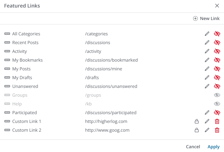
Navigation link permissions
For the default links and any custom links you create, you can set custom view permissions to control who can see and use them. This gives you the freedom to create a single, multifaceted set of links that cater to the needs of multiple groups of users within your community.
⭐️ EXAMPLE: You could create several custom links where a few are visible only to guests, several others are visible only to members, and still others are limited to your administrators. You can also set permissions for default links if you want to limit their visibility to a select group of users.
NOTE: If custom permissions are set for a link, the lock icon displays, as shown for the two Custom Link examples above; hover over this icon to view the Roles that can view the link.
Groups
You can add the Groups widget to any of your layouts to advertise and provide easy access to your community's Groups. It can be configured to list:
- all of your community's Groups (making it easy for users to learn about and access them),
- only the Groups a user belongs to, or
- even specific, hand-picked Groups.

Widget Options
- Title Type: Choose how the widget's title should display. You can choose a contextual title, hide it altogether, or enter a custom title.
- Subtitle: Subtitle text displays above the title (if you have one).
- Description: Description text displays below the title.
- Limit: Controls the number of Groups displayed in the widget.
- Sort By: Controls how Groups are sorted: by newest, oldest, most popular, or most active. The location in your community or use-case will likely dictate which of these options to use.
- Filter By: Controls which Groups to include in the widget: all, only Groups users belong to (this is specific to each user), only Featured Groups, or only Groups with one or more Tags. With the Featured and Tag options selected, additional options appear allowing you to select the desired Featured Groups / Tags.

Container Options
There are two unique Container Options to discuss:
- Max Columns: (This option is only available when Display Type is set to Grid or Carousel.) Controls the number of columns in a Grid- or Carousel-based configuration. The image above shows a three-column layout.
- Display Type: Configure the widget's display as a List, Grid, Carousel, or Link (Grid is shown in the image above). Use the various Group Options, discussed below, to control how much detail is included about each Group.

Group Options
- Group Description: Displays/hides Group descriptions. If you want a cleaner, streamlined look, hiding them is a good way to achieve this (especially if your Groups have long descriptions); on the other hand, doing so makes it more difficult for your users to understand what a Group is about, so choose the option that best suites your community's needs.
- Featured Image: Choose how to display a Group's image (or None to not display an image): as a Banner or Icon. Banners are larger while Icons are smaller; your selected Display Type may impact your choice here (e.g., List, Grid, Carousel, etc.).
- Meta Options: Check/uncheck these options to control how much detail is displayed for each Group. An important option to consider is Join Button/Membership Status, as this controls whether users can join or request to join private Groups right from the widget.

Group Directory
NOTE: This is a default, required widget in Group Directory layouts that cannot be removed. It is included in this article to explain its customizable features.
The Group Directory widget powers your community's main Groups landing page. It lists your community's Groups, making it easy for users to learn about and access them, and even join or request to join.

Container Options
There are two unique Container Options to discuss:
- Max Columns: (This option is only available when Display Type is set to Grid.) Controls the number of columns in a Grid-based configuration. The image above shows a three-column layout.
- Display Type: Configure the widget's display as a Grid or List (Grid is shown in the image above). Use the various Group Options, discussed below, to control how much detail is included about each Group.

Group Options
- Group Description: Displays/hides Group descriptions. If you want a cleaner, streamlined look, hiding them is a good way to achieve this (especially if your Groups have long descriptions); on the other hand, doing so makes it more difficult for your users to understand what a Group is about, so choose the option that best suites your community's needs.
- Featured Image: Choose how to display a Group's image: as a Banner or Icon. Banners are larger while Icons are smaller; your selected Display Type (Grid or List) may impact your choice here.
- Meta Options: Check/uncheck these options to control how much detail is displayed for each Group. An important option to consider is Join Button/Membership Status, as this controls whether users can join or request to join private Groups right from the widget.
Group Details
NOTE: This is a default, required widget in Group Home Page layouts that cannot be removed. It is included in this article to explain its customizable features.
The Group Details widget displays a Group's details on its home page, like its image, name, description, and various meta details, as you see below:

Widget Options
- Title Type: Choose how Group title's (names) should display (or hide them altogether). Options include:
- Group Name: This is the default option that pulls a Group's title from it's configured settings (think of this as an automatic setting).
- None: Hides Group titles.
- Custom: Select this to display an additional Description field where you can enter a custom title that overrides each Group's configured title. Note that this custom title will be used for all Groups, meaning you'll likely only use this for layouts you only plan to apply to a specific Group.
- Description Type: Choose how Group descriptions should display (or hide them altogether). Options include:
- Group Description: This is the default option that pulls a Group's description from it's configured settings (think of this as an automatic setting).
- None: Hides Group descriptions.
- Custom: Select this to display an additional Description field where you can enter a custom description that overrides each Group's configured title. Note that this custom description will be used for all Groups, meaning you'll likely only use this for layouts you only plan to apply to a specific Group.

Group Options
- Meta Options: Check/uncheck these options to control how much detail is displayed for each Group on its home page. For example, do you want the creation date, Group owner's name, and number of Group members displayed?
- Group Icon: Controls whether a Group's image is displayed on its home page.
- Name: Controls whether a Group's title (name) is displayed on its home page.
- Description: Controls whether a Group's description is displayed on its home page.
- Privacy Label: Controls whether a Group's privacy label is displayed on its home page.

Group Members
NOTE: This is a default, required widget in Group Home Page layouts that cannot be removed. It is included in this article to explain its customizable features.
The Group Members widget displays a configurable subset of a Group's total members on its home page as interactable icons, as well as the Group's total number, as you see below:

Users can click these member icons to view more information about a member, and access actions like viewing their profile and sending them a message.
Widget Options
- Title Type: Choose how the widget's title should display (default is "Members"). Options include:
- Group Name: This is the default option that displays "Members" as the widget title.
- None: Hides the widget title altogether.
- Custom: Select this to display an additional Title field where you can enter a custom title, perfect for community's who use a different term for its members (e.g., "Users" or "Champions," etc.).
- Max User Icons: Choose how many member icons to display, up to a maximum of 500

Guest Sign In
Allows Administrators to insert a title, description, and two buttons: Sign In and Register.
- You cannot modify the links for these buttons: they are pulled from your site's registration.
- Buttons can have a Primary and Secondary color, which are pulled from your Style Guide, or be plain text.
While your Vanilla community has a default page dedicated to signing in and registering, the purpose of this widget is to give you the freedom of custom placement of these actions anywhere you may want to highlight them.

NOTE: When configuring the widget, if you're inserting an image via the Image option, the recommended dimensions are 1920x480px. Depending on the size of the layout, the image will scale appropriately. If you're concerned about file size, simply scale the image down from the above dimensions to retain the aspect ratio.
Guide Pager
NOTE: This widget is limited to Guide Article Pages layouts.
At the bottom of Guide knowledge bases are buttons that allow users to view the previous or next article in the sequence.
This widget allows you to control the placement of these buttons. For example, you may want to also include these buttons at the top of Guide articles, giving users the option to view other articles without having to scroll down to the bottom of the page.

Help Center Overview
Help Centers feature a home page showcasing the available categories and their associated articles. This widget displays this information, and is a default, and required, widget for Help Center Home Page layouts.
NOTE: This widget can be added to any layout, even non-Help Center layouts. This is a great way to advertise your Help Center content in other areas of your community.

Display Options
- Filter: Use this option to control what Help Center content displays in the widget:
- Contextual: Content shown is filtered dynamically based on the Help Center knowledge base the user is viewing.
- Set: Displays a new field, Knowledge Base, allowing you to select a specific Help Center knowledge base to display in the widget.

Ideas
- Displays a list of ideas from your Vanilla community. Using the Display Type Container Option, ideas can be displayed as a grid, list, carousel, or as links.
You can control what information is displayed for each idea, including:
- an excerpt from each idea,
- various idea details (view count, comment count, etc.) and user activity metadata (last comment user, score count, etc.).
In addition, each idea can be clicked so that users can read more and participate.

Discussion Options
- Excerpt: Controls whether an excerpt from each idea is included (this is a short snippet, or preview, of text serving to give users an idea as to its content).

Knowledge Bases List
Displays a list knowledge bases, of which there are two types: Guides and Help Centers. Check out this article to learn more about these two types.
This widget is not limited to Knowledge Base page layouts, giving you the ability to advertise your helpful Help Center and Guide knowledge base articles in various areas across your community.
You can control which knowledge bases display using the Filter By option (learn more below), allowing you to showcase specific articles in specific areas of your community.

- Filter By: Use this option to filter the displayed knowledge bases:
- None: Displays all of your Help Center and/or Guide knowledge bases in the widget.
- Dynamic: Displays only the knowledge bases associated to the current community or subcommunity a user is viewing. For example, if your Vanilla community has two subcommunities, this setting will dynamically show each subcommunity's associated knowledgebases as a user navigates between them.
- Featured: Select this option to display a new field, called Knowledge Bases, allowing you to manually choose one or more knowledge bases to display in the widget.

Container Options
The main option to consider here is the Display Type, of which there are four options. Choosing the correct Display Type helps tailor the presentation of knowledge bases to meet the needs of your audience and the context of the content being displayed.
- Grid: Knowledge Bases are arranged in a grid layout, providing a visual and structured organization that is particularly useful for showcasing multiple knowledge bases simultaneously. You can set a max number of columns to display from 1 up to 5.
- List: Knowledge Bases are displayed in a vertical list format. This format is useful for providing detailed descriptions and other information for each knowledge base in a straightforward, readable manner.
- The main feature to this list type is it's the only one that can include a Follow button (bell icon) directly in the widget. This makes it easy for users to Follow knowledge bases, and even manage their notification settings.
- When set to List, you can control whether the Follow button is available: to do so, expand the Display Options settings and toggle the Follow Knowledge Base Button ON or OFF.
- Carousel: Knowledge Bases are displayed in a horizontal scrolling format, making it suitable for presenting a visually engaging list where each item can be seen in a sequence.
- Link: Knowledge Bases are presented as simple hyperlinks, without additional meta options. This minimalist format is useful for when the goal is to provide quick access to knowledge bases through straightforward links
Display Options
NOTE: The Display Options available depend on the chosen Display Type (see above).
- Description: Controls whether each knowledge bases' description displays in the widget.
- Article count: Controls whether each knowledge bases' total article count displays in the widget.

Leaderboard
Displays a list of the top contributors (those who have earned the most activity-based points) in your Vanilla community during a selected time period.
✔️ TIP: This widget is a good tool for "nudging" other users to become more engaged in community activities.
Each entry:
- provides the member's name,
- their earned-points total, and
- links to the member's profile.
NOTE: The Grid (shown below) and Carousel views also include a user's role within the community.

Earning points
Your Vanilla community members can earn points in a number of ways, including:
- positive reactions to their posts
- answering other members' questions
- having their answers accepted (if this option is enabled in Q&A settings)
- receiving badges
To learn about setting up a point-awarding program to reward your community's top contributors, see the knowledge base articles in:
Widget Options
- Timeframe: Click the dropdown and select the timeframe in which you want the Leaderboard widget to calculate point totals. Options are:
- Daily
- Weekly
- Monthly
- Yearly
- All Time
NOTE: Refer to the Leaderboard list resets section below to learn more about how leaderboard data is handled for each timeframe.
- Leaderboard Type: Click the dropdown and select one "qualifier" as the points basis to display in the widget.
- You can select: Reputation points, Posts and comments count, or Accepted answers count.
- This means you can create three types of leaderboards for your community: one dedicated to users' reputation scores, one dedicated to the number of posts and comments users have made, and one dedicated solely to users with the most accepted answers. This flexibility gives you several ways to highlight your user's engagement and accomplishments.
- Included/Excluded Roles: By default, all users are eligible to appear in the Leaderboard widget, as long as they've met the chosen criteria. However, you can use the Included Roles and/or Excluded Roles dropdowns to filter the Leaderboard to users based on their Role membership.
- This option makes it easy to create user-specific Leaderboards (e.g., a Leaderboard showcasing just your MVPs).
- In instances where you want to make the widget available to numerous Roles, it's often easier to exclude the one or two that it doesn't apply to rather than include all of the ones that it does.

Filter By
A particularly important option for the Leaderboard widget is Filter By.
- By default, leaders are determined by tallying activity across all of your Vanilla community's Categories and Subcommunities.
- However, you can use the Filter By options to limit users eligible to appear on the leaderboard to either a specific Subcommunity or Category (and, optionally, its associated subcategories).
In addition to the options discussed above, these filters enable you to customize your Leaderboard widgets to an even greater extent by highlighting user engagement from specific Categories and Subcommunities.

Leaderboard list resets
A Leaderboard widget checks the database for users' point totals and then resets the lists in order to ensure that the leaderboards remain current. The resets occur every:
- Day for the Daily leaderboard
- Monday for the Weekly leaderboard
- First day of the month for the Monthly leaderboard
- First day of the year for the Yearly leaderboard.
- All Time leaderboards update every time the page is loaded and display the leader list accordingly.
New Post Button
Add one or more buttons that enable users to post a new Discussion, Question, Idea, Poll, and/or Event. These are known as "post types."
You can:
- use the default + New Post button, which contains all of the post types in a dropdown list (shown below), and/or...
- add individual buttons, each dedicated to a particular post type (discussion, poll, etc.).
NOTE: As you add individual buttons, they are removed from the + New Post button list.

Let's learn the two ways you can configure this widget.
- Excluded Buttons: If there are post types that you do not want available in the + New Post button, add them in this field.
- They won't be available in the + New Post list or as individual buttons.
- Notice below how the Event and Poll post types are NOT available in the + New Post button list.

- Separate Buttons: Any post types selected here will display as their own individual buttons, making this a great way to highlight specific types of content creation across your community.
- Note that any post types added in the Excluded Buttons field cannot be used as individual buttons here.

- Custom Labels - Slide the toggle to the right to enable text fields in which you can customize the label of each post type button.
- For example, you could change the "Discussion" post type to something more appropriate for your community, such as "Thread."
NOTE: Customizing button labels is not currently supported on multi-lingual communities; this functionality is in development.
Original Post
NOTE: This widget is limited to, and cannot be removed from, Discussion Page, Idea Page, and Question Page layouts. It is included in this article to explain its customizable features.
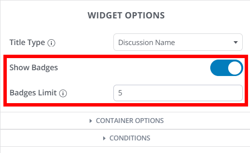
Displays the original post in a thread, along with details about the author. This widget's main feature is the ability to control whether the author's badges display next to their name.
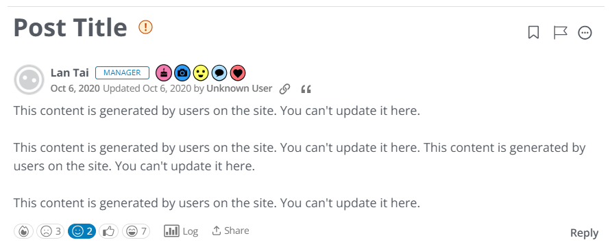
Widget options
- Show Badges: Controls whether the author's badges are displayed next to their name.
- If on, use the Badges Limit option to control how many badges display (if set to 2, for example, a maximum of two badges display).
Check out our Badges article to learn about the logic governing which badges display and how they're sorted.
Posts
Displays a list of posts from your Vanilla community. Using the Display Type Container Option, discussions can be displayed as a grid, list, carousel, or as links.
You can control what information is displayed for each discussion, including:
- an excerpt from each post,
- various post details (view count, comment count, etc.) and user activity metadata (last comment user, score count, etc.).
In addition, each post can be clicked so that users can read more and participate.

Discussion Options
- Excerpt: Controls whether an excerpt from each discussion is included (this is a short snippet, or preview, of text serving to give users an idea as to the discussion's content).

Post Meta
If your community uses custom Create Post Page layouts, a new feature becomes available: custom Post Types. With custom Post Types, you can create custom Post Fields, which are additional fields users can fill out during the post-creation process, allowing your organization to gather additional information.
When viewing a post's details page, any associated Post Fields display below the post's content, as shown below. Post Fields display via the Post Meta widget. This is a default widget for custom Post Page layouts that cannot be deleted; however, it only displays if there are Post Fields associated to a post.

Q&A Comments
NOTE: This widget is limited to Question Page layouts. It is a default widget that cannot be added or deleted from a layout. It is included in this article to explain its customizable features.
This is the tabbed list of comments on a Q&A thread, allowing users to view comments in three filtered views:
- All comments
- Accepted answers
- Rejected answers
The main feature of this widget is the ability to nest comments up to five levels deep (or you can choose to display them in a flat structure).

Widget Options
You can customize the titles of the widget's three tabs to suit your community's needs:
- All Comments
- Accepted Answers
- Rejected Answers

NOTE: All other options are identical to the Comment Thread widget discussed earlier in this article. For descriptions of these options, refer to Comment Thread.
Widget notes
- If an answer has been accepted, the Accepted Answers tab displays by default to highlight this information to users.
- If an answer has not been accepted, the All Comments tab displays by default.
- Accepted and Rejected answers are not nested: instead, they display in a flat list, and each includes a prompt users can click to view the answer in the All comments thread.
- Rejected Answers can only be viewed by users with the proper permissions (likely community managers and admins).
Questions
- Displays a list of questions from your Vanilla community. Using the Display Type Container Option, questions can be displayed as a grid, list, carousel, or as links.
You can control what information is displayed for each question, including:
- an excerpt from each question,
- various question details (view count, comment count, etc.) and user activity metadata (last comment user, score count, etc.),
In addition, each question can be clicked so that users can review it, see other members' answers, and submit an answer.

Display Options
- Status: By default, all Questions display in the widget. However, you can click the Status dropdown and filter Questions by:
- Accepted answer only
- Answered questions only
- Unanswered questions only
- All

Discussion Options
- Excerpt: Controls whether an excerpt from each question is included (this is a short snippet, or preview, of text serving to give users an idea as to the question's content).

Quick Links (renamed, Featured Links)
NOTE: This widget has been renamed Featured Links. The information has been moved up in this article to the appropriate alphabetical position.
Use the link on the right side of this page to access the Featured Links section.
Related Articles
NOTE: This widget is limited to Help Center Article Pages and Guide Article Pages layouts.
Displays a Related Articles section at the bottom of knowledge base articles that automatically presents users with links to additional articles with similar content or subject matter to the current article.

Role Spotlight
The Role Spotlight widget displays a dynamic, filterable list of posts (that can include comments) created by users who belong to a specific Role within your community.
Use this widget to highlight the activity and contributions of members with specific Roles—such as moderators, advocates, or any custom-defined Role—making their content more visible to the community. This is also a great way to highlight important content from your organization's staff, like you see in the example below.

NOTE: Vanilla also has a widget called User Spotlight, so let's understand the difference between the two:
- The Role Spotlight widget displays content from all users belonging to a specific Role, aiming to spotlight collective contributions.
- By contrast, the User Spotlight widget highlights an individual user. It displays their username, avatar, and profile link, along with any custom text you want to share about them.
Permissions
The content shown in the widget respects the viewing user's permissions—only posts and comments the viewer is allowed to see are included.
Use cases
- Highlighting activities from specific teams, advocates, moderators, new members, or other important groups.
- Making it easier for community managers and members to track the latest contributions from targeted Roles.
- Supporting recognition, transparency, or group-based updates (like dedicated "staff" streams).
Widget Options
- Role to Spotlight: Select a Role from the dropdown. Only content from users belonging to this Role is presented in the widget.
- Include Comments: Controls whether post comments are included or not.
- Sort Oder: Defines the content sort order. The available options depend on whether comments are included or not.
- Comments included: By Comment Date or Top (most likes).
- Comments no included: Recently Commented, Recently Created, Top, or Oldest.
- Limit: Determines the initial number of posts and comments displayed in the widget (not the total that can be displayed). The maximum is 500.
- No matter the limit, you can include the Load More button to allow users to manually load more content (the limit does not affect how much additional content can be loaded).
- If you do want to limit the number of posts, set a Limit and do not include the Load More button.
- Show "Load More": Controls whether the Show More button is displayed in the widget. Users can click this button to load additional posts and comments in the widget; it can be clicked multiple times to continue loading content. Once the page is refreshed, the content will revert back to its set limit.

Item Options
Check and uncheck these boxes to control what meta data is included with each post and comment.
RSS Feed
Displays an RSS feed of your choosing, allowing you to give your users easy access to important RSS content across your community. This is a great way to promote community blog content and/or external news feeds.
After you configure the widget with an RSS feed's URL, that feed's thumbnails, titles, and descriptions are automatically populated from the feed.
NOTE: There is a slight delay (about a minute) between applying a Layout with an RSS Feed and when the RSS feed will display in your community.
Using the Display Type Container Option, questions can be displayed as a grid, list, carousel, or as links.
Each entry:
- provides a summary and
- links to the community blog or external feed where users can see the full content.

Widget Options
- RSS Feed: Enter or copy/paste the RSS Feed's URL in this field.
NOTE: A preview of the RSS Feed will not display while editing your Layout; you will only be able to view the feed once the Layout is applied and you view the page in your community.

Search
The Search widget enables you to add a search field to any of your custom pages. It can be configured to filter search results to specific types of content, allowing you to create custom search experiences to suit the needs of specific pages across your community.

Widget Options
- Title Type: You can set this to Subcommunity Title (a contextual title pulled from the banner or subcommunity where the widget is located), None, or Custom.
- Title: When the Title Type is set to Custom, use this field to enter your custom title.
- Description Type: You can set this to Subcommunity Description (a contextual description pulled from subcommunity where the widget is located), None, or Custom.
- Description: When the Description Type is set to Custom, use this field to enter your custom description. This is a great way to explain how a specific Search widget functions (e.g., perhaps it only queries specific types of content, like events or discussions).
- Placeholder: Enter custom text to display in the search field prior to a user typing (e.g., "Search for specific discussions").
- Border Radius: Enter a value between 1—20 to control the curvature of the search box, ranging from no curve (0) to rounded (20).
- Filter By: Filter what community content the widget will query to produce search results. Options are: All (default), Posts, Places, Members, Articles, Events.
- Post Types: If Posts is selected, use this dropdown to choose what default post types are queried. 📝 Currently, you can only filter by the default post types (discussions, questions, ideas); this will be enhanced to allow custom post types in the future.

Site Totals
Displays a range of site totals data, such as total:
- members
- posts
- online users
- discussions
- comments
- questions
You can choose which metrics to display, and in what order, and even filter the data by a specific subcommunity.

Widget Options
- Site Metrics: Click Edit to manage what site total data is displayed in the widget. This process is described in the Manage site totals section below.
- Filter by subcommunity: Toggle ON to display a Subcommunity dropdown you can use to filter the Site Totals widget's data to a subcommunity of your choosing.
- Label Type: Controls how the data is displayed: Icon and Text, Icon only, or Text only.
- Format numbers: Controls how numbers are formatted. Unchecked: exact, full numbers (e.g., 99,999); checked: rounded numbers with decimals (e.g., 100.0k)

Manage the site totals
Click the Site Metrics Edit button (shown above) to view the Edit Totals dialog.
- The Label text for data that is currently displayed in the widget is bold (e.g., Posts below.
- The Label text for data that is currently hidden in the widget is grayed out in the dialog (e.g., Questions and Discussions below)
You can manage this data in the following ways:
- Drag and drop the data Types in the order you want them displayed (this sort order is not reflected in the widget preview).
- Hover over active data to access the Edit and Hide options.
- Hover over hidden data to access the Show option, which you can click to make it active.

Subcommunities
Displays a list of your subcommunities, allowing you to advertise them anywhere in your Vanilla community for better visibility and easy access.
Using the Display Type Container Option, subcommunities can be displayed as a grid, list, carousel, or as links.
Each entry:
- provides a summary and
- links to the subcommunity for easy access.

Suggested Content
Displays dynamic content to each user based on their interests, as mapped in your Interests & Suggested Content settings. This is an excellent way to give your users an additional method of finding and engaging with new content they may otherwise not see.
IMPORTANT: The Suggested Content widget will NOT include content:
- users have already read
- that is older than 7 days
With these caveats in mind, the Suggested Content widget is ideal for keeping a steady stream of new content over time; if you'd prefer to display "stagnant" content that doesn't change over time, consider the Featured Collections feature and widget.
- Manage the Suggested Content feature on the Dashboard > Settings > Interests & Suggested Content page.
- See Interests & Suggested Content to learn how to set up and manage the Suggested Content feature.

Widget Options
- Suggested Follows refers to Categories. Turn this toggle ON/OFF to control whether mapped Categories display to users meeting the criteria. 📝 NOTE: If you have not mapped Categories to your Interests, no Categories will display in the widget, even if this is toggled on.
- Suggested Content refers to posts. Turn this toggle ON/OFF to control whether posts associated to an Interest's mapped Tags display to users meeting the criteria.
Use their respective options to provide a custom title and/or subtitle, and set a content limit (the default is 3).
For posts, you can additionally limit the excerpt length (text preview) shown in the widget and enable featured images.
NOTE: When the Featured Image option is enabled, the first image in each post (by location, not first image uploaded) will automatically display in the widget. These "thumbnail" type images help provide visual interest to a list of posts. If a post doesn't have an image, the widget will instead display a default, gradient-style image. However, you can override this default image by specifying a fallback image.

Display Options
- Exclude Categories: By default, all suggested Categories are eligible to appear in the widget. If you'd like to exclude one or more Categories, select them from this dropdown.

Tabbed Posts
This widget allows you to display up to three tabs of community content (of your choice), giving users easy access to a range of content options in a single, easy-to-use widget. This flexibility of choosing what content to display can lead to increased engagement for certain types of content that may be overlooked.
NOTE: Refer to the Content Types - List options section below to learn about each type of content you can display.

Widget Options
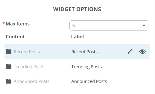
- Max Items: Controls how many content entries display in each tab. You can choose a maximum of 3, 5, or 10.
- Tabs: Three tab options display, each indicating their current configured content type (recent posts, unanswered questions, etc.) and label. Refer to the Tab management section below to learn more.
Tab management
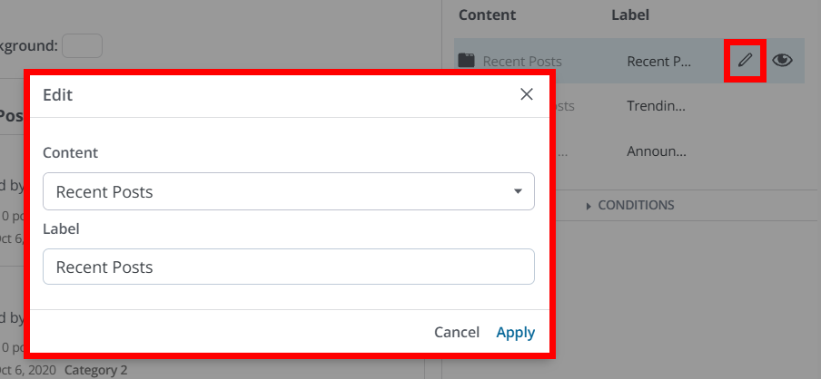
Hover over a tab to display its pencil and eye icons (you can also click to "select" a tab, keeping these icons visible).
- Click a tab's pencil icon to display the Edit dialog, where you can select the content it will display in your community, as well as its label.
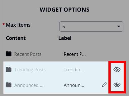
- Click a tab's eye icon to control whether its displayed or hidden in the widget. If a tab is hidden, its Label text is grayed out and the eye icon is crossed out.
- You can reorder the tabs however you'd like to control their order in the widget. To do so, hover your mouse cursor over a tab row and drag and drop it to the desired location.
Content Types - List options
You can choose from the following types of content to populate your tabbed lists.
NOTE: Content Types that reference "post" include discussions, questions, ideas, and custom Post Types. If you want to target specific content, choose a "siloed" option, such as Newest Ideas, Newest Discussions, etc.
- Newest Ideas - the ideas that were most recently added.
- Trending Ideas - the ideas that have received the most votes and comments in the past week.
- Newest Questions - the questions that were most recently added.
- Unanswered Questions - the questions that were most recently added but which have not yet been answered.
- Recently Answered Questions - the questions that were most recently answered.
- Trending Posts - the posts that have received the most comments and positive reactions this week.
- Top Posts - the posts that have received the most positive reactions this month.
- Recent Posts - the posts that have been newly commented on or published. 📝 This includes announcements, though they are not pinned to the top (they are treated as a normal discussion).
- Announced Posts - all globally announced posts.
- Recently Active Discussions - displays discussions that have had recent engagement.
- Newest Discussions - displays the most recent discussions.
Tag Cloud
Displays a global or filtered list of tags in your community as "pills."

Users can click these pills (see below) to display the tag's Tag Card, from which they can click:
- the Posts button to view their community's Recent Posts page filtered to the tag;
- the Groups button to view a list of Groups that use that tag, filtered to that tag and limited to Groups they have permission to see;
- the Follow button to follow the Tag. Learn more in our Tag Following article.

The Tag Cloud widget lets Admins control which tags display and how they are ordered. The widget can be filtered by Category or Subcommunity, including contextual options on supported page types, and can sort tags alphabetically, by usage, or by date created.
This is especially useful for landing pages, subcommunities, and other complex community setups that require a more curated experience (e.g., communities with multiple products or more advanced content structures, where Admins want to clearly show which tags are relevant within a given area of the community).

Filter By
Use Filter By to control the scope of tags shown in the widget. The available options are Subcommunity, Category, and None.
NOTE: The Subcommunity filter is only available if Subcommunities are enabled in your Vanilla community.
- When Subcommunity or Category is selected, you can then filter the widget to a specific Subcommunity or Category. In some page layouts, the Contextual option is available so the widget automatically reflects the page where it's placed.
- Select None to show all available tags rather than limit the widget to a specific Category or Subcommunity.
NOTE: When the widget is filtered by Category or Subcommunity, it displays Global tags and tags scoped to the selected Category or Subcommunity. The widget does not display tags scoped to other areas.
Sort By
Use Sort By to choose how tags are ordered in the widget. The available options are:
- Alphabetical: Displays tags in alphabetical order by name.
- Usage: Displays tags based on how often they are used.
- Date Created: Displays tags based on when they were created.
Text Widget
Allows you to add static, formatted content anywhere in a custom page layout without needing custom code. The Text Widget uses a built-in rich text editor, making it easy to create and format content such as headings, body text, lists, tables, videos, and other embedded content directly in Layout Editor.
This makes the widget a good option when you want to place informational content, such as page copy, privacy or legal messaging, or other custom text blocks, between your community’s dynamic widgets and page elements.

Widget Options
- Content editor - The widget’s primary feature is its rich text editor, where you can add formatted text and supported embeds instead of writing custom code.
Tiered Tab Widget
The Tiered Tab widget makes it easy to surface multiple “views” of community content using tabs and filters.
- You can add any number of custom tabs to the widget, with each tab targeted to a Category of your choosing: tabs will not surface content outside its selected Category scope.
- You can also create a global set of filters to allow further refinement of each tab's content.
This widget, then, offers two levels of content filtering: the high-level Category content and the secondary filtering of that Category content, making this a great way to create compact "content hubs" in your community that enable users to easily find content without needing to perform searches or navigate to multiple Category pages.

NOTE: You cannot create specific filters for each tab; the filters you configure are universal to all tabs. In the example above, as I click between the West Coast Region to East Coast Region tabs, the four filters shown are the same for each.
Widget Options
Let's learn how to manage three of the widget's main options: Categories, Filters, and Update URL.

Categories
Click Edit Categories to create and manage the widget's tabs.
- Click (+) Add Category to add a new tab.
- When creating or editing a tab, you can give it a label (name) and select the Category to scope its content to. You can only select one Category per tab.
- Click the pencil icon to edit an existing tab.
- Click the trashcan icon to delete an existing tab.

Filters
A set of five default filters are included with the widget:
- All Posts, Announced Posts, Accepted Questions, Answered Questions, Unanswered Questions.
These defaults will likely meet your needs with little to no customization needed; however, you're free to edit (pencil icon) and delete (trashcan icon) these defaults and add your own custom filters.

Manage a filter
You can manage the following options for each filter:
- Name: This represents the filter's "tab" name in the widget.
- Post Types: Controls what post types are "allowed" in the widget's Categories (e.g., Discussions, Questions, Ideas, Polls, custom Post Types).
- Status: Narrows results by content status, primarily for Questions and Ideas:
- Question statuses like Unanswered, Answered, Accepted.
- Idea statuses like Active, Considering, In Progress, Completed, etc., including any custom idea statuses.
- Announced: Controls whether the filter includes only announced posts (global announcements) or not. This lets you build a tab like “Announcements” by restricting to Announced Posts (i.e., globally announced discussions/posts) instead of all posts.
- Resolved: Filters by the resolution state of posts. This option relates to the Community Management Dashboard's Triage Dashboard, where moderators can review and decide whether new posts are acceptable or not. Only users with the
staff > allow, moderation > manage, or settings > manage permission can view these statuses.- Resolved: Posts marked as resolved, meaning they did not require further review.
- Unresolved: Posts that have not yet been reviewed by a moderator.

Update URL
The widget includes the Update URL checkbox:
- When Update URL is checked:
- The widget's current filter/sort state is reflected in the URL (for example, as query parameters).
- Refreshing the page preserves the user’s chosen tab, filter, and sort.
- When Update URL is unchecked:
- The UI still updates without a full page reload when users change tabs or sorts.
- Refreshing the page resets the widget to its default state (default tab and sort).

Recommendations
- Enable this option for:
- Category homepages where you want deep linking to a particular filter/tab.
- Internal support workflows where staff share URLs for specific filtered views.
- Disable this option if:
- You prefer the page to always load in a consistent default state, regardless of how users interacted with the widget previously.
Title Bar
If your community is configured to use custom page layouts, these custom layouts include the Title Bar widget, allowing you to fully customize the Title Bar for each of your community pages.
NOTE: Communities using our legacy layouts will be limited to the default Title Bar coming from their applied theme.
When editing a custom layout, click the Title Bar area at the top of the editor to select it, followed by the pencil icon to edit it.

Check out the article below to learn more:
User Spotlight
The User Spotlight widget is a great way to showcase specific users in your Vanilla community (and even people in your organization or affiliates). You can use it to:
- introduce your community team members
- introduce partners / special guests for upcoming webinars
- recognize thought leaders and super users
- recognize active members who are contributing in a special way (answering questions, providing great ideas)
The widget:
- provides a bio/description,
- includes the member's name and role within the community, and
- links to the member's community profile.

Who's Online
Displays a list of users who are currently online in the community. The widget:
- provides a total count of online users (the number at the top right, shown below),
- can have avatars or linked usernames, and
- can include a count of guest users (the +x Guests, shown below).

Widget Options
- Style: Allows you to display users as icons (their avatars) or by their usernames.
- Display Guests: Here, you can opt to display only registered users or also include guests
