When you add an image to a Call To Action (CTA) widget, Vanilla's recommended image dimensions (1920px x 480px) might not always be the best dimensions.
This is because there are several layout options, and the layout that you choose can influence the appearance of your image.
EXAMPLE: The same image added to a 1 Column - Default section displays differently than it does when added to a 3 Columns - Even section — due to the size of the respective image placeholders.
Image best practices
The previously recommended 1920px x 480px remains a good baseline size for images in CTA widgets because it keeps text placement predictable, BUT, instead of adhering to fixed dimensions, know that the "ideal dimensions" of any image that you want to insert are ultimately going to dictated by the type of Section to which you're adding the widget.
Section options
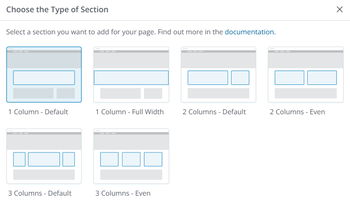
The image below shows the various Section types and how the widgets are situated and display within each type.
NOTE: The 1 Column - Full Width section type does not support the Call To Action widget.
Examples of Sections with an image
This article provides graphic examples of the same image inserted in Call To Action widgets in each of the various section options — except the 1 Column - Full Width section type, which does not support the CTA widget.
The examples are intended only to:
- give you an idea of how your image might display, and
- help you decide which configuration is the best option for you.
NOTE: For all of the image examples below, the Description Type field was set to None in order to keep the examples as "clean" as possible.
Including a description on your widget will affect the layout of the image. Further, the text of the description could obscure any text that is embedded on your image. For this reason, text embedded on an image is discouraged.
CTA widget influencers
In addition to the Section Type (which is described above and illustrated below), several factors can influence how an image displays in the widget. For example, in the Widget Options configuration panel:
- Title - A long title can increase the height of the widget and affect the display of the image.
- Description - The presence and length of a description can increase the height of the widget and affect the display of the image.
- Text Color - If you change the color of the text, make sure that it complements the colors in your image. Colors that:
- contrast too much aren't very pleasing.
- are too similar can be difficult to read.
- Button - The presence of the button will cause the widget to be taller.
- The Text option affects the height less than the Primary and Secondary options.
See the section Widget Options for more detailed information on these settings and options.
Image 'scaling' and 'cropping'
When an image is inserted in a widget, it will be automatically scaled (width and height are reduced) in order to fit in the placeholder. When this happens, the scaling is "proportional," which means that, although it's been made smaller, the image will retain its (width-to-height) aspect ratio.
It is possible, too, that, in order to properly "fit" in the placeholder, the image might be cropped in addition to being scaled. "Cropping" is, essentially, cutting off some of the image.
- This cropping could be to the height or the width of the image, but it will always be an equal amount (off the top and the bottom or off the right and the left) in order to maintain the appearance of the image.
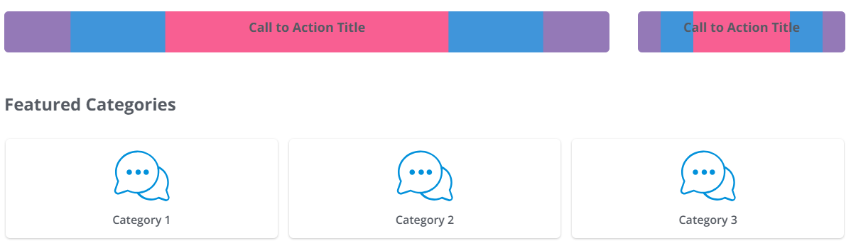
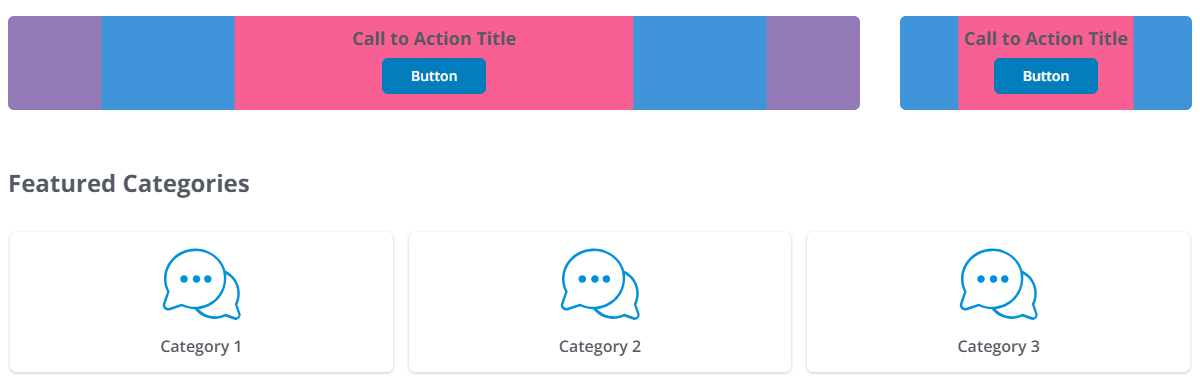
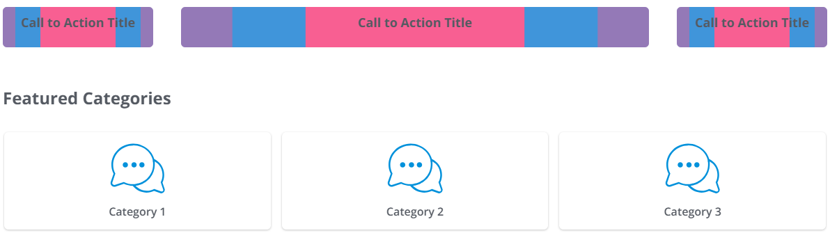
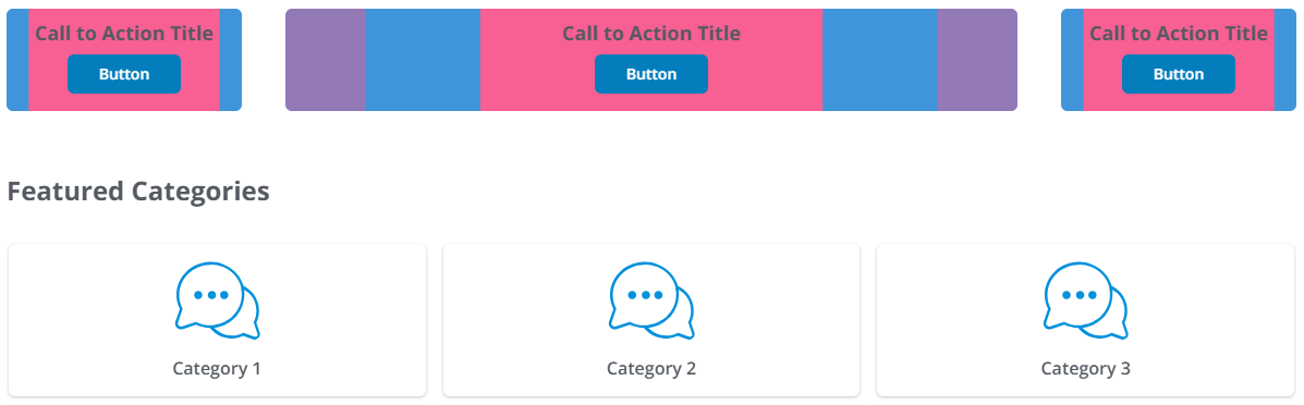
1 Column - Default
Compare how the image look in this Section Type with and without the button.
Without button
With button
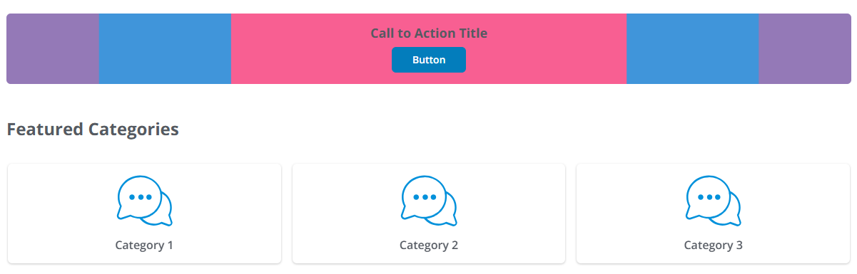
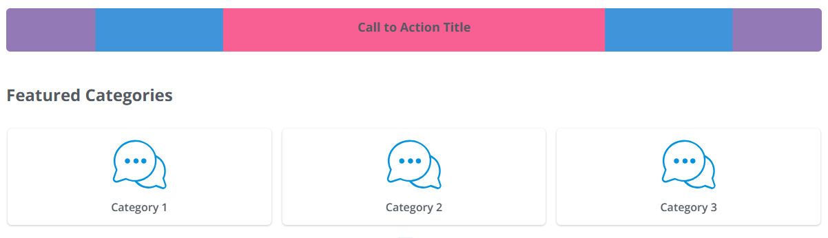
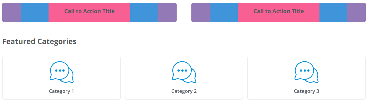
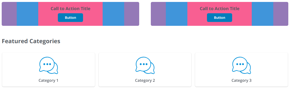
2 Columns - Default
Compare how the image look in this Section Type with and without the button.
Without button
With button
2 Columns - Even
Compare how the image look in this Section Type with and without the button.
Without button
With button
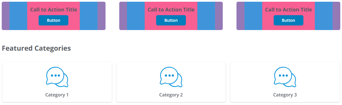
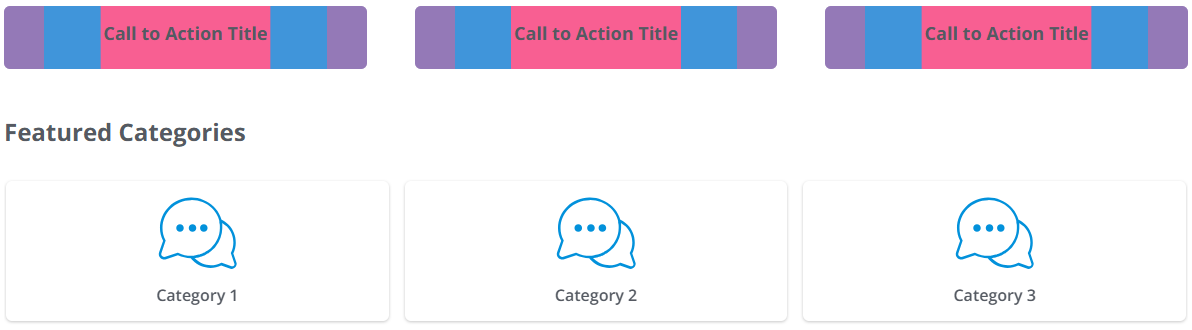
3 Columns - Default
Compare how the image look in this Section Type with and without the button.
Without button
With button
3 Columns - Even
Compare how the image look in this Section Type with and without the button.
Without button
With button