BETA NOTICE: Widget Builder is currently in active beta. Features, APIs, and interface elements may evolve as we refine developer tooling.
Access is available on staging environments for testing, and select customers have approved early access in production.
For the latest updates or to request beta access, contact your Customer Success Manager (CSM) or Account Executive.
The purpose of this article is to explain when to use Widget Builder, how to get access, and the key concepts to understand before you start building.
WARNING: Widget Builder is a powerful, code-first customization interface designed for developers who are skilled in JavaScript, CSS, React, and other design principles. With this in mind, make sure you possess the proper coding expertise and knowledge before using this tool—or work with someone who does. Otherwise, you may damage the integrity and functionality of your Higher Logic Vanilla (Vanilla) community.
For guidance on safe customization, review our Widget Builder Best Practices.
Overview
Widget Builder is a developer-focused tool for creating custom widgets—or tailored variants of Vanilla’s existing widgets—when your organization’s needs and goals go beyond the capabilities of our built-in widgets. It’s designed for organizations that want to extend their community’s layout, design, or functionality beyond the standard configuration.
For developers, Widget Builder offers a complete coding workspace using familiar web technologies—React, HTML, CSS, and JavaScript—plus a built-in utilities library for safe access to Vanilla’s APIs and data. This environment supports live previews, version control, and reusable components, making it easier to build, test, and manage custom widgets directly within your community.
Once published, your custom widgets appear in the Layout Editor, where community managers and other non-technical admins can place and configure them like any other widget.
Guidance
Because Widget Builder runs live code, we recommend that anyone editing or creating widgets have at least a basic understanding of JavaScript or collaborate with a developer on their team. Invalid or unsafe code can cause widgets to break or behave unexpectedly.
If you’re experimenting or learning, start safely:
- Use a staging site to test new widgets before publishing them to production.
- Validate and review code before committing changes.
- Ask for help early — your developer team can help review or debug issues before they impact live pages.
Terminology
Before you start building, it helps to understand the key terms used in Widget Builder:
Widget
- A widget is a complete, configurable component that is available in Layout Editor's widget selector (e.g., Post List, Q&A, or Search).
- Widgets are what non-technical admins place on pages to build layouts.
- Developers can use Widget Builder to create new widgets or variants of existing ones, which will then appear in the Layout Editor for easy reuse.
Fragment
- A fragment is a code template that defines how part of a widget looks and behaves.
- Most of your coding work in Widget Builder happens inside fragments.
- Some fragments represent small pieces of a widget (like a post list item), while others can act as full components (like a banner or search bar).
How they fit together
- Widgets are made up of one or more fragments.
- Fragments define a widget’s structure and behavior.
- Widget Builder is where developers create and customize fragments, which in turn control how widgets appear and function in Layout Editor.
Think of a widget as the finished product your admins use, and fragments as the parts developers assemble to build it.
Understanding this relationship will make it easier for you to navigate the Widget Builder interface and know where to make changes.
Key features
Widget Builder gives developers and technical admins the flexibility to extend Vanilla’s front-end experience safely, using familiar tools. Let's learn about its core capabilities and what makes it unique:
- Custom code environment: Write and edit widget code directly inside Vanilla using React, HTML, CSS, and TypeScript. No need for external development environments or deployment pipelines — everything happens in one place.
- Live previews: See your changes instantly as you build. The preview panel updates in real time, showing exactly how your widget will appear and behave once published.
- Version control: Every save and commit is tracked. Compare versions, view differences, and roll back to earlier versions if something breaks or changes unexpectedly.
- Utils Library: Access a curated library of safe, platform-aware utilities for data fetching, navigation, user context, permissions, localization, and formatting.
It’s built specifically for the Widget Builder environment, ensuring compatibility and security. - Seamless layout integration: Once a widget is published, it automatically appears in Layout Editor, ready for non-technical admins to place and configure like any other built-in widget.
- Sandboxed & secure: Widget Builder runs in an isolated environment, keeping your custom code separate from Vanilla’s core system — helping prevent conflicts and maintain platform stability.
Together, these features make Widget Builder a bridge between developer flexibility and admin usability, empowering teams to build custom components without leaving the Vanilla platform.
Access Widget Builder
NOTE: Widget Builder is currently in beta, and access is being rolled out in stages. The feature can be enabled for eligible customers on staging sites, with full release availability coming soon.
During Beta
While Widget Builder is in active development, access is limited to approved customers.
Here’s how it works during the beta phase:
- Staging access: All approved beta participants can test Widget Builder safely on staging environments.
- Production access (limited): Some organizations have received permission to use Widget Builder in production, though this remains part of early testing.
- Requesting access: To join the beta program or confirm your eligibility, contact your Customer Success Manager (CSM). Your CSM can enable the feature for your organization and help determine whether staging or production access is appropriate.
IMPORTANT: We recommend testing widgets on a Staging site before deploying to a Production site. Invalid or unsafe code can cause visual or functional issues on live pages.
Plan availability (after beta)
When Widget Builder is fully released, availability will depend on your Vanilla plan tier:
Plan | Access Level | Included Features |
|---|
Essential | Not Available | — |
Corporate | Lite Version | Access to Title Bar and Custom Fragments for lightweight customization. |
Enterprise | Widget Builder | Complete builder environment with live preview, version control, and utilities library. |
Enterprise Plus | Widget Builder | Includes everything from the full version plus advanced customization capabilities |
NOTE: If you’re unsure which plan your organization is on, reach out to your CSM or Account Executive to confirm what level of Widget Builder access you’ll receive at launch.
How to access when enabled
- Access the Dashboard.
- Navigate to Appearance > Branding & Assets > Widget Builder
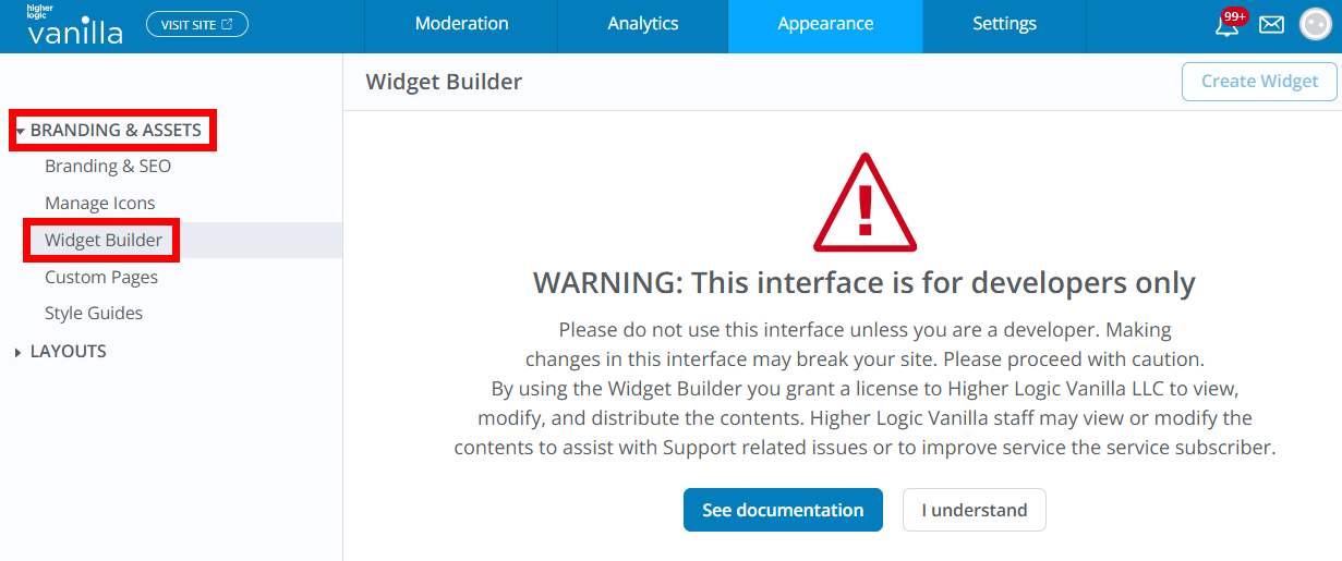
The first time you access this page, a warning indicates that this feature is meant for developers only, and that improper usage could result in the degradation or breaking of your Vanilla community.
- Click See Documentation to learn more about these risks;
- click I understand to proceed.
From there, you can view available widgets and fragments or start creating your own.
When to use Widget Builder
Widget Builder is a powerful tool — but it’s not always the first place to start. Use it when you need more flexibility or functionality than what Vanilla's standard configuration options provide.
Use Widget Builder when:
- You need to create fully custom widgets that don’t exist among Vanilla’s built-in options.
- You have a developer or technically skilled team member who can safely build and maintain custom components.
- You want to extend or modify an existing widget’s layout or behavior (for example, changing how posts or categories display).
- You need interactive or data-driven components — such as dynamic charts, custom banners, or embedded integrations — that aren’t possible with layout or theme settings alone.
- You want to give admins reusable, branded widgets that they can easily add and configure in Layout Editor without touching code.
Use built-in tools instead when:
- You only want to rearrange or style content on your pages; in these scenarios, the Layout Editor or Theme Editor will likely meet your needs.
- You’re making simple visual tweaks like updating colors, fonts, or images.
- You want to adjust text or messaging on existing widgets without changing their functionality.
- You prefer no-code customization and don’t have developer resources available.
Summary
Widget Builder bridges the gap between simple configuration and full front-end development.
If your customization needs go beyond what can be done through Layout or Theme Editor — and you have the technical expertise to manage code safely — Widget Builder gives you the control to build exactly what your community needs.
Next steps
You’re now familiar with what Widget Builder is, who it’s for, and how to get access.
To continue learning, explore the following resources to start building safely and effectively:
- Build Custom Widgets & Fragments: Learn how to create, edit, and preview custom widgets using the Widget Builder interface. This guide walks through the builder tabs, version control, and best practices for testing before publishing.
- Widget Builder Best Practices: Understand how to write secure, stable, and performant widget code. This article covers safe API usage, staging workflows, and common pitfalls to avoid when working in Widget Builder.
- Utils Library Reference: Explore the built-in utility methods available to your widgets. Includes examples for data fetching, navigation, localization, user context, and permissions