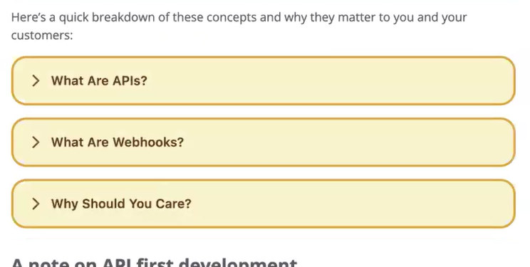
Rich Editor includes the Toggle Block feature, which allows users to insert collapsible content blocks into articles and posts to reduce visual clutter and make content easier to scan to more easily pinpoint specific information.
Common use cases include FAQs, definitions, or sections with long supporting details.
This feature helps authors organize long or complex material, making it more manageable and engaging for readers.
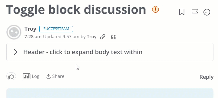
Toggle Block feature overview
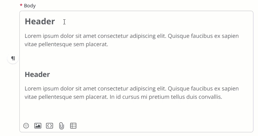
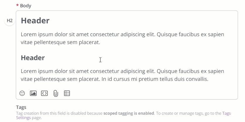
- The first paragraph of the block is the Toggle Header, which is what the user clicks to expand or collapse the block. The Header can only contain text and emojis.
- The remaining paragraphs are the Toggle Body, revealed when the Header is expanded. The Body can contain formatted text, lists, images, videos, tables, links, and attachments.
- By default, Toggle Blocks are collapsed when an article or post is viewed.
- Toggle Blocks cannot be nested (there can only be a single level).
- Toggle Blocks display according to your applied Theme; however, you're free to customize several aspects of them using Variables. Refer to the Customize your Toggle Blocks section in this article to learn more.
- The following accessibility features are supported:
- The Header is keyboard focusable.
- Space or Enter toggles the Header open/close.
- Proper ARIA attributes support screen readers.
Create a Toggle Block
You can insert Toggle Blocks in knowledge base articles and all post types that use Rich Editor (discussions, questions, ideas, events).
Let's walk through how to create a Toggle Block from scratch and to convert existing content to a Toggle Block. While the process isn't too different, there is some nuance to make the process easier.
From scratch
Create the Toggle Block first and then add the Header and Body content. This makes it easy to visualize your block in Rich Editor and work within its "bounds."
- Place your cursor where you'd like the Toggle Block to be (a blank paragraph).
- Click the Element Toolbar > Special Formats Menu > Toggle Block.
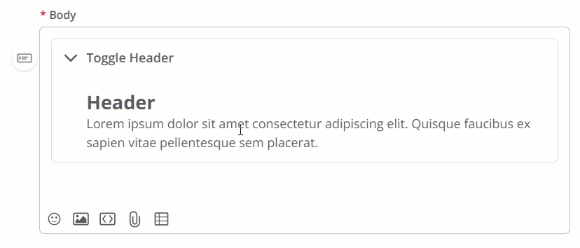
- You now have a Header line at the top and the Body section below. Add your Header text; this is the text users will see and need to click to expand the block. The Header can only contain text and emojis.
- Add the Body content, which can include all paragraph formatting, like lists, images, tables, etc.
TIP: While editing the Header, you can add "soft" and "hard" line breaks (enter or shift + enter | return or shift + return on a Mac) to expand the Header into multiple lines.
Convert existing
The main thing to remember when converting existing content to a Toggle Block is that all of the content you select will become the Toggle Body; you'll still need to add the Toggle Header manually.
- Click and hold to select all of the existing content you want to make a Toggle Block.
- Click the Element Toolbar > Special Formats Menu > Toggle Block.
- The selected content is now the Toggle Body, and a blank Toggle Header is positioned above. Add your desired Header text.
TIP: While editing the Header, you can add "soft" and "hard" line breaks (enter or shift + enter | return or shift + return on a Mac) to expand the Header into multiple lines.
Remove a Toggle Block
- Click into the block.
- Click the Element Toolbar > Special Formats Menu > Toggle Block.
The block is removed and all content is now reverted to separate paragraphs while retaining its formatting.
Customize your Toggle Blocks
By default, Toggle Blocks inherit the visual styling inherited from your community's applied Theme. However, you can customize various aspects of your Toggle Blocks, including their background and foreground colors, and border, to make them appear exactly how you want.
Customize Toggle Block styles
You can customize several aspects of your Toggle Blocks using Theme Variables, which are inserted into a Theme via the Advanced Settings panel.
- To access the panel, edit a custom theme and click Advanced Settings, as shown below. (The button always displays, irrespective of which section is being customized.)

NOTE: The styling applied below is for illustrative purposes only; replace the examples below with your desired styling.
Modify background and foreground color using the following Theme Variables:
"userContent.toggle.bg": "#f8f9fa""userContent.toggle.fg": "#495057"
Modify border styling using the following Theme Variables:
"userContent.toggle.border.color": "#e9ecef""userContent.toggle.border.width": 1"userContent.toggle.border.style": "solid""userContent.toggle.borderRadius": 8
Modify padding using the following Theme Variables:
"userContent.toggle.padding.all": 16"userContent.toggle.padding.vertical": 4"userContent.toggle.padding.horizontal": 8"userContent.toggle.padding.bottom": 6"userContent.toggle.padding.top": 6"userContent.toggle.padding.left": 16"userContent.toggle.padding.right": 16
Modify the Toggle Block Header font using the following Theme Variables:
"userContent.toggle.heading.font.size": 16"userContent.toggle.heading.font.weight": 500"userContent.toggle.heading.font.color": "#ffffff""userContent.toggle.heading.font.letterSpacing": -0.01em"userContent.toggle.heading.font.lineHeight": 0.5em"userContent.toggle.heading.font.letterSpacing": -0.01em"userContent.toggle.heading.font.shadow": 6em"userContent.toggle.heading.font.textDecoration": "underline""userContent.toggle.heading.font.transform": "uppercase" "userContent.toggle.heading.font.weight": 6
Example
In this example, we leveraged several Variables to change the header font size, block background color, header font color, and some text decoration and transform effects.
TIP: Click the image below to enlarge.
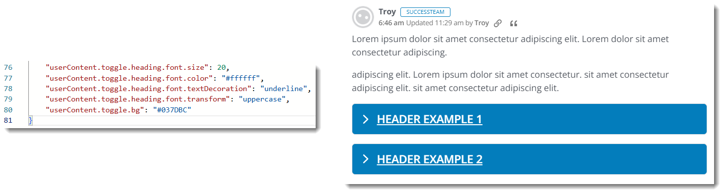
TIP: When adding more than one variable, be sure to insert a comma "," after each one, except for the last one in the sequence. Refer to the image above for an example.