With Higher Logic Vanilla's (Vanilla) updated Analytics experience, Analytics Dashboard, you can:
- run out-of-the-box reports to measure the health and activity of your Vanilla communities and
- build custom Analytics dashboards to create your own reporting to visualize the data that matters most to you.
Enable the Analytics Dashboard
Analytics Dashboard is available to all cloud customers who have Advanced Analytics as part of their subscription.
Out-of-the-box vs. custom Dashboards
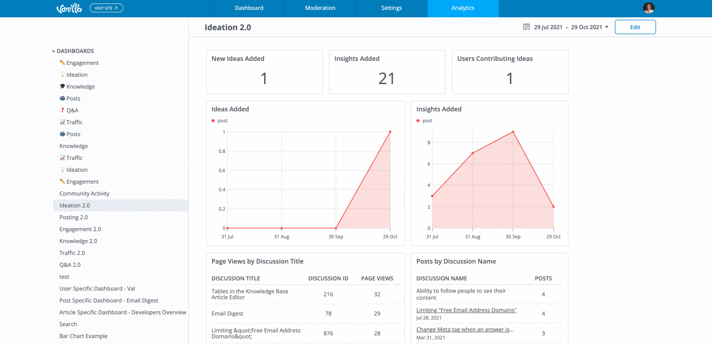
The out-of-the-box Dashboards are preconfigured to include specific types of analytics and provide a quick "read" on what's happening with the related activities in areas such as community discussions, idea submissions, and page views.
The custom Dashboards are how you build, design, and customize the layout and analytics for your own dashboards in order to capture and display the data in which you're most interested.
Access the Dashboards
When Analytics Dashboard is enabled, there are two options in the left navigation:
- Analytics - is the collection of out-of-the-box Dashboards. Click a Dashboard name and it immediately populates with data on the Analytics page.
- Dashboards - is where all custom Dashboard activity is stored: the add-dashboard option and your custom Dashboards. Click a Dashboard name to edit it on the page; click Add Dashboard to create a new one.

Insights feature for users and content
- Insights are a set of out-of-the-box analytics reports that focus on the activities associated with individual users, posts, and knowledge base articles.
When you access them, the report displays a dedicated page on the Analytics tab of the Dashboard.
Edit your custom Dashboard layout
After you've added charts to a custom Dashboard, you can modify its layout with our drag-and-drop interface.
TIP: You cannot change the layouts of the out-of-the-box Dashboards, but you can download a .CSV file of the data by clicking the ellipsis (…) icon in the upper right of the chart.
On the Dashboard page, click Edit in the upper right to manage the display and layout of your charts as shown in the video below. You can:
- drag and drop a chart to reposition it,
- click and drag a chart's side to increase/decrease the width, and
- click and drag a chart's bottom end to increase/decrease the height.