The out-of-the-box Dashboards provide great insight into the overall engagement and activity in your community. However, you can take this functionality to the next level by:
- adding your own Dashboards and then
- adding and customizing Charts to show only the analytics you want.
To get started with custom Dashboard and Charts, let's first look at how to add a Dashboard.
Add a Dashboard
To add a custom Dashboard:
1. Access the Dashboard.
2. On the Analytics tab, click Dashboards > Add Dashboard.

3. Give your Dashboard a unique name (this can be changed later by clicking the pencil icon) and select which type of Chart you want to add (more can be added later).

The Chart editor is where you build your analytics query.
- The left panel of the editor displays a preview of your chart; it updates in real time as you configure the settings.
- The right panel is where you configure the various settings. These are described in Adding & customizing Charts, below.

Chart types
For each chart you create, you configure how you would like the data to display.

There are several chart types to choose from. The sections that follow offer a closer look at them so that you can decide which best suits your analytics.
Score Card
This is a great choice if you just want basic data indicators. Score Cards show a simple numeric value for analytics, such as the number of new posts, number of active users, and average-time-to-first comment.

Bar Graph and Line Graph
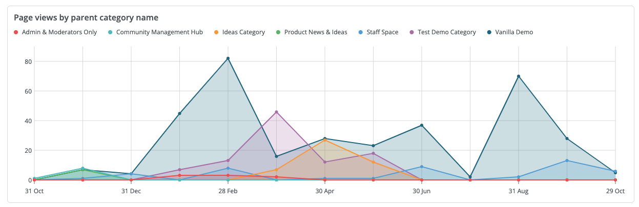
These graphs are ideal for displaying analytics results over a period of time in order to better see fluctuations in community engagement for various activities. For example, you could plot out the number of page views, posts, and new users per day over the course of a week or a month.
You can further refine your data by using the Group By option with these graphs. For example, you could group:
- Page View data by Category name to see posting trends per Category over a select period of time.
- Points Earned data by point Source to focus the graph on the number of points awarded within the specified time frame and how those points were earned (by answering questions, earning badges, or receiving positive reactions).

TIP: For bar graphs, you have the flexibility to display the data in two styles: Stacked (shown above) and Grouped (separate bars for each metric).
- You'll generally want grouped bars for side-by-side comparisons and stacked bars to illustrate part-to-whole relationships.
Pie Graph
This type of graph is a great way to group and compare data in a very concentrated display, but with color distinctions to simplify interpreting the data.
- Below right is a good example of a pie graph representing user reactions grouped by type; from this, it is easy to scan the graph and quickly get a sense of "positive" versus "negative" reactions.
- And in the user participation rate pie graph, it's clear (textually and visually) that 1/7th of the active users are also contributors.

Table
Tables are an ideal choice for a simple multi-factor analytics, such as a Leaderboard widget. The table below displays which page types were viewed and how many times by which types of users and in which country:

- At least one Group By selection is required for a Table.
- Table columns can be sorted by clicking the row header; click again to reverse the sort order.
- To create a Leaderboard table, scroll down to the ORDER section and choose Result for the Order by setting.

- This arranges your table entries by "highest hit count to lowest hit count." Below, our previous table is now sorted on the page views column by "highest hit count." The order can be reversed by clicking the arrow.

Advanced Chart
Select the Advanced Chart option to add one to your Dashboard.

While the other chart types allow you to build your own custom analytics view using data sources and filters, an Advanced Chart is a chart type that lets you drop in a pre-built, curated analytics query (e.g., “Members by Accumulated Reputation”).
Essentially, an Advanced Chart gives you several pre-configured queries to insert and run as-is, rather than building from scratch.

These queries focus on several of the most common analytics that organizations are interested in.
- Participation Rate
- Average Visits Per Active User
- Average Posts Per Active User
- Average Comments Per Post
- Posts With The Most Positive Reactions
- Members By Accumulated Reputation
Copy a Dashboard
Rather than start from scratch every time you need a new Dashboard, you may find it easier to copy an existing one and tweak its settings and content. This is especially useful when you want to examine a similar set of metrics but simply tweak a few filters.
To copy a custom Dashboard:
- Select one of your custom Dashboards.
- Click the Copy button at the top right.
You will now be editing your copied Dashboard, where you can give it a new name and update its settings as needed.

Adding & customizing Charts
When you add a Dashboard, you have to select a Chart to populate it. You can then add more Charts to display multiple analytics on the Dashboard.
This section describes how to add a chart to a Dashboard, and then how to use the configuration settings to customize a chart.
Add a Chart to a Dashboard
- On your Dashboard, click Edit in the upper right.
- Click Chart in the upper right.
- Click a chart type to select it.

In the Add/Edit Chart dialog that automatically opens, use the settings in the CHART OPTIONS panel (described in the Customize a Chart section below) to customize the Chart.
TIP: You can change the chart type (with the Type setting) as you work if you want to preview your data in different layouts to determine which works best.
Rich Text chart
Before we learn how to customize the chart types shown in the image above, let's first learn about another chart type: Rich Text.

While technically a chart, its purpose is unique:
- It enables you to add important notes, nuance, and contextual information to your community's analytics data.
- Just like any other chart, it can be dragged and dropped anywhere on a Dashboard, making it easy to contextually position your notes next to other data.
- It functions just like any other Rich Text editor you've used in your Vanilla community, providing full formatting and media functionality you can learn more about in this article.

Customize a Chart
The CHART OPTIONS panel on the right of the "add/edit" dialog is where you customize a Chart.
- Name is prepopulated and the associated chart displays on the left. You can give the chart a custom name (be sure that the name clearly indicates its analytics). The name auto-updates if you choose a different Preset.
- Type is prepopulated based on which chart type was chosen. You can change this as you work or edit it later if you decide a different type of chart presents the data better.
- Preset is way to quickly add a preconfigured chart. You can try different chart types and select the one that you think best presents the data.

NOTE: The settings that are available depend on which chart type is selected. For example, a Score Card chart has fewer settings than the Graphs chart types.
NOTE: This section uses the Bar Graph chart type as an example; the descriptions apply to the other chart types.
DATA settings
- Data Source is how you choose which community activity is the main focus of the analytics chart. The remainder of the configuration settings enable you to refine and collate the results that are pulled for the selected Data Source.
- Group By is a dynamic set of options that self-adjusts based on the chosen Data Source. You can use these options to refine your results based on multiple parameters (such as subcommunity, category, and/or country).
NOTE: Group By is only available for bar graphs, line graphs, pie graphs, and tables.
X-axis customization for bar charts
By default, bar graphs use time as the default X-axis metric.

Unique to bar charts, however, is the ability to customize the X-axis to any of the available Group By options, providing more flexibility in the data you want to view. Essentially, you're able to have multiple Group By options defined at once to enhance the comparison of results.

METRIC settings
- Function is a static set of options that you use to further refine how the data is calculated. The Function options are:
- Count - the total number of occurrences of the selected Data Source activity. For example, the count of page views. This count includes multiple actions by the same user. For example, User-Mary views a page 3 times; that's a count of 3. 📝 NOTE: This is the only option that does not require a Field value.
- Count Unique - the number of unique occurrences of the selected Data Source activity. For example, the count of unique page views. This differs from Count in that it does not count multiple actions by the same user; it records "1" for any action taken by a user, even if that user does the action multiple times. For example, User-Mary views a page 3 times but this is considered 1 action and so records a count of 1.
- Minimum - the lowest numeric value of the Data Source metrics that were returned by the query.
- Maximum - the highest numeric value of the Data Source metrics that were returned by the query.
- Mean - the average numeric value of the Data Source metrics that were returned by the query.
- Median - the middle-most numeric value of the Data Source metrics that were returned by the query.
- Sum - the cumulative total of all the numeric values of the Data Source metrics that were returned by the query.
- Label is where you can add a description of the chart; it displays below the chart title.
- Field is a qualifier for your chosen Function.

LIMIT settings
A powerful way to control what data is presented in your charts is to make use of the following LIMIT options:
- Limit By - the options available here depend on the Group By option you selected in the DATA section. As suggested by its name, use Limit By to limit the Chart data, helping you to focus on a specific metric.
- Direction - choose Ascending or Descending to display the highest or lowest data points. In some cases, this will also limit the data provided.
- Amount - use this to control how much data is displayed. If your data set is large, this is a great way to limit the total amount to a more digestible, and meaningful, amount. For example, if you're viewing page views by user role, and you have 30 user roles, that may make it difficult to accurately view the data; to remedy this, you can limit to 5 or 10 roles to make the data more presentable.

FILTERS settings
Filters can be added to your query in order to refine the results. This is a great mechanism for when you want to really focus on a preferred set of analytics, such as the number of views a page has received, or to exclude specific types of activity, such as excluding "admin" views of pages from the results.
NOTE: The options that are available in the Field dropdown depend on which Data Source is selected.
- Field is a dynamic set of options from which you can choose (only one) aspect of the Data Source as the focus of the analytics data. If a field is chosen, Operator and Value become required fields.
- Operator is how you include or exclude query results that you do/don't want in the chart. The static options are: Equal to, Not equal to, Exists, One of, Contains, and Does not contain.
- Value is a dynamic set of options that are based on to the selected Field. Choose a value as the qualifier for the Operator.

Multiple filters: AND/OR
When adding more than one filter, use the AND or OR operator to control how the filter functions.
- With the AND operator, multiple filter conditions are "ANDed" together, meaning data must match all filter conditions to appear in the results.
- This means adding more filters narrows your results (records must satisfy all of them).
- The OR operator provides a way to check for at least one matching condition, as opposed to all of them.
- This means adding more filters widens your results (records can satisfy any of them).

Sub-filters
Sub-filters are available when the top-level operator is AND. When it is:
- The Add filter button (+) becomes a dropdown with:
- Add Filter adds another top-level condition (combined with AND).
- Add Sub Filter adds an OR’d condition inside the current filter group.
- All Sub-filters in that group use the OR operator automatically.

Think of Sub-filters as a way to put parentheses around part of your filter logic.
- A normal filter list can do:
- “A AND B AND C”
- or “A OR B OR C”
- A Sub-filter lets you do:
Instead of only having one big chain of ANDs or ORs, you can filter with more nuance, such as “these two conditions go together as an OR group, and then I’ll AND that group with something else.”
Example
Show posts that are in Category A and are written by admins OR moderators.
With Sub-filters, you build:
- One top-level filter for Category = A
- One top-level filter for User Role, and under it:
- Sub-filter: Role = admin
- Sub-filter: Role = mod
This reads as:
- (Role = admin OR Role = mod) AND Category = A
Set the date range for Charts
You can set a date range on the Dashboard and it will be applied to all the charts.
Click the date range in the upper right of the Dashboard to open the date selector and use the tabs to set a time frame for the chart data.
- Presets is a collection of preconfigured time periods.
- Range offers two calendars that you can use to set a static custom time period.
- Advanced has several dropdowns that you can use to set a flexible custom time period.

In addition to the date range, click a time-frame pill to set the granularity of the chart data.

Click Apply and the chart immediately updates to reflect your new settings.
Download a Chart
You can download and save a .CSV file of any chart. The downloaded file contains the same data as that which displays on the Dashboard.
- Click the ellipsis (…) icon on any chart and then click Download CSV.
NOTE: Download file names are based on the chart name and date range that is set for the Dashboard, such as Page Views by User Role Name - 2 Aug 2023 - 1 Sep 2023.csv.

TIP: Use the functionality of the spreadsheet application to customize the report data to suit your needs. For example, you can:
- move columns and rows
- delete columns and rows
- rename column headers
Manage the Charts on a Dashboard
Now that you've added a few charts to your Dashboard, you can manage the position and appearance of the charts in order to customize the Dashboard to display the data how you prefer.
Click Edit in the upper right, then:
- You can move a chart by clicking/holding the top of it and dragging it to a different position on the Dashboard, and then dropping it into place.
- You can adjust the width of a chart by clicking clicking/holding the chevron in the lower-right corner and dragging it horizontally to make it wider or narrower.
While editing a Dashboard, you can also manage your charts. On any chart, click the ellipsis (…) icon and then click:
- Edit to open the chart editor to make changes to any of the settings (described above in Adding & customizing Charts).
- Duplicate Chart to make a copy of the Chart (it will be positioned directly below). Duplicating Charts is a great way to copy complicated Charts to make small edits to their settings rather than starting from scratch each time.
- Download CSV to generate and save a file of the chart. The file name is the chart name and the date range (e.g., Page Views by User Role Name - 2 Aug 2023 - 1 Sep 2023.csv).
- Delete to remove the chart from the Dashboard.
IMPORTANT: Use this option with caution because it immediately removes the chart from the dashboard; there is not a confirmation prompt. A deleted chart cannot be retrieved and re-added to the Dashboard; it has to be re-created.