With Higher Logic Vanilla's (Vanilla) updated Analytics experience, Analytics Dashboard, you can:
- run out-of-the-box reports to measure the health and activity of your Vanilla communities and
- build custom Analytics dashboards to create your own reporting to visualize the data that matters most to you (check out Create Custom Dashboards & Charts to learn more).
Out-of-the-box Dashboards
On the Dashboard > Analytics page, the Analytics Dashboard has several out-of-the-box Dashboards that are preconfigured to include specific types of analytics and to provide a quick "read" on what's happening with the activities in areas such as community discussions, idea submissions, and page views.
You can use these Dashboards to quickly and easily understand what's happening in your community.
- Engagement
- Ideation
- Knowledge
- Posting
- Q&A
- Search
- Traffic

Engagement Dashboard
The Engagement Dashboard provides an overview of user engagement across your Vanilla community. You can see:
- How many new and/or active members there are
- How many users are logging in vs how many are posting
- How long it takes for users to start commenting on new posts
- Which users have the highest reputation score
- Which posts have the highest score
- How users are reacting to your content, and which reactions are being used

Ideation Dashboard
The Ideation Dashboard provides a high-level view of your ideation strategy, including:
- How many new ideas and insights were added, and who is contributing them
- Which ideas have received the most votes, activity, and views

Knowledge Dashboard
The Knowledge Dashboard will inform you of:
- How many articles have been added and edited
- Which articles are getting the most views
- How many articles are rated as helpful and unhelpful

Posting Dashboard
The Posting Dashboard helps you understand your community’s posting trends. Use it to see:
- How many posts and comments have been added
- How your posting volume has evolved over time
- How many contributors you have
- Which users, Roles, Categories, Subcommunities, and posts are the most active

Q&A Dashboard
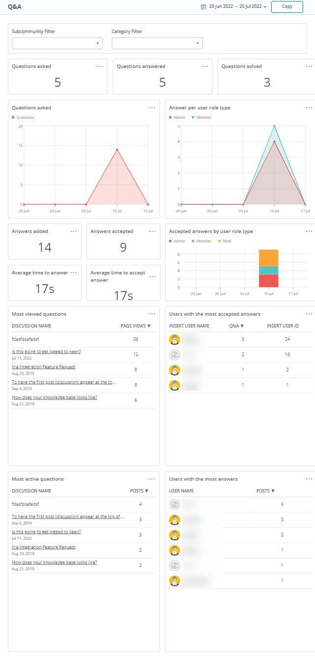
The Q&A Dashboard is designed to help you understand how your community is contributing to your support strategy. Use it to see:
- How many questions were asked, answered, and solved
- How many answers were provided and accepted
- Which users provided answers
- How long it takes to get answers and resolve questions

Search Dashboard
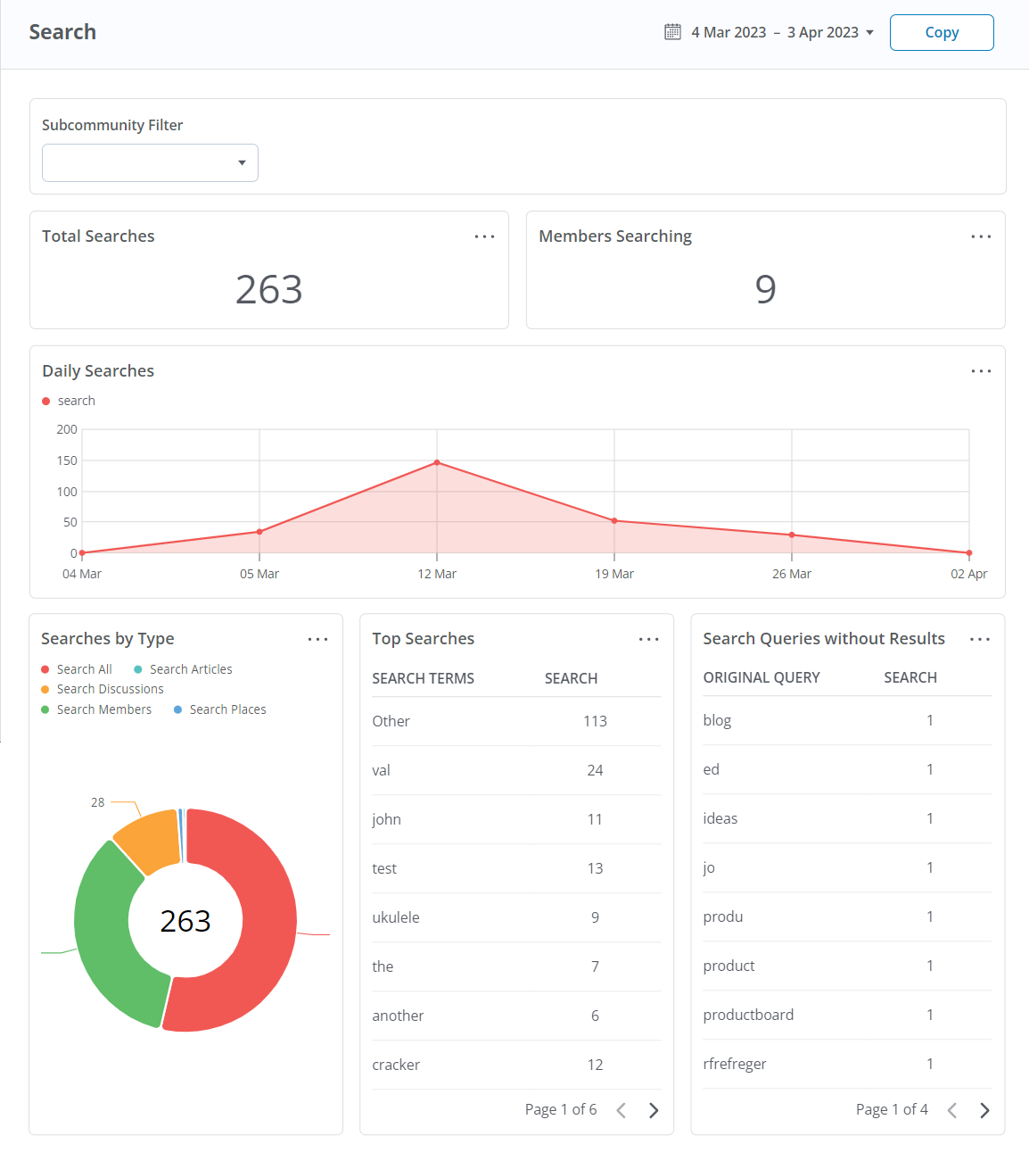
The Search Dashboard provides an overview of search activity in your Vanilla community. This Dashboard has the following areas:
- Subcommunity Filter - If you have subcommunities, you can select one to filter the data to it.
- Total Searches - How many times users have searched your community.
- Members Searching - How many unique members are searching your community.
- Daily Searches - A line graph visualizing search occurrences by date.
- Searches by Type - After searching, users can narrow their search term by content type via the following tabs: All, Discussions, Articles, Places, Events, Members. Searches are grouped by type in the pie graph.
- Top Searches - A list of all terms searched, grouped by most used.
- Search Queries without Results - Lists all user searches with no results.
TIP: A best practice is to monitor this chart on a regular basis to understand what content your users are unable to find in your community. These insights can help you provide content tailored to your users' needs.
NOTE: When reviewing your Top Searches, the term “Other” indicates an empty search string was used.

Traffic Dashboard
The Traffic Dashboard makes it easy to see how busy your Vanilla community is within the configured time period. Its charts display:
- How many page views and visits you’re getting, and whether these are coming from active members, guests, or admins.
- Which Subcommunities, Categories, pages, and/or posts are getting the most views.
- You can also view this data for a specific Subcommunity (if you have them) and Category using their respective dropdowns above the charts.

Page views by referrer
A useful metric provided by the Traffic Dashboard is the Page views by referrer chart, located at the bottom. This chart makes it easy to understand where internal and external traffic is coming from.
NOTES: When navigating from one web page to another via a link, the referrer (or referring page) is the URL of the web page from which the link was followed. For example, users may come to your Vanilla community via a link that your organization posted on a social-media site.
In this case, the referrer is the social-media site. A referrer can be either internal (a link on one of your community's pages) or external (a link from an "outside" web page). Internal traffic is labeled as such in our analytics so you can understand what traffic is sourced internally versus externally.

Referrer data for individual posts
In addition to the Traffic chart discussed above, you can also view this referrer data for individual posts for more granular insights.
To do so:
- Navigate to a post.
- Select Analytics from its (…) menu.
- The Page views by referrer is chart is available at the bottom of the resulting page.
