IMPORTANT: Pockets, and their associated widgets, represent our classic design experience. For a more streamlined experience, with deeper layout customization and expanded widget capabilities, we recommend upgrading to our Layout Editor.
NOTE: Pockets only display in legacy layouts, and will not function in Layout Editor layouts.
This article describes adding and using the Discussion List widget for Pockets. A more feature-rich version of this widget is available in Layout Editor:
Overview
The Categories widget is a great way to promote popular and important Categories in your Higher Logic Vanilla (Vanilla) community.
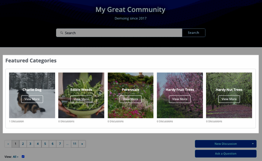
When you put Categories "front and centre," as shown below, users are more likely to click into them.

Categories widget notes
- The text and images that are used for Categories added to this widget are pulled from each respective Category's settings.
- Test this widget on your staging site before committing it to your production site.
- The Location and Page settings of the host Pocket let you target specific pages — and locations on those pages — for this widget.
Featured Categories notes
Before setting up Featured Categories, review the following information.
- In order for a Category to be "featured," its Featured category setting has to be enabled, as described below in Set a Category as "Featured".
- All Category types (Discussions, Nested, Flat, and Heading) and their sub-categories have the Featured category setting and can be set as "featured."
- When a Category is set as "featured," a star icon displays next to it on the Manage Categories page.
- Featured Categories display from left to right in the widget based on the order in which their Featured category setting was enabled.
- To adjust the display order of your Featured Categories, disable their Featured category settings, and then re-enable them in the order you prefer.
Theme dependencies
The Categories widget is optimized for Foundation themes, and this article assumes you are using a Foundation theme.
NOTE: This widget is compatible with Legacy (i.e., non-Foundation) themes; review the notes below.
Legacy themes notes
If you are using this widget with a Legacy theme, note that:
- Some additional tweaks to your custom theme may be required.
- A default image will not appear for this widget when used with a Legacy theme, so be sure that all Categories have assets uploaded.
- Legacy themes might not be compatible with all pocket locations (such as AfterBanner).
Set a Category as "Featured"
You can edit a Category on the Manage Categories page to set it as a "featured" Category. Before doing so, review the following information.
- In order for a Category to be "featured," its Featured category setting has to be enabled, as described below.
- All Category types (Discussions, Nested, Flat, and Heading) and their sub-categories have the Featured category setting and can be set as "featured."
- When a Category is set as "featured," a star icon displays next to it on the Manage Categories page.
- Featured Categories display from left to right in the widget based on the order in which their Featured category setting was enabled.
- To adjust the display order of your Featured Categories, disable their Featured category settings, and then re-enable them in the order you prefer.
To set a Category as "featured":
1. Navigate to Dashboard > Settings > Discussions > Categories.
2. Click the down arrow (shown below) for the Category and then select Edit.

3. Scroll down to the Featured category setting and toggle it to the right (ON) to enable it.

4. Click Save.
5. On the Manage Categories page, verify that the Category has a star icon.

The Category can now be added to a community page via a pocket as described in the next section.
Setting up the Categories widget
To use this widget in your site, you must add it via a Pocket. Many of the settings for Pockets are similar across multiple Pockets and are available in multiple widgets.
To add and configure a Pocket:
1. Navigate to Dashboard > Settings > Pockets.
2. Click the Add Pocket button to open the Add Pocket dialog.
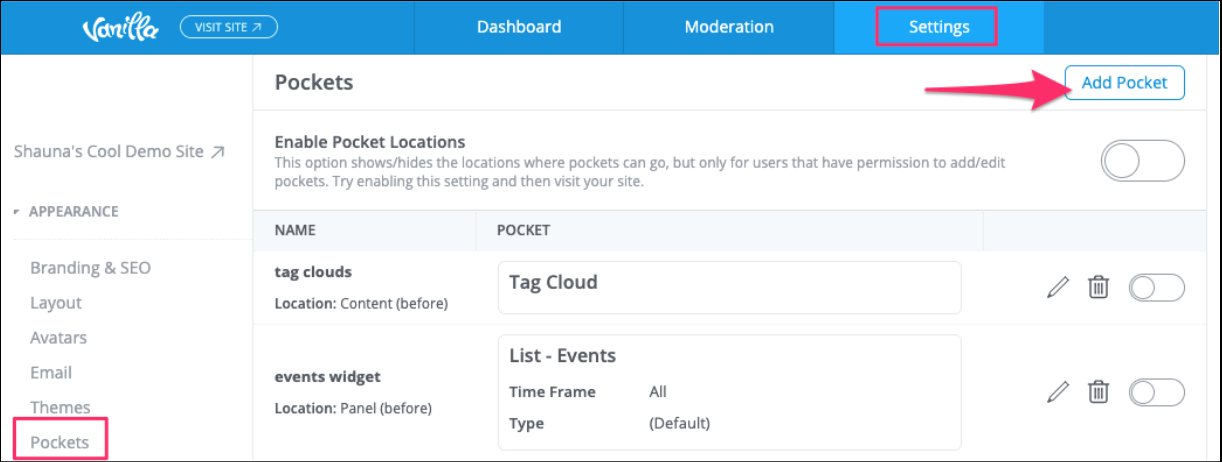
3. On the Content tab:
- Specify a Name (e.g., Featured Categories) for your pocket.
- Select Featured Categories as the Type. The dialog refreshes to display additional settings for the chosen Type.

- Complete the fields in the lower part of the page.
TIP: We recommend that you take the extra minute or so and complete even the optional fields; this might be helpful to other Admins.
4. Click Save.
Notes
The appearance of the widget and its elements (Title, Description, etc.) are controlled by the settings in the Widgets and Global Styles sections of Theme Editor.
The Max Columns value that is specified on the Add Pocket page will override the default value in the Widgets section of Theme Editor (shown below).

Placing the Featured Categories widget
As you configure the widget on your Staging site, you should try it in various locations to see where works best with your image choices and theme.
TIP: The section, Sample Configurations, below, offers a great "sneak peek" at how some of the page-and-location combinations actually appear on a community page.
Also, it might help to consider:
- what the main focus (concept) of your community is, and
- that most users will not scroll very far down the page.
Therefore, it's important that the content at the top of the page is relevant to the purpose of the community in order to drive the engagement that will make your community thrive.
- Click the Placement & Conditions tab on the Add Pocket dialog to set page and location options as described in working with pockets.
Widget settings in the Theme
You can manage many of the default, global settings for all your widgets in the Theme Editor. This is an easy way to apply your "brand" to widgets and to ensure that your branding is consistent across all widgets — no matter the type or location — without having to individually manage each one!
How your widgets display is dependent on two configuration sections in the Theme Editor: Global Style and Widgets.
Global Styles section
This section in the Theme Editor controls many of the properties of the widget's content. For example, each widget's:
- Background colour is inherited from the Background setting.
- Title, Description, and article links colours are inherited from the Text setting.
- View All link colour is inherited from the Links setting.
- Subtitle and hover-over colours are inherited from the Brand Color setting.

The image below shows how the widget displays with the out-of-the-box settings.

Widgets section
This section in the Theme Editor controls the appearance of the widget container and widget content tiles. For example:
- Max Columns is the number of columns of widget tiles to display. Additional tiles trigger "line wrapping" and add rows, as necessary. If the Carousel option is enabled, line wrapping doesn't occur.
- The two Border settings let you select whether to apply a border to the widget container and the individual widget tiles.
- The two Background settings act separately as the "fill colour" of the widget container and the individual widget tiles.
Notes
It's important to test the Max Columns setting so that you can get a preview of how the widget tiles will display with the different widget-placement options, and then set an appropriate number.
Pockets set to the Content - Before location have a fixed maximum of four columns. Use the AfterBanner location if you want to use more columns.
Display types
The Featured Categories widget can appear in a variety of ways on your Vanilla community pages. Their appearance is controlled by the Image Type setting in the Widgets section of the Theme Editor:

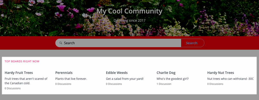
None (text-only display)
Choose this option to have the widget tiles display only the Category title, description, and number of discussions, as in:
Icon
Choose this option to have the widget tiles display the Category photo and title, description, and number of discussions, as in:

Image
Choose this option to have the widget tiles display your banner image, Category title, description, and number of discussions, as in:

Background
Choose this option to have the widget tiles display your banner image as a shaded background, the Category title and a View More button (links to the Category) as overlays, and the number of discussions display below, as in:

NOTE: The Background CTA option is similar, but replaces the number of discussions with the description.
Featured Categories in a Carousel
If the Carousel option is enabled and the number of Featured Categories exceeds the Max Column value, left and right arrows automatically display so that users can manually navigate through the Featured Categories.

To learn more about the Carousel option, see:
Configuration examples
The examples in this section are based on choosing the Image option as the Image Type (refer to Display Types, above) in the Widgets section of the Theme Editor.
Configuration: 1 Column with Carousel, set to the Panel Before location

Configuration: 2 Columns with Carousel, set to Content - Before location

Configuration: 3 Columns, no Carousel, 3 Featured Categories, set to AfterBanner location

Configuration: 3 Columns, no Carousel, 3 Featured Categories, set to Content Before location

Configuration: 4 Columns, no Carousel, set to After Banner location with only subtitle set (no title or description)

Configuration: 4 Columns, with Carousel, set to Content - Before location

Configuration: 5 Columns, set to After Banner location

You can further customize the appearance of the widget by adding borders to the widget container and/or the individual widget tiles. To learn how, refer to Theming Featured Categories, below.
Images, icons, and backgrounds in widgets
Images, icons, and backgrounds are a great way to "dress up" your widgets. You can add these graphical elements in two ways:
- Globally, in the Theme Editor, as defaults for all widgets and
- Individually, when you edit a Category, as unique to that Category.
NOTE: Images, icons, and backgrounds that are added at the Category level override any that are set for widgets in the Theme Editor.
Let's look at how to add images, icons, and backgrounds in the Theme Editor and at the Category level.
Theme Editor
To set global, default images:
1. Navigate to the Theme Editor.
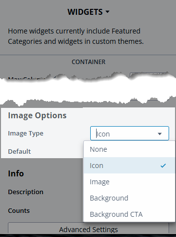
2. Under GLOBAL & HOMEPAGE, select Widgets.
3. In the Image Options section (shown below):
- select an Image Type and
- choose a Default image.
Category
To set an individual Category's images:
1. Navigate to Dashboard > Settings > Categories.
2. Edit the category you want to customize and manage either or both of the following image options.
- In the Photo section, click Browse and select an image to be used as the Icon.
- In the Banner Image section, click Browse and select an image to be used as the Image and Background.
NOTE: Wait until the image has uploaded before continuing.

3. Scroll down and click Save.
NOTE: These changes are applicable only to the Category that you edited.
TIP: Repeat these steps to edit a different Category and use entirely different images!
Theming Featured Categories
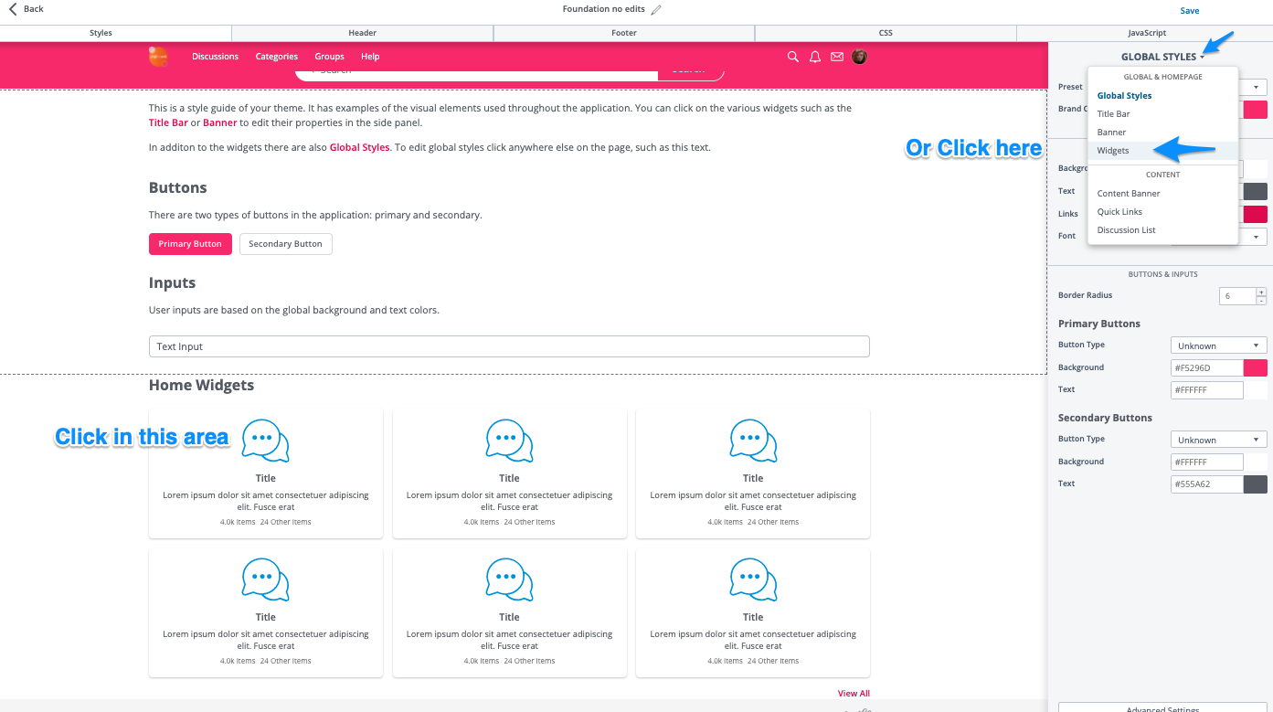
You can theme featured categories using the Theme Editor. Simply go to the dashboard, then themes, and edit your current theme.
Once you are in the theme editor, you can click the widget area on the left, or choose “Widgets” from the drop down on the right:
Container Settings

The container holds all individual category tiles. The exact area included in the container will depend on the placement and other settings of the Featured Categories widget. If you are unsure, set the Container Background to an odd colour and save (on staging!) to easily see the container.
Max Columns
Set the default number of columns for the widget to display.
Note that if you have something different set in the pockets, the # of columns set in the pocket settings will take precedence.
It may still be useful to set the # of columns to match here when working on a particular Featured Categories widget just to have as accurate a representation as possible in the live theme editor example and reduce saving and reloading the site.
Border
In the Theme Editor, you can add a (solid or shadow) border to the widget container to distinguish it from the other content on the page. The border is applied to the container, so it "groups" all of the Featured Categories widgets.
Container > Border: Solid
Container > Border: Shadow

Container > Border: None (only the widget tiles have borders)

Background
You can set the background color for the Featured Categories container (as well as the discussions list, unless explicitly set separately).
Need more?
HomeWidget container variables
You can edit the the container more granularly by using theme variables:
Theme Variables may require developer resources, but allows more control of the grid spacing.
Tiles
You can also edit settings for individual tiles in the theme editor:
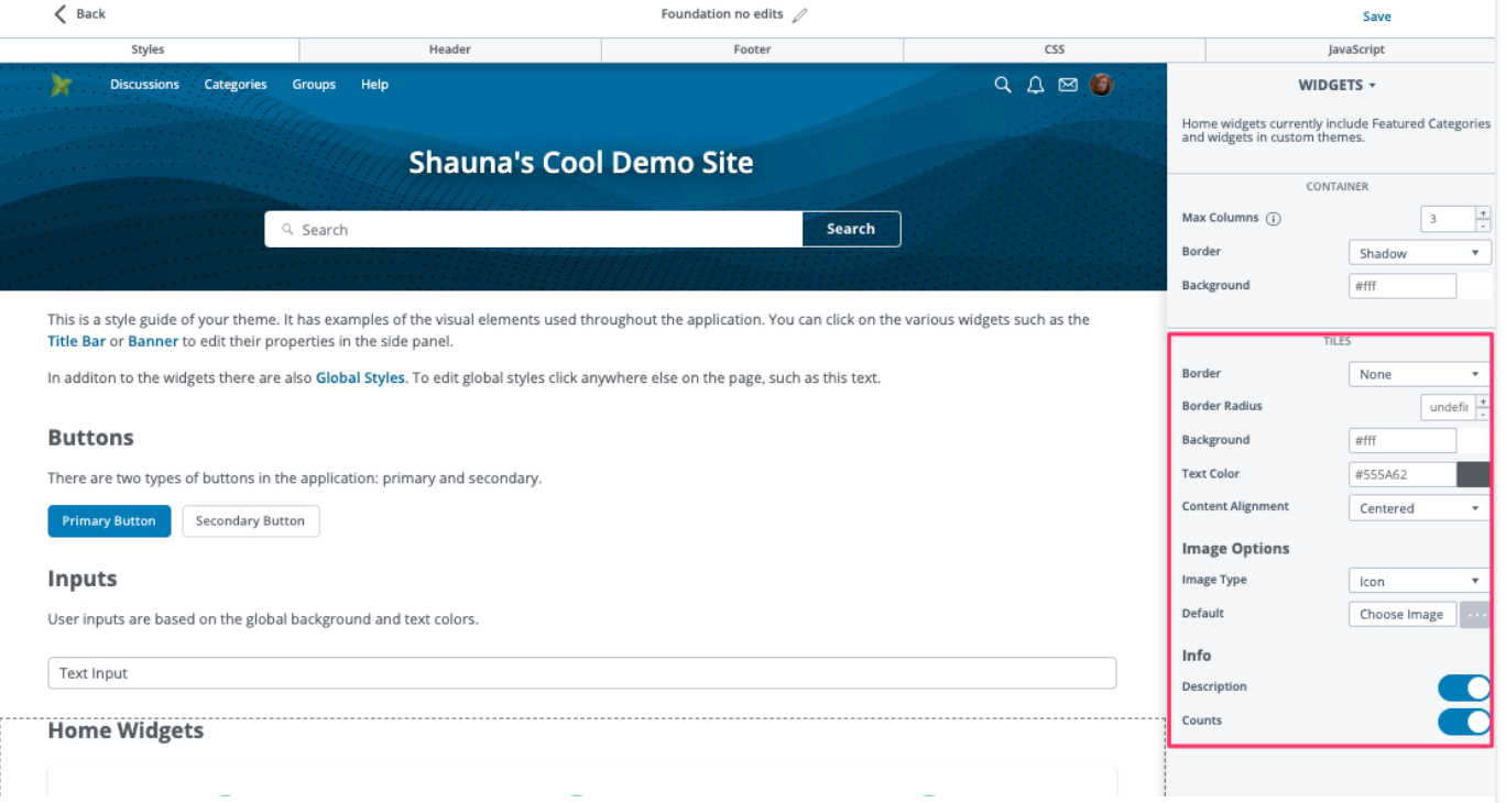
Border
In the Theme Editor, you can add a (solid or shadow) border to the widget tiles to give them a little bit of definition within the group. If you choose a solid or shadow border, you can also set how "rounded" the corners are; refer to Border Radius, below.
NOTE: The border is an "all or none" option; when applied, it appears on all the tiles in the Featured Categories widget.
Tiles > Border: Solid
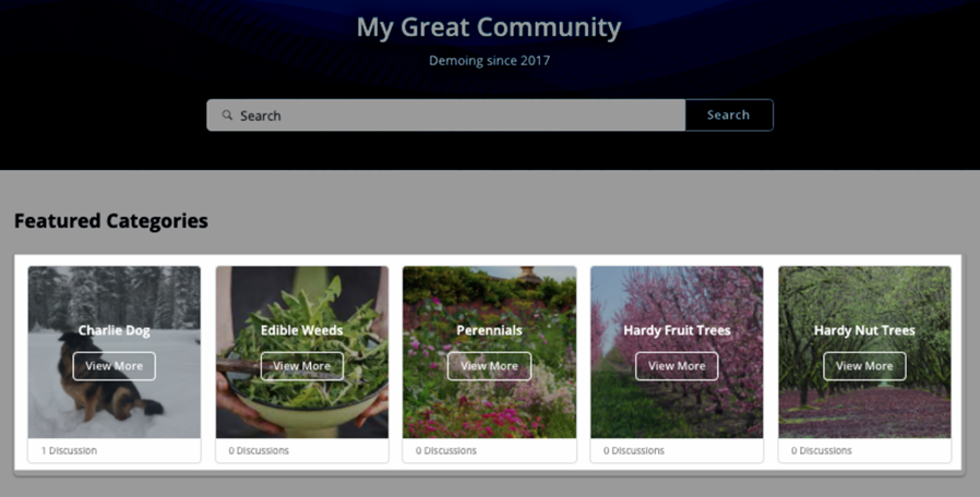
Tiles > Border: Shadow

Tiles > Border: None

Border Radius
If you choose a solid or shadow border for the tiles, you can also set the how "rounded" the corners of the tile borders are. Set Border Radius to 0 to have the corners be square; set it to 100 to have the corners be completely rounded.
- Specify any number from 0 to 100 to set the preferred "roundness" of the borders on the tile corners.
TIP: In the Theme Editor, try a variety of settings and watch the home widget examples in the left panel update in real time to display the "roundness."

Background
The background of the individual tiles. This will cover the background of most tile types, and the bottom of the “Image” and ‘Background” display types.
Text Color
Affects the Title and Description text of all widgets except the “Background” display type which displays white text by default.
Content Alignment
Can be left or centre aligned.
Image options
Image Type
Set the default image display type for additional options.
Note that if you have something different set in the pockets, the image option settings set in the pocket settings will take precedence.
It may still be useful to set image display type to match here when working on a particular Featured Categories widget just to have as accurate a representation as possible in the live theme editor example on the left and reduce saving and reloading the site when trying things out.
Changing the Image Type will also change the possible options below.
None (text-only)
Image Type None (Display Type Text)
- Description - Toggle the visibility of the category description
- Counts - Toggle the visibility of the discussion and subcategory counts
Icon
Set a default image for categories that do not have an image (photo) set in the category settings.
- Description - Toggle the visibility of the category description
- Counts - Toggle the visibility of the discussion and subcategory counts
Image
Set a default image for categories that do not have an image (banner) set in the category settings.
- Height & Width - Set the height and width of the background image
- Description - Toggle the visibility of the category description
- Counts - Toggle the visibility of the discussion and subcategory counts
Background
Set a default image for categories that do not have an image (banner) set in the category settings.
- Height & Width - Set the height and width of the background image
- Vertical Alignment - Set the vertical alignment of the background image (top, centre, or bottom)
- Description - Toggle the visibility of the category description
- Counts - Toggle the visibility of the discussion and subcategory counts
Other background settings
You can set the overlay color and more by using theme variables. Learn about theme variables in:
Background CTA
Set a default image for categories that do not have an image (banner) set in the category settings.
- Vertical Alignment - Set the vertical alignment of the background image (top, centre, or bottom)
- Description - Toggle the visibility of the category description
- Counts - Toggle the visibility of the discussion and subcategory counts
Other background settings
You can edit the individual Home Widget Items more granularly by using theme variables. Learn about theme variables in:
Troubleshooting
- Is the pocket enabled?
- Double check placement and condition settings are as desired.
- Are there categories set to featured?
- Does the user viewing the theme have permission to view all the featured categories?