The Styles section of the Theme Editor is further broken down into subsections, which can be accessed by clicking elements in the theme preview (the area to the left) or by using the navigation menu (highlighted below).
In this article, we'll cover the options available to you in the Global Styles subsection.
IMPORTANT: Any time you're working with website design, it's important to keep accessibility principles in mind. See Accessibility in your Vanilla Community to learn more.

Preset
Select Light or Dark from the Preset dropdown to automatically update several color-based options, such as the Brand Color, Body and Button Background, Text, and Link fields, as you can see in the examples below.
Light

Dark

TIP: While working in the Header, Footer, CSS, JavaScript, and Advanced Settings editor, you can click the icon highlighted below to switch between a light/dark theme. These particular presets don't affect your actual theme, like the one discussed above; they are provided simply to make working in these editors easier visually.

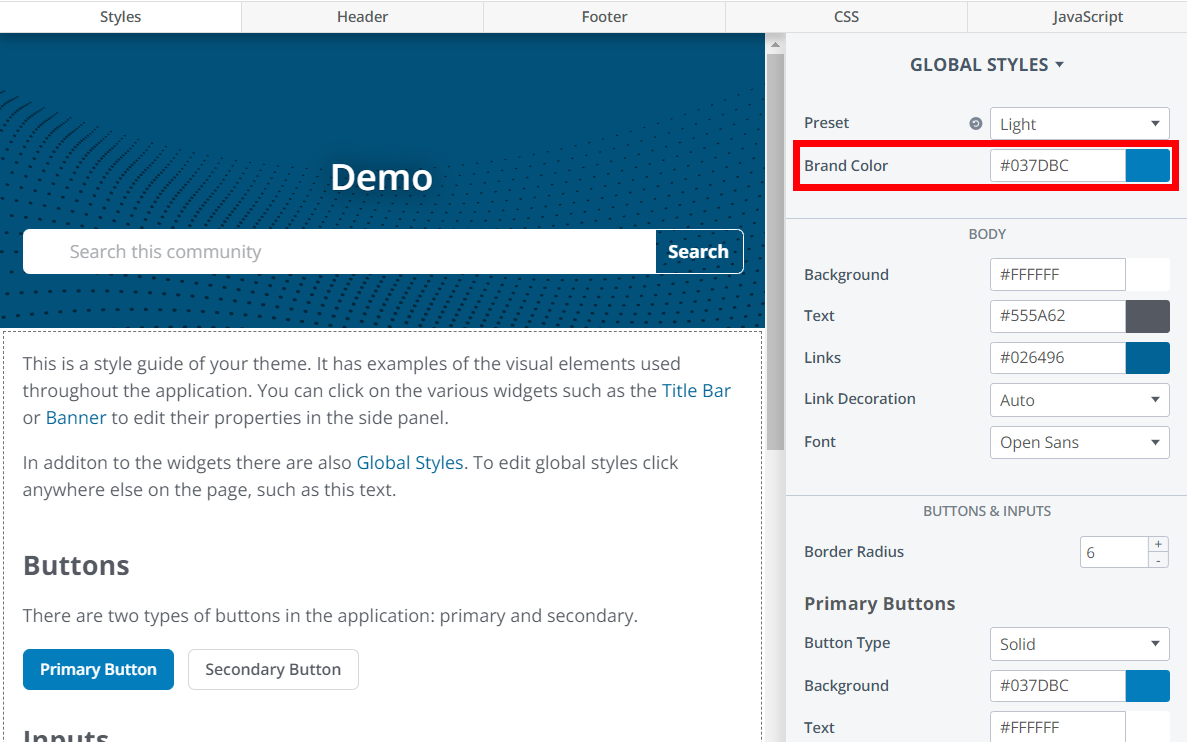
Brand Color
The Brand Color affects various styles within your community to make theming as quick and easy as possible (in some instances, this might be the only option you need to update). As you can see in the examples below, the Brand Color affects styles like the body background, text color, link color, and button colors.
TIP: If there are any elements that inherit the brand color that you want to set individually, check the appropriate article aimed at that element, as well as the theme variables article for additional settings.
Example 1
Example 2

Body
The options in the Body section control most text in your community, including post pages.

- Background: Sets the main background color for the community. This is typically white in lighter themes, black in dark themes. ✔️ TIP: If you have a technical resource, you can use Theme Variables to adjust this more granularly, and to set an image as the background.
- Text: This controls the default colour of the text in most elements, including user posts. This is typically black in lighter themes, white in dark themes. Certain text elements can be modified on a more granular basis. For more information, check out the article on the particular feature you're trying to change.
- Links: Choose what color links should have by default. ✔️ TIP: If you have a technical resource, you can use Theme Variables to adjust this more granularly and to set individual states (such as active, focus, and visited).
- Link Decoration: If set to Auto, link underlining will only appear when users hover over a link. If set to Always, link underlining will always appear.
- Font: Choose from a number of standard font options. ✔️ TIP: If you have a technical resource, you can use Theme Variables to adjust this more granularly and to update font size and weight. For more granular information about updating your font, see Change your Community Font.
Buttons & Inputs
The options in the Buttons & Inputs section control all aspects of your community's primary and secondary buttons.

- Border Radius: Controls how rounded button corners are.
Set the following independently for your Primary and Secondary buttons:
- Button Type: For both your primary and secondary buttons, you can choose to have a solid or outlined button. Referencing the image above, the primary button is set to Solid, while the secondary button is set to Outline. This is generally recommended, to help give your primary buttons a more prominent appearance (hence their name).
- Background: Sets the button's background color.
- Text: Sets the button's text color. For ease of reading and accessibility, you'll want to choose an easy-to-read text color based on your button background color. Again referencing the image above, you'll notice the blue primary button has white text, while the white secondary button has black text; both of these are great choices for accessibility.