
Happy Tuesday everyone!
It's starting to look like Spring🌷🌱 here in Northern Ontario, and I'm feeling the spring cleaning vibes at home and at work -- a new initiative to spruce up the community this spring is #TipTuesday -- we'll be posting a cool new tip around community management, the Vanilla product, and everything in between every Tuesday!
To kick things off, I thought about what features create the biggest impact for the least amount of effort -- when I'm working with folks trying to level up their communities, one of the quick wins I often suggest is setting up some kind of CTA (Call to Action), typically targeted at different roles in their community -- this might be something as simple as using the same real estate on the page and displaying something different for guests vs logged in users, or it might be highly curated to show different content for customers vs prospects vs partners vs staff.
It will depend on what roles you have already (or plan to have!) in the community and what kind of next step you want those folks to take.
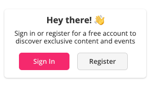
An easy one is simply having a call to action communicating the value of community to guests (AKA logged out users) to convince them to register or sign in, here's an example of the one we use on this community:
I've seen some different ways of doing this over the years from a technical perspective:
Guest Widget

This widget will only show to guests (non logged in users) by default, and the sign in and register buttons will automatically update to the appropriate places as per your registration or SSO settings.
I always recommend personalizing this with your community's overall tone (are you casual? more professional? fun-loving?) and including a value statement that communicates WHY users should bother to sign in or register for your community. Think back to the concept of CARGO and dial in to the Acquisition step -- how are you going to acquire users? Why should they bother to sign in or up for the community? How can we entice them?
I like to make things 💥 pop ⭐️ by adding emojis and images wherever I can.
(PROTIP💡: you can hit control + command + space on a mac to pull up the emoji menu!)
I know some of you have cool guests widgets already -- I'd love to see some examples in the comments below!
Call to Action Widget
The Call to Action Widget is another cool widget that you can target at different roles -- I like to encourage communities to think about what the next step in a user's journey might be:

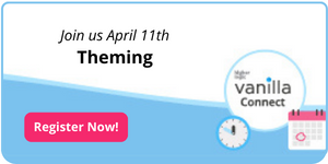
If you're targeting a call to action widget at a particular role, what kind of behaviours do you want to encourage? Do you want to them to request a demo of your software? Learn about your super user programs? Sign up for an event (we use this widget to create awareness about our HL Vanilla Connect series, for example).

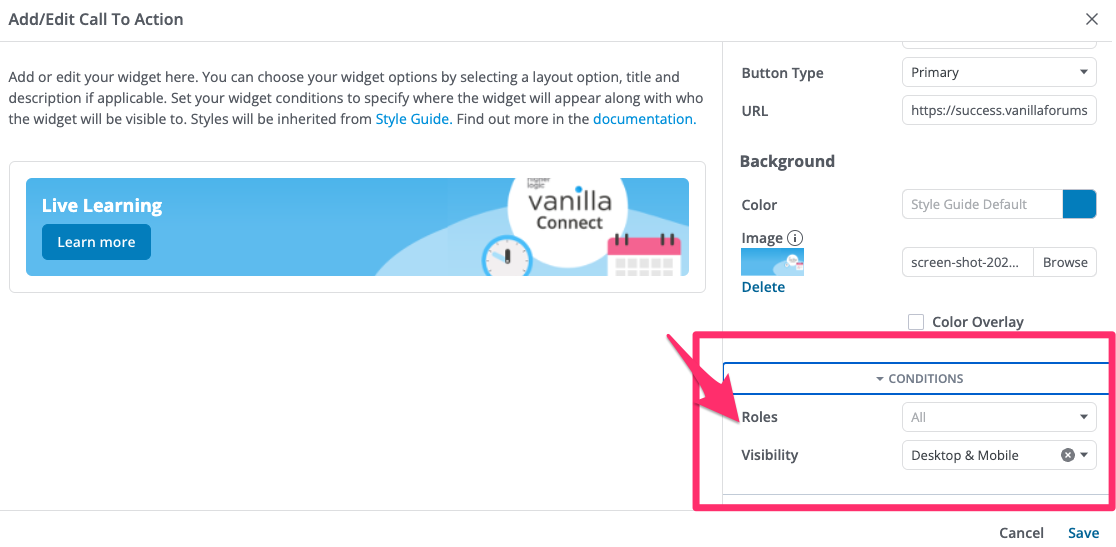
Remember, you can create several different widgets, and target each one to different roles (or desktop vs mobile!) by going into the widget conditions:
Quick Links
In addition to different call-to-action type content, you might also want to have different links prominently visible different roles - for example, if you have content that is exclusive to a certain role, you might want to surface this for particular roles. The easiest way to do this is with the Quick Links Widget.
For example, in our community we have some super secret staff docs that I like to link just below our regular quick links that are visible to everyone:

⬆️ These are actually two different Quicklinks widgets, one targeted at all roles, and the Staff one simply targeted at staff roles. I've seen folks use this method to surface special links for staff, moderators, devs and partners -- do you have a special role in your community? Are you surfacing any special links or content to this role?
Consider what areas of the community you might want specific folks to visit.
Category Tiles + Category as Link
Another way that you can create a couple personalized call to action tiles based on a few key actions you want different roles to have.
To do this, you will need to leverage the category widget + the category as link addon (if you want certain category tiles to lead to other areas, such as particular discussions, or the log in page, or even another category labelled differently, the category as link addon allows you to redirect a category to another place in the community)
How I did this was by considering the different roles that users might have throughout their user journey -- (you can see what that journey might look like here) -- we don't use SSO, so for this community that might be guest, then unconfirmed (i.e., waiting for user to confirm their email), then applicant (i.e., waiting to be approved by a moderator), then member.

In the example above, the top one is targeted at guests (prompt to create an account that forwards to the registration page), the middle is targeted at unconfirmed and applicant users (prompts them to go to a 'I'm new here' section) and the bottom one is targeted at regular members (adds a 'submit a product idea' button')
Sidenote- they are all showing at once on my staging site as I target them at each role + admin so that I can easily toubleshoot --- annoying on production but useful on staging, IMHO!
I would encourage you to check out the look and feel with a test user in each role to make sure everything looks & feels good for each persona. If there are gaps in the real estate of your page for certain users, you might want to think about what you might put there to make things looks consistent & keep things relevant for the user looking at the page no matter their role.
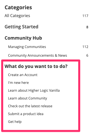
The trade off here is that it will create some categories you don't actually need -- I like to remove the 'add discussions' permission for these widgets so they don't appear in the option when users try to create a new post, and nest them under a 'what do you want to do' type category:
Linked image in an HTML-based pocket
On certain pages, you might not want to use a widget, but take it old school and use an HTML widget with a simple image and link. (Want to learn about creating cool images with Canva? Check out this HL Vanilla Connect session)
I keep this template locked and loaded in my canva, and simply adjust the title and time when there is a new session:
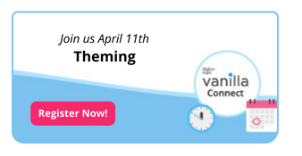
Once I've got my image, I upload it to a random comment in the staff space, then copy the link, that will give me something like
To make this render as an image that links to a particular discussion (in this case I want to lead users to today's HL Vanilla Connect session discussed here:
Now I've got everything I need to create an HTML based pocket, which always has basic code that look something like this:
<a href="THIS IS A LINK"><img src="THIS IS A LINK TO AN IMAGE"></a>
so in this case:
<a href="><img src="></a>
I like this in the 'panel:before' location, personally!
You can also target pockets to different roles, so you can get creative with what images and links you show different roles!
This is a great way to feature content on discussion pages -- for those of you with a lot of traffic coming from search engines, consider what folks see when they land on a page -- how can we prevent them from getting the answer to their immediate question and leaving never to return? How can we convince them to stay, and maybe even create an account?
📣Do you have certain widgets/pockets targeted at certain roles? Are you enticing them to establish new behaviours, discover content or just making site navigation easier? I would love (and I'm certain the rest of the community would too!) to see all the cool things you are doing, so don't be shy and post them below! Love to hear the tips and tricks from this awesome community of community builders⬇️
Cheers,
Shauna🤓
EDIT SPRING 2024:
All of the above is now also possible with WIDGETS AND RANKS!!!! (but not ranks+pockets)
https://success.vanillaforums.com/kb/articles/1576-release-2024-007#ranks-added-to-widget-conditions