When I joined Glean in January, the Glean community was entirely housed within Slack. We had just purchased a new community tool, Higher Logic Vanilla but had not begun the implementation process. Our goal? Launch our customer community, the Gleaniverse, at our first-ever user conference, Glean:GO, on May 20th. That meant the entire site needed to be designed, built, tested, and published in just a few months.
Our internal design team created incredible character illustrations for the event, and they immediately became my north star for the community’s look and feel. We made the launch deadline in May, but the first version of the Gleaniverse was functional at best. It was clunky, unintuitive, and didn’t reflect the vibrant energy of our brand. With no budget, no extra hands, and a strong desire to give our customers a better experience ASAP, I rolled up my sleeves and dove into a full redesign.


Here’s the process I followed — what worked, what didn’t, and the little tricks that saved my sanity.
Step 1: Mock it up in Canva
I started in Canva, quickly creating visuals for the hero section and footer. They weren’t perfect, and that was totally fine. The goal was to nail layout, spacing, and the overall vibe before worrying about perfect code.
To be clear: I’m not a designer, and I’m definitely not a developer. But Canva gave me a tangible starting point that made the next steps much smoother.
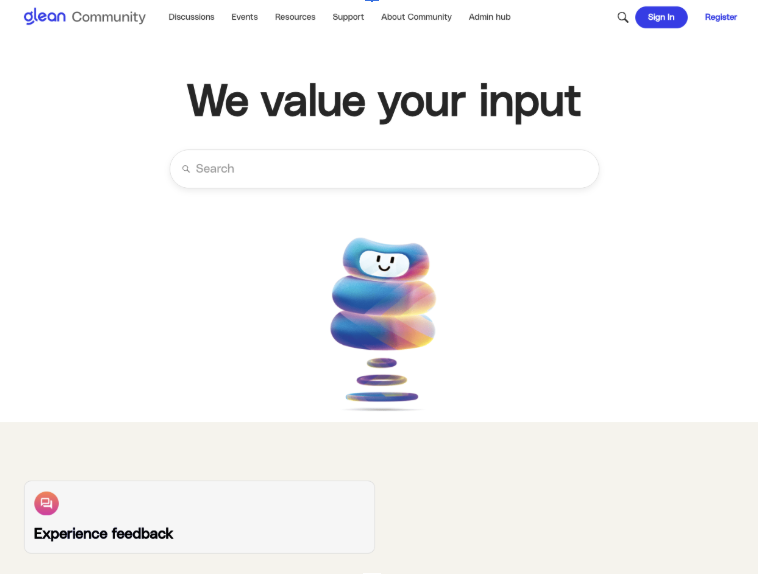
What started as this in Canva:

Quickly was able to turn into this in the Gleaniverse:


Step 2: Translate design to code (with AI backup)
Once the designs were ready, I turned to my “co-developers,” ChatGPT and Claude, to help convert my Canva mockups into HTML and CSS that would work in Higher Logic Vanilla’s HTML widgets.

I was very specific by letting my AI know what I was building, the tooling I was using and telling them I had images of what I was hoping for but needed help with the code. I also specified that I would be building inside a “HTML widget” and wanted code that did not require me to do anything to our Style Guide. Once I shared the photo, I would receive code and the Vanilla’s staging site became my safe space to experiment. Every tweak, test, and “oops” moment happened there first, so I could freely break and fix things without customers seeing it.
The code took many rounds of iterations. I swapped between ChatGPT and Claude and once I found myself stuck in one tool, I moved to the next and picked up where the previous tool left me. This allowed me to get new perspectives and often was able to fix an issue I encountered by having fresh AI eyes on it.

Each time I sent it a change, I copied and pasted in the exact code I wanted AI to pull from and this allowed me to stay on track without too many changes being made unintentionally.

Step 3: Wrestling with characters (and winning)
The trickiest challenge? Character placement.
These little guys had a mind of their own… drifting into random corners, covering and hiding behind text, you name it. Anytime I turned to my AI helpers, they touched unrelated parts of the code, causing more issues that weren’t initially present. I’d have to roll back to an earlier version and start over.
The fix:
- Be extremely specific in instructions – “Only adjust the character’s position, nothing else.”
- Break requests into small, clear steps so the AI didn’t wander off into unrelated code changes.

This alone saved me hours of rework.
Step 4: Keep it simple in the middle
Once the header and footer were locked in, the rest was straightforward. Each new page only needed text and link swaps, and sometimes I could repurpose header/footer elements for other sections (like the Help Center).

For most middle content, like our discussions page, testimonials, and the events functionality, I stuck with out-of-the-box Vanilla components to avoid heavy Style Guide overrides. The one exception? Our Glean Academy page, which had some odd spacing issues. That fix required adding JavaScript to the Style Guide with a wildcard so it wouldn’t get wiped during updates.

Step 5: Test, then launch in waves
The redesign timeline looked like this:
- 2 long days: Header & footer finalized
- 3 days: Rest of the design completed
- 1 day: Testing, editing, and polishing
In production, I started with low-traffic pages first to confirm nothing broke. I also saved each code segment in a document so I could reference it if needed or revert the page entirely. I only touched HTML at this stage, saving Style Guide edits for the very end. Thanks to all the staging work, the full production push took just two hours… and everything worked perfectly.
Lessons learned
If you’re tackling a Higher Logic Vanilla redesign solo, here’s my survival kit:
- Get shared elements (header/footer) perfect first — it makes everything else faster
- Use staging relentlessly – it’s your no-stress playground
- Be painfully specific with AI instructions and use multiple AI tools at once
- Avoid overriding the Style Guide unless it’s absolutely necessary
- Ask Support questions – they’re fast, friendly, and know their tool inside out
This project proved that with the right tools, a little creativity, and a lot of persistence, you can pull off a major redesign without a big budget or big team.
Now, the Gleaniverse feels true to our brand, is easier to navigate, and best of all, is ready to grow with our community. Follow along our journey in the Gleaniverse.