These docs are meant for developers working on Enterprise level communities creating file based themes in github.
If you are using the Theme Editor UI, please refer to this documentation:
Adding Modules in Twig
To add a theme module in twig, make use of the renderModule function.
Example:
{{ renderModule("NewEventsModule",
     {
       limit: 20,
       mode: "past",
     }
) }}
The first parameter is the name of the module and the second are props.
Available Modules
NewEventsModule
This module allows users to see upcoming events at a glance. It's meant to be compact and to be used in a side panel.
N.B. The module appears by default in the side-panel when Groups & Events is enabled and you have upcoming events.

Properties
These properties are option, you do not need to put any of these props for it to render. If no props are added, our defaults will be used
parentRecordID Record ID of the parent where the event was created.parentRecordType Record type of the parent where the event was created (ie. group/categorymode Range of events. See below for possible values
Requirements/dependencies
- Enable the Groups & Events add-on
- For non Foundation based themes, you will a CSM to enable the
themeFeatures.NewEventsPage feature flag
Sample code
// Default, no props
{{ renderModule("NewEventsModule") }}

// Or customized with props
{{ renderModule("NewEventsModule",
     {
       limit: 20,
       mode: "past",
     }
) }}
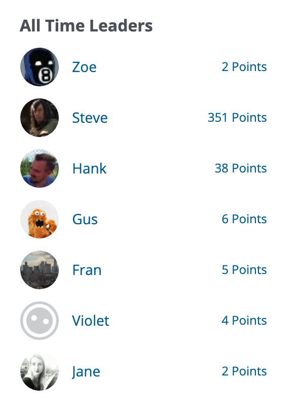
Leaderboard
Display the top users in your community.
N.B. This module appears by default on your forum's Activity Page when Badges is enabled

Properties
These properties are option, you do not need to put any of these props for it to render. If no props are added, our defaults will be used
SlotType See below for values- "w" - Gives this weeks leaders
- "m" - Gives this month's leaders
- "a" - Gives all time leaders
Limit maximum number of resultsCategoryID Only look up one category
Required Plugins
Sample code
// Default, no props
{{ renderModule("LeaderBoardModule") }}

// Or customized with props
{{ renderModule("LeaderBoardModule",
     {
       SlotType: "a",
       CategoryID: 1
      }
) }}
Discussions

Displays forum discussions in a custom location. Note that you will need to style this component. It's used to insert discussions where we don't by default, so it's not fully styled.
Properties
These properties are option, you do not need to put any of these props for it to render. If no props are added, our defaults will be used
Limit maximum number of resultsshowPhotos Do you want the user avatars?categoryIDs For displaying discussions from specific categories. Note that this is an array, not an int or string
Required Plugins
None
Sample code
// Default, no props
{{ renderModule("DiscussionsModule") }}


// Or customized with props
{{ renderModule("DiscussionsModule",
    {
      limit: 40,
      showPhotos: true,
      categoryIDs: [1, 2, 5],
    }
) }}
Tags
Display popular tags (aka tag cloud).
N.B. This module appears by default in your site's side-panel when the Popular Tags add-on is enabled

Properties
These properties are option, you do not need to put any of these props for it to render. If no props are added, our defaults will be used
Context What scope are we searching tags in- "Global" - Search everywhere
- "Discussion" - Search in current discussion (Note that you do not explicitly set this one. If you don't set the context, it will autodetect if you're in a discussion)
- "Category" - Search current category (Note that you do not explicitly set this one. If you don't set the context, it will autodetect if you're in a category)
Required Plugins
None
Sample code
// Default, no props
{{ renderModule("DiscussionsListModule") }}


// Or customized with props
{{ renderModule("DiscussionsListModule",
   {
     Context="Global"
   }
) }}
Who's online
See which other members are online currently.
N.B. This module is enabled by default in your sites side-panel when the Online add-on is enabled

Properties
None
Required Plugins
Online
Sample code
// Default, no props
{{ renderModule("WhosOnlineModule") }}
Advanced
For the end user, there should be no difference using PHP vs React modules. I'm documenting it here for more advanced users. PHP only modules extend Gdn_Module and the react modules extend AbstractReactModule (which, extends Gdn_Module).
Custom React Modules
If you make a custom component, you'll need to first register it with addComponent in an entry point. Likely from your theme: [your theme]/src/scripts/entries/forum.tsx. Core modules are already added.
addComponent("my-new-component", MyNewComponent);
This prevents crashing if the component doesn't exist.
AbstractReactModule's toString function outputs a div with data-react with the component name and data-props. These are picked up by JS, the component is looked up in the component registry and gets passed the props with the proper encoding.
Under the hood
Now that you've got everything set up, you can use the renderModule and call your component as you would any other!
Outputting your component
cssWrapperClass is optional and is for adding a class to the wrapper div that contains your component. Sometimes needed for theming purposes.
renderComponent Sometimes you may want to not render a module under certain circumstances. For example, if you're displaying a list, you may want to not render if it it's empty. This is the function to do it. it will default to true so only overwrite if you've got some logic to determine if it should show or not.
Optional functions for AbstractReactModule
getComponentName the name of the component. This needs to match exactly the name used when the component was registered with addComponent. It'll be the lower cased hyphenated name described above.
getProps returns the props in an array to be passed to the react component.
Required functions for AbstractReactModule
Next, create a class to extend AbstractReactModule.
Now that your component is registered, we need to create the module so we can call it in Twig.
The first parameter is the name of the component, lower cased and hyphenated. The second parameter is the name of the react component, with no extension.