This guide will help us through the process of adding a section in the theme editor to style a component. In this example we will be implementing customizable Discussion Lists.

Prerequisites
You will need:
- A react component to customize (in this case, the DiscussionList)
- Theme variables used for styling the component (make sure those are documented as well, to help other devs)
- Some dummy data to render a preview of the component (make sure the data is appropriate as it will be customer facing)
Adding a section to the panel
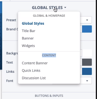
The panel to the right of the Theme Editor is contextual. It will change when selecting a widget in the page.
In some cases, we need to select a different part of the page to customize in order tochange the content of the Left Panel (the preview) and display items we want to customize. Those are grouped by section titles in the dropdown. For example, selecting Quick Links here will change the preview to the Content page, which presents a simple discussion list page which quick links and a banner.
In order to add a section to the dropdown we will need to change a few files.
Add a variable panel type
// ActivePanelContext.tsx.
export enum ActiveVariablePanel {
    GLOBAL = "global",
    TITLE_BAR = "titleBar",
    BANNER = "banner",
    CONTENT_BANNER = "contentBanner",
    WIDGETS = "widgets",
    QUICKLINKS = "quickLinks",
    // A new section is added here:
    DISCUSSION_LIST = "discussionList",
}
Add a section to the dropdown
{/* ActivePanelChooser.tsx */}
<DropDownSection title={t("Global & Homepage")} noSeparator>
    <SectionItem panel={ActiveVariablePanel.GLOBAL} />
    <SectionItem panel={ActiveVariablePanel.TITLE_BAR} />
    <SectionItem panel={ActiveVariablePanel.BANNER} />
    <SectionItem panel={ActiveVariablePanel.WIDGETS} />
</DropDownSection>
<DropDownSection title={t("Content")}>
    <SectionItem panel={ActiveVariablePanel.CONTENT_BANNER} />
    <SectionItem panel={ActiveVariablePanel.QUICKLINKS} />
    {/* A new section is added here: */}
    <SectionItem panel={ActiveVariablePanel.DISCUSSION_LIST} />
</DropDownSection>
Add a section name
// ActivePanelChooser.tsx
function sectionToName(panel: ActiveVariablePanel) {
    switch (panel) {
        case ActiveVariablePanel.QUICKLINKS:
            return t("Quick Links");
        case ActiveVariablePanel.TITLE_BAR:
            return t("Title Bar");
        case ActiveVariablePanel.BANNER:
            return t("Banner");
        case ActiveVariablePanel.CONTENT_BANNER:
            return t("Content Banner");
        case ActiveVariablePanel.WIDGETS:
            return t("Widgets");
        // A new section title is added here:
        case ActiveVariablePanel.DISCUSSION_LIST:
            return t("Discussion List");
        case ActiveVariablePanel.GLOBAL:
        default:
            return t("Global Styles");
    }
}
At this point you should now have the section showing up in the panel dropdown.
Creating a new widget in the preview
The preview page to the left needs a new Discussion List that we can preview while we customize it's variables.
Defining the preview page for a section
First, we will need to define the preview page for that panel section
// ThemeEditorPreviewPage.tsx
function ThemePreviewPages() {
    const { activePanel } = useActivePanelContext();

    let content: React.ReactNode = null;
    switch (activePanel) {
        case ActiveVariablePanel.BANNER:
        case ActiveVariablePanel.GLOBAL:
        case ActiveVariablePanel.TITLE_BAR:
            content = <ThemeEditorPreviewContentsGlobal />;
            break;
        case ActiveVariablePanel.QUICKLINKS:
        // Add the discussion list here:
        case ActiveVariablePanel.DISCUSSION_LIST:
        case ActiveVariablePanel.CONTENT_BANNER:
            content = <ThemeEditorPreviewContentsContent />;
            break;
        default:
            content = <ThemeEditorPreviewContentsGlobal />;
            break;
    }

    return <BannerContextProvider key={activePanel}>{content}</BannerContextProvider>;
}
Clicking on the Discussion List section will now change the preview page to ThemeEditorPreviewContentsContent. The name of this component seems confusing but it's structured like this: ThemeEditor -- PreviewContents -- {Section}. In this case the Content page matches the title of the dropdown we just edited.
Adding a component to the Preview Page.
We can now add our DiscussionListView component to the preview page.
// ThemeEditorPreviewContentsContent.tsx
export function ThemeEditorPreviewContentsContent() {
    const classes = themeEditorPreviewClasses();
    return (
        <div className={classes.content}>
            {/* This component will be tasked with selecting the right panel section when clicked */}
            <PanelActivator
                panel={ActiveVariablePanel.DISCUSSION_LIST}
                color={globalVariables().mainColors.fg}
            >
                <DiscussionListView discussions={themeEditorDiscussionData} />
            </PanelActivator>
        </div>
    );
}
We should now see this in the preview:

Adding Variables to the panel

In order to add variables to our Discussion Lists panel, we will first need to add a section to the panel.
// ThemeBuilderPanel.tsx
function PanelItems() {
    const { activePanel } = useActivePanelContext();
    switch (activePanel) {
        case ActiveVariablePanel.QUICKLINKS:
            return <ThemeBuilderSectionPanel />;
        case ActiveVariablePanel.TITLE_BAR:
            return <ThemeBuilderSectionTitleBar />;
        case ActiveVariablePanel.BANNER:
            return <ThemeBuilderSectionBanner />;
        case ActiveVariablePanel.CONTENT_BANNER:
            return <ThemeBuilderSectionContentBanner />;
        case ActiveVariablePanel.WIDGETS:
            return <ThemeBuilderSectionWidgets />;
        // Our section goes here:
        case ActiveVariablePanel.DISCUSSION_LIST:
            return <ThemeBuilderSectionDiscussionList />;
        case ActiveVariablePanel.GLOBAL:
        default:
            return <ThemeBuilderSectionGlobal />;
    }
}
We can now create our section component
// ThemeBuilderSectionDiscussionList.tsx
export function ThemeBuilderSectionDiscussionList() {
    return (
        <>
            <ActivePanelChooser titlePanel={ActiveVariablePanel.DISCUSSION_LIST} />
            {/* ... Our variables will go here. */}
        </>
    );
}
Building the structure of our panel section
We now have an empty theme builder section. We can go ahead and create our editable variables using the following reusable components:
ThemeBuilderSection
Delimited by a title and a line separator, they group together similar variables.
<ThemeBuilderBlock label={t("Background")}>
    <ThemeColorPicker variableKey={"discussionList.contentBoxes.depth1.background.color"} />
</ThemeBuilderBlock>
ThemeBuilderBlock
A block creates a row of Label and Input for a variable
<ThemeBuilderSection label={t("List Item")}>
    <ThemeBuilderBlock label={t("Border")}>
        <ThemeDropDown
            variableKey={"discussionList.contentBoxes.depth2.borderType"}
            options={themeListBorderTypeOptions()}
        />
    </ThemeBuilderBlock>
</ThemeBuilderSection>
Theme Inputs
Various inputs are available to use inside of a ThemeBuilderBlock. These are found in library/src/scripts/forms/themeEditor.
These are automatically bound to a variable of the theme, customized by the variableKey property.
<ThemeToggle variableKey={"discussionList.item.metas.display.lastUser"} />
Congratulations!
That's it. You've created a whole new section to customize the theme. This will be very invaluable for clients and services alike, and adds immediate value to our product.